Setting up a dynamic chart in Google Sheets is useful when you want to create interactive charts to your spreadsheet.
You can add your own dynamic charts to give users of your spreadsheet control over what data they want to be visualized. This can be achieved through data validation and any Google Sheets chart.
Let’s begin with a quick use case where we might need to make a dynamic chart.
You are a manager of an online store and would like to see which categories a bulk of your revenue comes from. Since you handle many products, there are about 15 categories in your revenue sheet.
You want to create visualizations of multiple combinations of categories, but you don’t want to make separate charts every time. To solve this, you can make a dynamic chart that makes it easy to pick and choose which categories are part of your dataset.
Similarly, you might have a data set of daily revenue that you want to filter out. Using a dynamic chart setup, we can create a spreadsheet that lets users pick an arbitrary start date and end date of a visualization.
Now that we have a basic idea of the benefits of a dynamic chart let’s explore a real example of it on an actual sample spreadsheet.
A Real Example of Using Dynamic Charts in Google Sheets
Let’s look at a real example of a dynamic chart that you can set up in a Google Sheets spreadsheet.
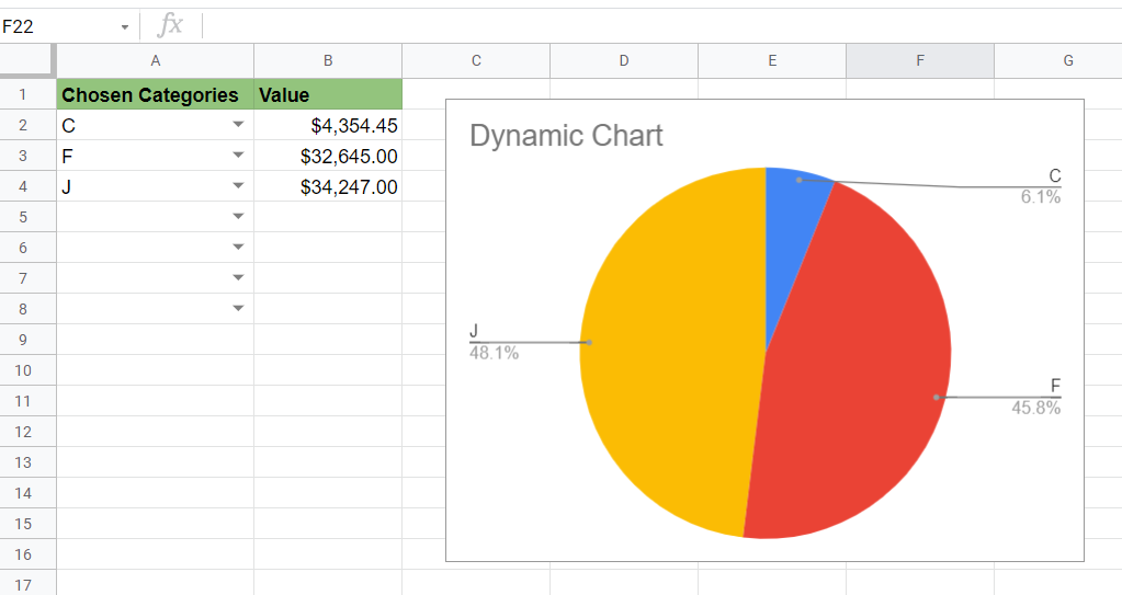
The example seen below shows a pie chart that displays the contribution of a select number of categories. Data validation gives you the option to display as many or as few categories as you want.

To get the values in Column B, we used a VLOOKUP formula that uses the category selected in column A as a search key.
In the example below, we have the same data, but we’ve opted for a column chart instead. Like the pie chart seen earlier, each chart is dynamic and updates when categories are added or removed.

Alternatively, we can create dynamic charts using a different approach. In the chart below, we can select which categories appear by simply ticking a checkbox on the table.

The trick to this particular chart is that the source data range is a second table. This additional table filters out rows without a ticked checkbox using the FILTER function.
You can make a new copy of the spreadsheet above using the link attached below.
If you’re ready to try creating your own dynamic chart, head over to the next section to follow a step-by-step guide.
How to Create a Dynamic Chart in Google Sheets
This section will guide you through your first time creating a dynamic chart in Google Sheets. You’ll learn how to set up data validation and a VLOOKUP column to create the data source for our interactive chart.
Let’s follow these simple steps to start building our dynamic chart:
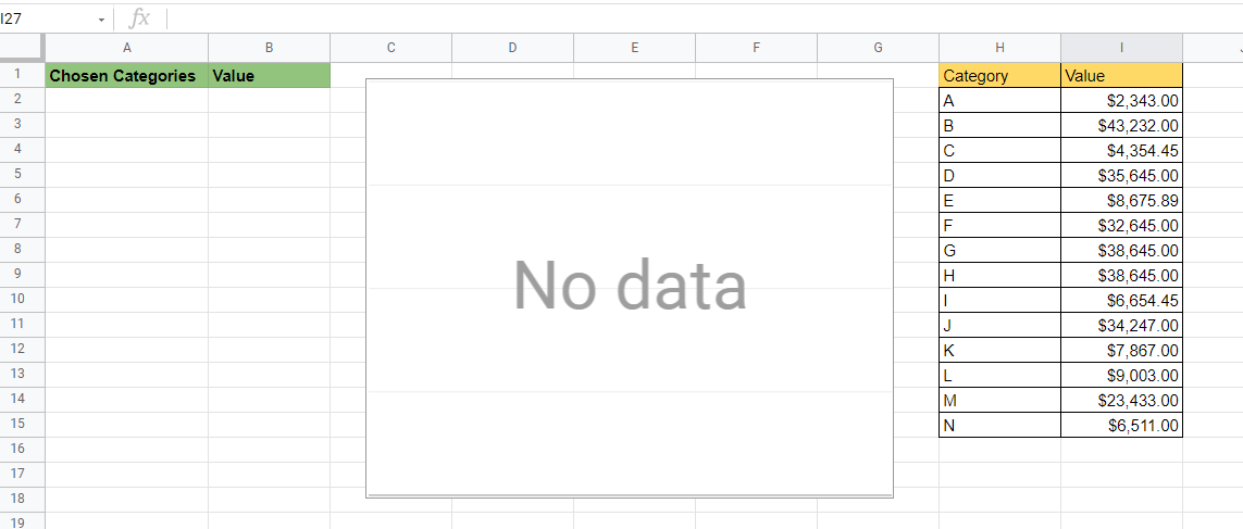
- First, make sure that you have a lookup table prepared. Ideally, the first column of the table should be the label we’ll be using later for our data validation.
In our current example, we’ll be using the Category values as our search key.

- Next, let’s add an empty chart to our spreadsheet. Afterward, we’ll create a data range for our dynamic chart. In this example, we’ll be populating column A with our chosen categories.
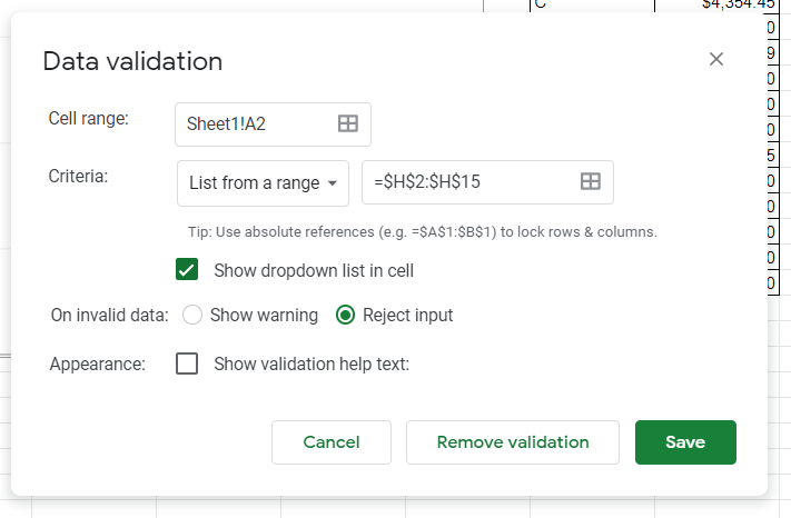
- We should add data validation to the cells in column A to ensure that users do not add invalid categories.

- The criteria for the data validation should be a list from a range. The range must be the lookup table we set up earlier. Make sure that the dropdown list option is checked.
- Your cells in the first column should now look something like this.

- Add a
VLOOKUPformula to the second column. This will allow the column to auto-populate once a category is chosen.

- Drag down the formula to create more cells for users to select.

- Select the empty chart object we added earlier. In the Chart editor on the right, find the data range option. We should select A:B as our data range for our chart.

- After selecting the data range, you can now format the chart however you like. In the example below, we’ve created a pie chart from our data.
- Test out the sheet to see if the chart is truly dynamic. We’ve removed a few entries in the example below, and the chart updated accordingly.
This guide should be all you need to start using dynamic charts in your spreadsheets. This step-by-step tutorial shows how easy it is to create visualizations that anyone using your sheet can modify.
Dynamic charts are just one of many ways you can visualize data in Google Sheets. With so many other Google Sheets features out there, you can surely find one that suits your data.
Are you interested in learning more about what Google Sheets can do? You can stay updated on new guides like this by subscribing to our Google Sheets newsletter!