The gauge chart in Excel is useful when you want to create an eye-catching visualization for a certain metric against a set goal or limit.
Gauge charts resemble the speedometer of a car, which uses a pointer or needle to display information on a dial.
Let’s take a look at a scenario where we can use the gauge chart visualization.
Suppose you have a document that keeps track of monthly sales from your business. You have a target of 1000 sales in a month, and you wish to keep track of your progress. Achieving less than 50% of your target is too low, while reaching 60-75% of your target is average. Reaching 75% or higher can be considered a great month of sales.
With the gauge chart visualization, it becomes quite easy to keep track of the monthly sales metric in terms of how close you are to your goal.
This use case is just one way to use the gauge chart in Excel. It’s a perfect visualization for any cases that involve a target or goal. You can also use this type of chart to keep track of the progress of your projects. Situations that have both a minimum, maximum and current value can be easily visualized using a gauge chart.
Now that we know when to use gauge charts in Excel, let’s dive into how to use it and work on an actual sample spreadsheet.
A Real Example of a Gauge Chart in Excel
Let’s take a look at a real example of the gauge chart being used in an Excel spreadsheet.
The example below shows a gauge chart that shows the progress of a certain project. Users can indicate the progress in a specific cell and a helper table will determine what the gauge chart will look like.

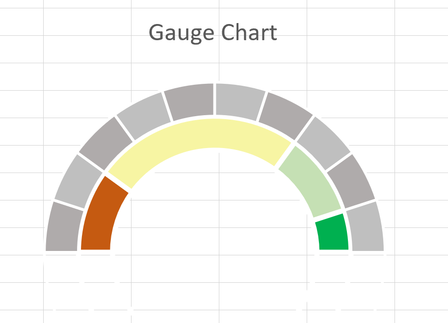
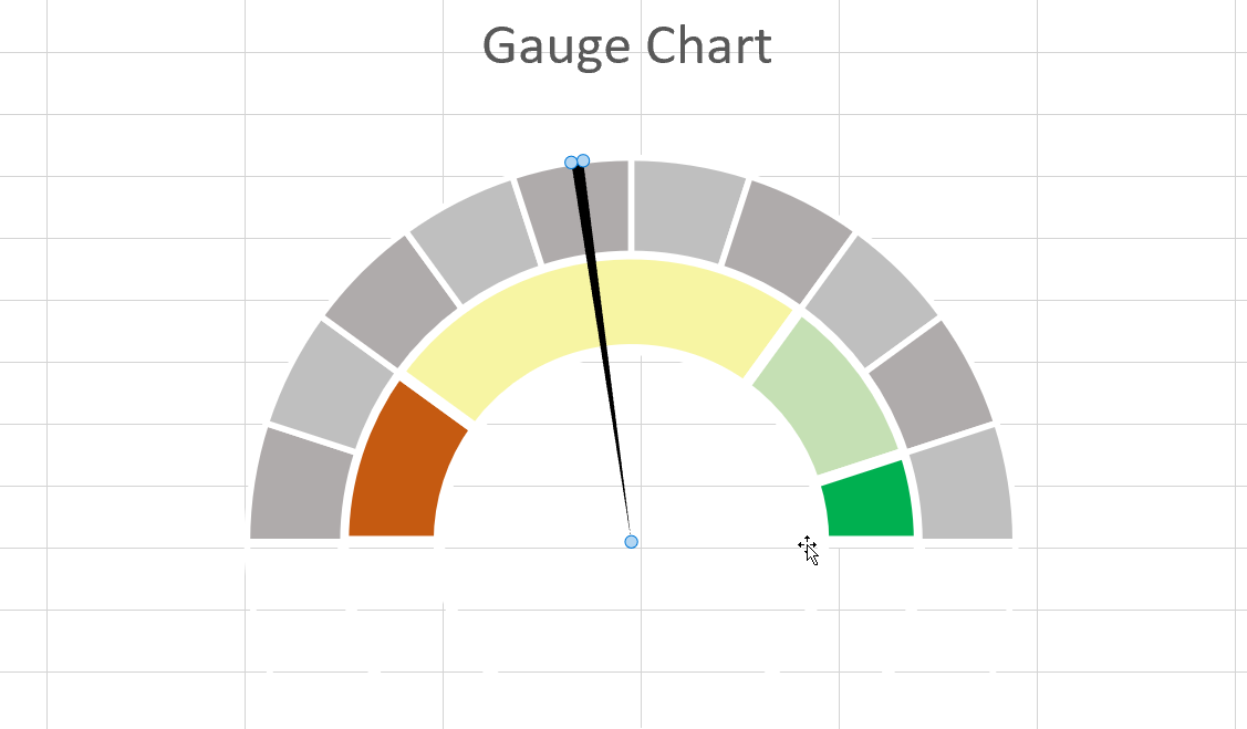
As made clear in the example above, a gauge chart is just a pie and donut chart put together. The donut chart determines the “zones” of the dial while the pie chart renders the needle.
The above example gives us three zones that are appropriately colored to reflect how much progress has been made on the project. Certain elements of the pie and donut chart are invisible to achieve the speedometer effect.
The pie chart is made of three parts. The first sector is simply the value corresponding to the progress made. The second sector will be our needle and will have a value equal to 1. The last sector is equal to a value such that the sum of all three sectors equals a specific number, in this case, 150.
In the example below, we’ve used a donut chart with two layers to show two different types of sectors at once.
You can make your own copy of the spreadsheet above using the link attached below.
If you’re ready to try out the gauge chart in Excel, we’ll discuss how to write it ourselves in the next section!
How to Create a Gauge Chart in Excel
This section will explain each step needed to create a Gauge Chart in Excel. You’ll learn how we can use both a donut chart and a pie chart to create a speedometer-like visualization.
- First, we must add a doughnut chart to our spreadsheet. You can find this option under the Insert tab.

- Next, click on the Select Data option. You can find this in either the Chart Design tab or in the dropdown menu when you right-click on an existing chart.
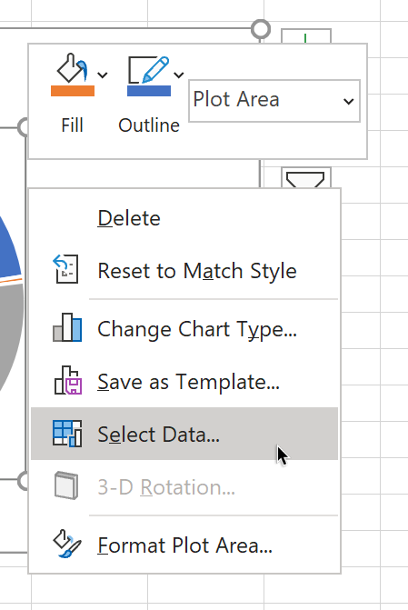
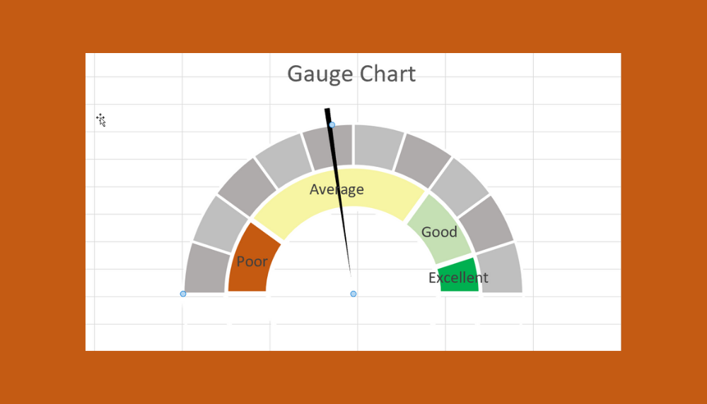
- We should select data that corresponds to the categories or sectors you want to show in your gauge chart. In this example, we have an existing table for our performance categories ranging from poor to excellent.
Each category has a corresponding value that will be used to determine how much area each category will cover in the chart.

- Depending on the look of your gauge chart, you may need to change the angle of the first slice. In this example, we want the first slice to be at the 270-degree angle.
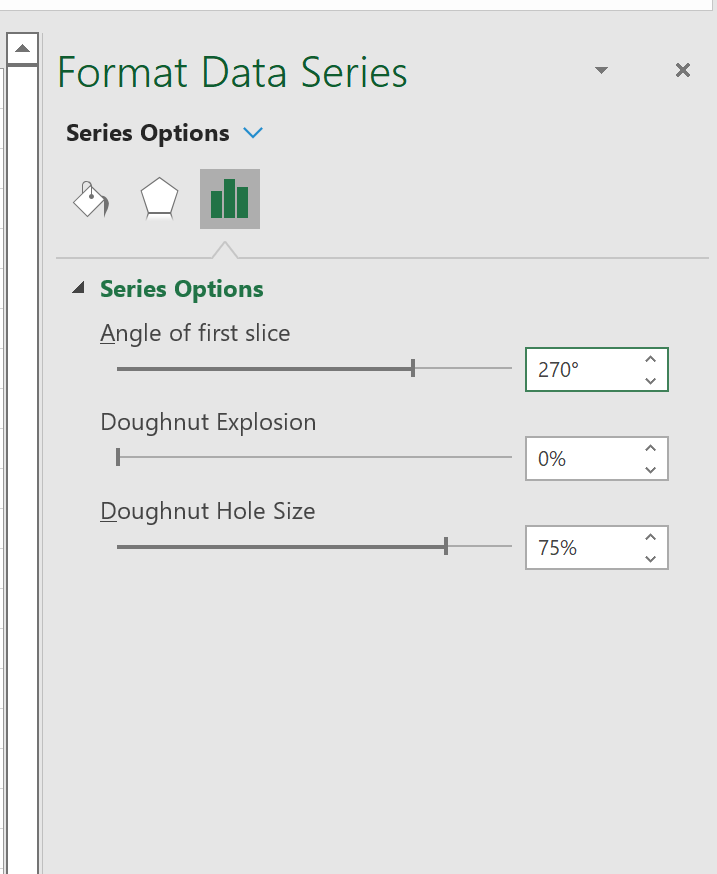
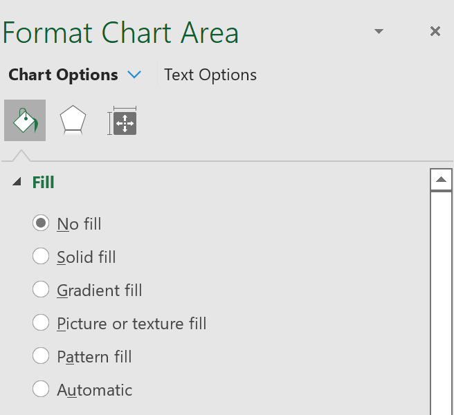
- To achieve the gauge or speedometer visualization, we must hide the last sector. We can do this by double-clicking on the element and changing the Fill option to No Fill.
- The final result should look similar to a semi-circle. In the example below, we’ve added another data source to give two different levels of measurement.
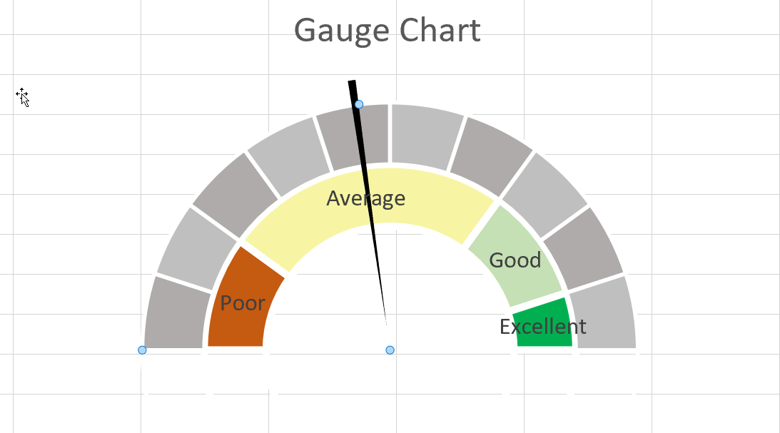
- Next, we must add a needle pointer to our doughnut chart. We can form the needle using a modified pie chart. We can add this to our current chart by selecting the Change Chart Type option under the Chart Design tab.
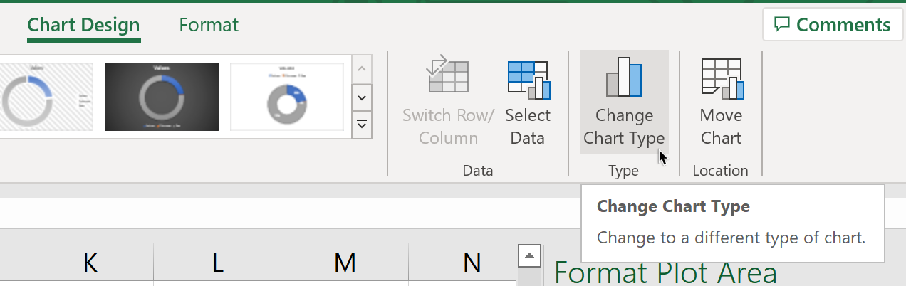
- A dialog box will appear where you can add another type of chart to your current selection. Make sure that you’ve selected the Combo type to allow multiple types of charts to be selected.
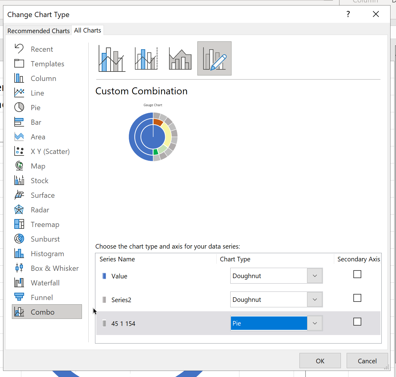
- Once the pie chart has been added, use the same method in Step 5 to make sure only the needle element is visible.
- You may also add labels to each sector by selecting the Add Data Labels option.
Frequently Asked Questions (FAQ)
- What are the disadvantages of gauge charts?
Gauge charts do have some disadvantages that you need to consider. Gauge charts may be too simple for some use cases since they only track one metric. Because of their simple nature, gauge charts may be misleading if used on their own.
That’s all you need to know to add a gauge chart in your Excel spreadsheet. This step-by-step guide shows how easy it is to create a visualization that shows how far along you are in a project or how close you are to achieving your target.
The gauge chart or dial chart is just one example of a visualization you can make in Excel. We have guides on many other Excel functions that can help you improve your spreadsheet knowledge.
Are you interested in learning more about what Excel can do? Make sure to subscribe to our newsletter to be the first to know about the latest guides and tutorials from us.