The SPARKLINE function in Google Sheets is useful if you want to create a miniature chart contained within a single cell.
This function is very handy when presenting some data to your colleagues or superiors as it can quickly provide attractive visual representations. 💹
Table of Contents
Let’s take an example:
As a student, you would like to track your exam results to keep track of your progress. You can simply use the SPARKLINE function to create a small line chart to give you an overall view of your results.

You can see that the SPARKLINE function generates a simple line chart according to the data inserted into the formula in the image.
There are also many other options that you can insert into the formula to customize it. Instead of line charts, you can customize the chart type!
The Anatomy of the SPARKLINE Function
The way we write the SPARKLINE function is:
= SPARKLINE(data, [options])
Let us help you understand the context of the function:
- The equal sign
=is how we start any function in Google Sheets. SPARKLINE()is our function. We need to add two attributes, namely thedataand[options], to make it work correctly.- The
datais the range containing the data to plot. In our previous example, it would be B3:B6. - The
[options]is a range of optional settings and associated values used to customize the chart. This attribute is optional. The formula will automatically plot a line chart if it is not inputted, as shown in our previous example.
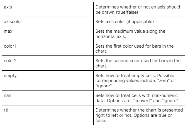
Let’s explore the endless customizable options you can input into the formula!

Now that you have learned all the options available, let’s use some of these in an example!
A Line Chart Using SPARKLINE Function
Very often, every year-end we are asked to have a meeting to discuss the performance of sales during the year. With the SPARKLINE function, you can easily create visualizations to let the listeners have a better understanding of the collected data.
Since the line chart is the default chart type, we would only need to specify the range of data.
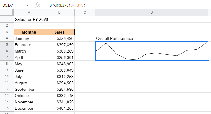
However, to make it more engaging and presentable, we can insert some options to enhance the outcome.
Example:
- Simply click on the cell that you want to write down your function at. In this example, it will be D5:D7. Simply merge these cells to create a bigger cell to showcase the line chart.

- Begin your function with an equal sign
=, then followed by the name of the function,SPARKLINE, then an open parenthesis(.

- We will then select cells B4:B15, as this is the range of data we would like to plot. Furthermore, we need to add a comma
,to separate thedatafrom our next attribute, the[options].

- To start any options, we will need to insert a curly bracket
{. Then, we can simply add in all the options we would like to customize the chart however we like. In this example, we want it to have a thicker line and be in the color blue. Hence, we would insertlinewidthand2for a thicker line. For a blue line, simply insertcolorandblue.

Do not miss out on the semicolon ; to separate each option from one another!
- Your input would look like this:

Final formula:
=SPARKLINE(B4:B15,{"linewidth",2;"color","blue"})
A Column Chart Using SPARKLINE Function
Let’s try creating a column chart using the SPARKLINE function. However, in this example, we would like to use different colors for the highest and lowest sales.
Example:
- To create a column chart, we would need to insert
charttypeandcolumninto the formula to specify the chart type.

- Now, let’s customize the chart to show a distinction between the highest and lowest sales using different colors. We would make the lowest sales red by inputting
lowcolorandred. Then the highest sales would be green. We will inserthighcolorandgreen.

- Your input would look like this:

A Bar Chart Using SPARKLINE Function
Unline the line and column charts. A bar chart does not take many values per chart.
Let us use some examples to demonstrate what this means.
Example:
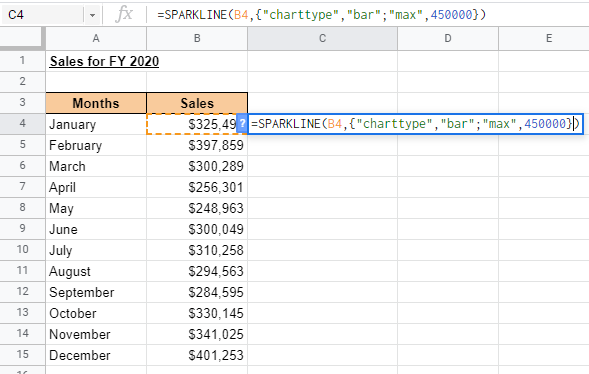
- Similar to the column chart, let’s specify which chart type we would like the formula to generate. We would insert
charttypeandbar. However, instead of selecting a range of data like before, we would only be selecting one cell. In this example, it would be B4.

- Your input would look like this:

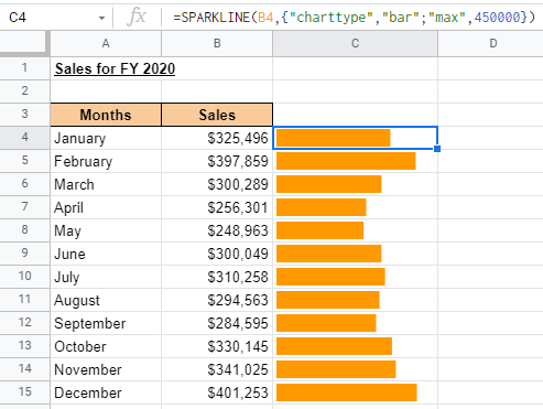
The problem here is that the bar chart fills up the whole cell. There is no representation of data showing the performance of the entire year. This is because when you create a bar chart, since each cell only knows the value of the bar it needs to create, there is no way to know how long the var can be.
To curb this, we would utilize the MAX option to create a comparative view.
- Let’s insert
MAXas another option. Then we would select the maximum amount in the range of sales we have, which is B15.

We can also manually input the maximum value into the formula.
- Your final input would look like this.
A Winloss Chart Using SPARKLINE Function
Winloss charts are a special type of chart where there are only two outcomes, positive and negative. It does not show the magnitude of the data, unlike the column chart.
Let’s move on to an example to get a clearer understanding.
Example:
- To get a winloss chart, we would need to insert the options
charttypeandwinloss.

- Let’s also customize the negative values using a different color. To do so, we will insert
negcolorandred.

- Your final input would look like this:

As you can see, regardless of how high or low the sales is, all the columns are the same height.
You may make a copy of the spreadsheet using the link attached below and try it for yourself:
If this tutorial is interesting to you, do not miss out on our tutorials on various ways to create charts in Google Sheets! From creating Candlestick charts to Gantt charts, we have it all!