


A thermometer goal chart in Excel is useful when you need to visualize progress towards a target goal or value.
A thermometer goal chart is implemented using an Excel stacked bar chart. It visualizes how far a current value is from a given goal or target value.
Let’s take a look at a sample scenario where it might make sense to set up a thermometer goal chart.
As a bakery shop owner, you want to keep track of how many sales you receive in a month. You have set a personal goal of 1000 items sold for the month of March. You have each order written down in a spreadsheet and the quantity of items associated with each order.
With a thermometer goal chart, we can set up an easy-to-follow visualization of our progress towards our goals. As you continue to get more and more sales, the thermometer chart will “fill up” until you eventually get a solid bar.
You can use a thermometer goal chart in any situation where you want to keep track of how far you are from a certain target. Now that we know when to use this type of chart, let’s look into what it looks like in action!
A Real Example of a Thermometer Goal Chart in Excel
Let’s take a look at a real example of a thermometer goal chart being used in an Excel spreadsheet.
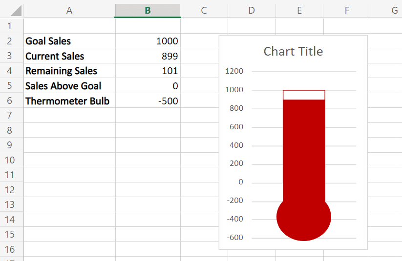
In the example below, we have a thermometer goal chart that keeps track of our sales goal. Cell B3 tells us that we currently have 899 sales, nearly enough to reach our target of 1000 sales.
The thermometer goal chart makes it easy to visualize how close we are to our goal or target number.
To get the value in cell B4, we just need to use the following formula:
=B2 - B3
You can make your own copy of the spreadsheet above using the link attached below.
If you’re ready to try out the thermometer chart in Excel, head over to the next section to learn how to create one yourself.
How to Create a Thermometer Goal Chart in Excel
This section will guide you through each step needed to set up a thermometer goal chart in Microsoft Excel. You’ll learn how to use a Stacked Column Chart and some clever formatting to create a pleasing visualization of your progress.
Follow these steps to start creating your own thermometer goal chart in Excel:
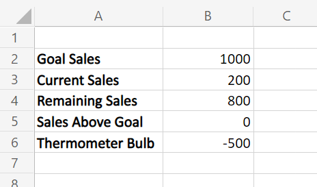
- First, we need to set up the following values. These values will control the size of the various segments of the thermometer chart. The value of Remaining Sales in cell B4 will indicate how much empty space will be allotted between the filled-in area and the top of the chart.
- Next, we should add a new Chart to our spreadsheet, specifically a Stacked Column Chart. This can be found in the Insert tab. Expand the dropdown menu and look for the Stacked Column option.

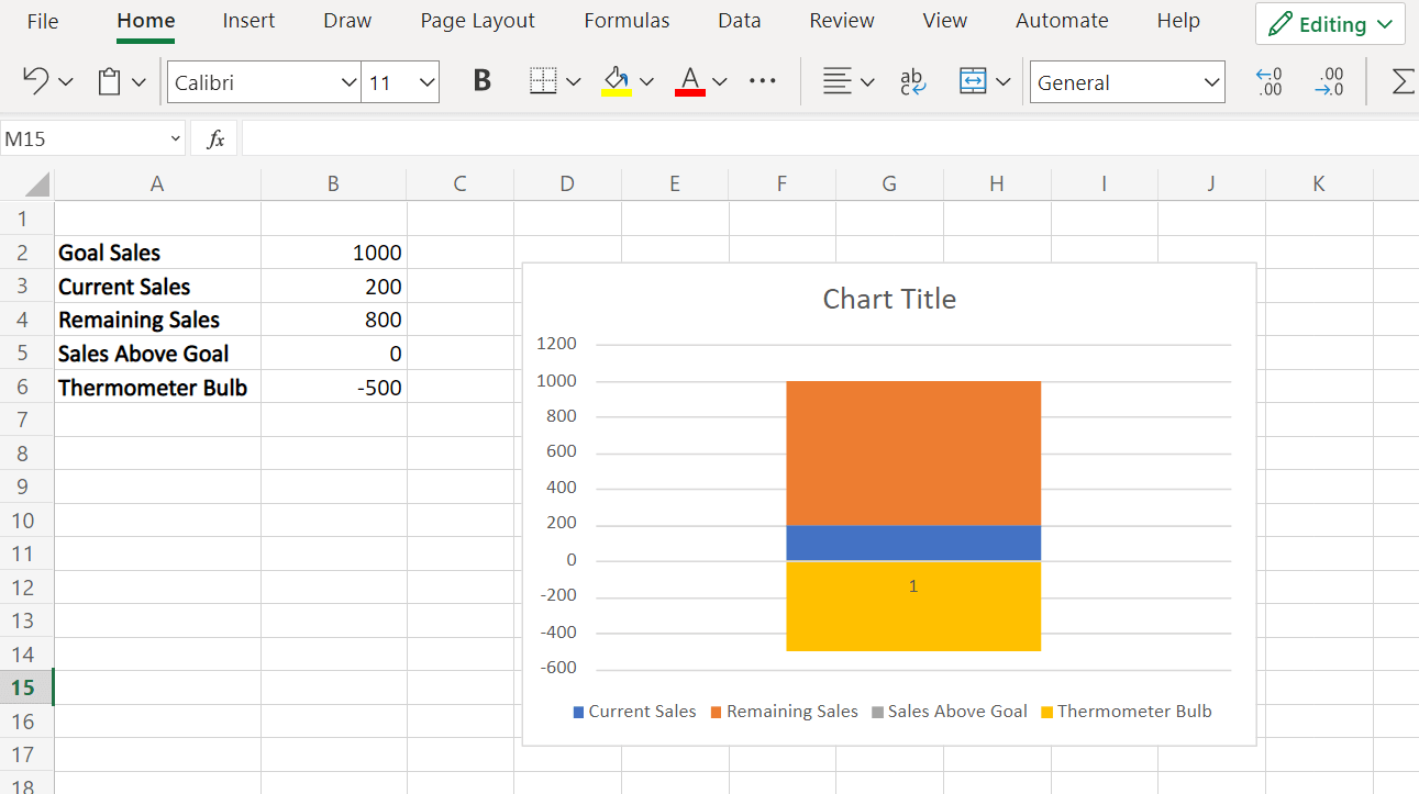
- Once a new Chart has been added, ensure that the data source is the table we set up in the first step. Your chart should look similar to the example shown below.

- We need to click on the Switch Row/Column option to ensure that all of our numerical values are stacked into one column.

- Your Stacked Column Chart should now look like a single vertical bar with multiple sections, as seen below.
- To achieve the thermometer goal visualization, we’ll have to make some changes to the formatting. In the Chart editor, change the Fill color of the Remaining Sales series to white. Set the outline color to red.
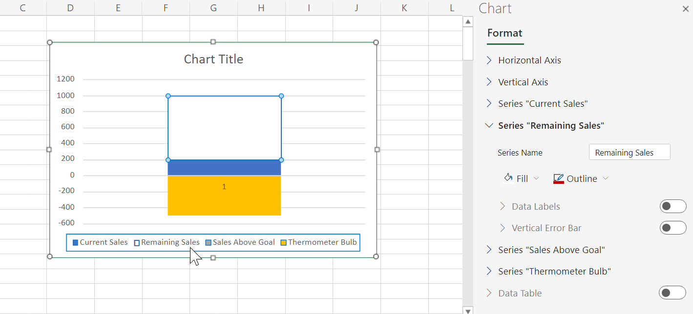
- Edit the fill color and outline color of the Sales Above Goal series to green.

- Next, let’s add some shapes to create the thermometer bulb. You can find the option to add shapes in the Insert tab.
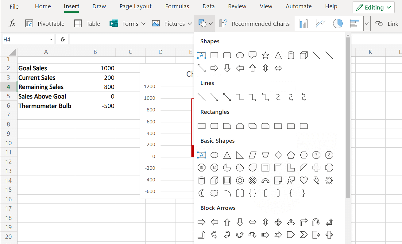
- We’ve colored the additional shapes to be the same as the fill and outline colors of our stacked chart.
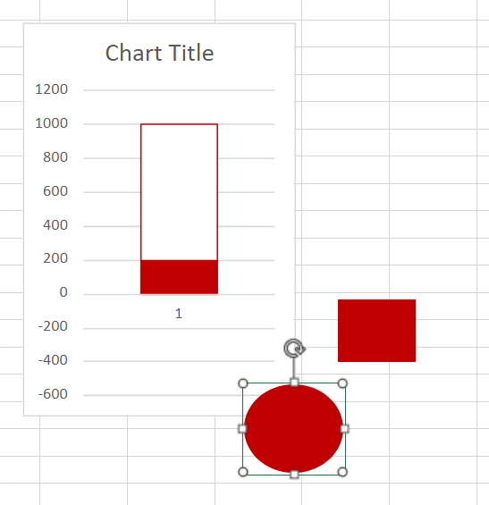
- Drag the shapes on top of the chart to create a thermometer shape.

- The thermometer goal chart should now be fully functional. In the example below, we increased the current sales from 200 to 899. The chart is automatically updated to reflect this change.
Frequently Asked Questions (FAQ)
- Should I use a stacked column chart or a 100% stacked column chart?
You can use both types of column charts, but the former has some advantages. A simple stacked column chart allows you to indicate the actual value of the current value and target value. The 100% stacked column chart has the y-axis in percentages.
That’s all you need to remember to start creating a thermometer goal chart in Excel. This step-by-step guide should be all you need to visualize on a spreadsheet how far you are from your targets.
The thermometer goal chart is just one example of how you can visualize your data in Excel. With so many other Excel functions out there, you can surely find one that best fits your data and use case.
Are you interested in learning more about what Excel can do? Make sure to subscribe to our newsletter to be the first to know about the latest guides and tutorials from us.


