This guide will show you how to add axis labels to charts in Excel.
Creating charts and graphs is visually helpful in providing a clearer picture of your research or any information that you are presenting to your reader. By adding axis labels, you make other people understand and interpret your data quickly and easily.
Suppose you need to present your team’s monthly sales at your company’s year-end meeting. Adding axis labels is one of the few elements that can help you deliver a more straightforward presentation.
Another example is if you want to monitor your website visits in a month. A line graph with axis labels can help you interpret daily data a lot faster. Now that we know when to use axis labels, let’s dive into how we can apply them in an actual spreadsheet.
A Real-Life Example of Adding Axis Labels to Charts in Excel
Let’s look at a real-life example of adding axis labels to charts in Excel.
In this example, imagine you are required to present your entire team’s monthly sales in three cities. At first glance, this kind of information can be overwhelming to your audience.

While tables can be very detailed, having charts and graphs can be very helpful, especially when introducing a lot of information in a short amount of time. However, as you noticed below, the lack of proper labels can confuse your audience. By default, a chart title, axes, and grid lines are automatically added when creating charts where axis labels are used. So you would need to add axis labels on the chart manually.

Having axis labels can make your charts more comprehensible. It displays a simple yet concise illustration as it summarizes the data in the table.

As you now understand how axis labels work, we can now go through some examples to demonstrate step-by-step how to add axis labels to charts.
You can make a copy of the spreadsheet above using the link attached below.
How to Add Axis Label to Chart in Excel
This section will help you add axis labels to charts in Microsoft Excel. There are two ways we can do this. This step-by-step guide below will demonstrate both methods using the example mentioned earlier.
Method 1: By Using the Chart Toolbar
- Select the chart that you want to add an axis label.
- Next, head over to the Chart tab.

- Click on the Axis Titles. Navigate through Primary Horizontal Axis Title > Title Below Axis.

- An Edit Title dialog box will appear. In this case, we will input “Month” as the horizontal axis label.

- Next, click OK. You’ll notice that the word Month has appeared on the chart’s horizontal axis.

- You can then repeat steps 3-5 for Primary Vertical Axis. For this example, we will input “Sales (in USD)” as the vertical axis label. There are a few formatting options for this title. Since our label is a bit long, let’s choose Rotated Title.


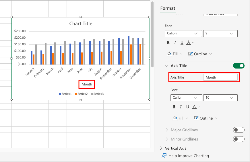
Method 2: By Using the Floating Format Toolbar
What’s good about the second method is that with two clicks, you can access a toolbar where you can edit and customize your chart to your liking.
- Right-click on the chart and select Format. Or you can simply double-click on the chart. It will automatically display the Format toolbar.

- Next, expand Horizontal Axis.

- Turn the toggle on for the Axis Title. This will display the default Axis Title for the horizontal axis.

- You can now change the title depending on the data in the chart. In this example, we will update the horizontal axis label to “Month.”
- Next, repeat steps 3-5 for the vertical axis. In this example, we will be adding the vertical axis label as “Sales (in USD).”
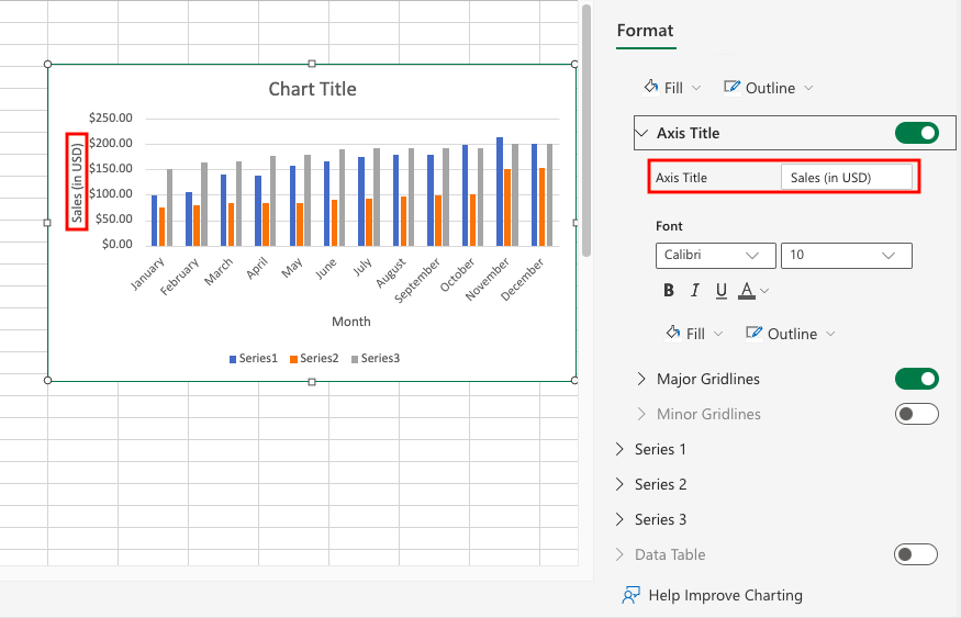
- Finally, in order to present a clearer illustration of the chart, edit the Chart Title. You can also change the formatting of the title and other elements of the chart.

That’s pretty much everything you need to know when adding axis labels to charts in Microsoft Excel. This guide shows how simple it is to present data and provide more concise and explicit information when using charts.
This feature is just one of many which can help you make your Excel spreadsheets more precise for other users. With so many different Excel functions and features, you can definitely find ways to improve your Excel experience.
Are you interested in learning more about how Google Sheets can help you make more powerful spreadsheets? Make sure to subscribe to our newsletter to be the first to know about the latest guides and tutorials from us.