This guide will discuss how to do conditional formatting on a stacked bar chart in Excel.
In fact, there is no function or tool to automate this task. Thus, we will need to perform a few things manually to achieve conditional formatting on a stacked bar chart in Excel.
A stacked bar chart is a type of chart available in Excel. It also shows different values across different categories. Each bar is split into sub-segments on top or stacked together.
Conditional formatting is commonly used to emphasize or highlight specific data. It is a feature that allows us to apply specific formatting like color to cells that fit our criteria.
Although it is easy to perform conditional formatting on cells, it can be difficult to perform on a bar chart. There is no built-in function or feature in Excel that will make it easy.
So we will manually perform conditional formatting on a stacked bar chart. There are two ways to do this task. First, we can change the data source by adding one more table. Then, we will use that as our data source for the stacked bar chart.
On the other hand, we can manually create a stacked bar chart in which we can easily use different colors for each stack. Both ways will require us to create multiple tables for our data.
Let’s take an example.
Suppose you want are doing a monthly sales report. And you want to highlight the bars that are less than 100, meaning the products that sold less than 100 units. So you manually performed conditional formatting by creating a separate table for the values less than 100.
And doing that would allow you to have a separate bar for those products for which you can use a different color like red to highlight it.
Awesome! Let’s move on to a real example of performing conditional formatting on a stacked bar chart in Excel.
A Real Example of Conditional Formatting on a Stacked Bar Chart in Excel
Let’s take a look at our sample data. For example, we have a table with the number of units sold per product.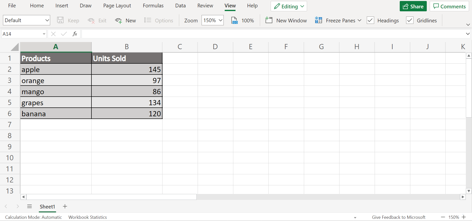
First, let’s try performing conditional formatting on a stacked bar chart. We can do this by creating a new table. In this case, we want to highlight products that sold less than 100 units. So we create a separate column for those values.
Then, we can choose the stacked bar chart in the charts available in Excel. Make sure also to use the modified table as the data source. Now we can format it however we want. In this case, we will turn the bars with values less than 100 into the color red to emphasize them.
Great! Now let’s try the second conditional formatting method on a stacked bar chart. And this time, we will manually create a stacked bar chart. Similarly, we need to create additional columns to separate our data.
Then, we will use conditional formatting to create a stacked bar chart in the cells. It would look something like this: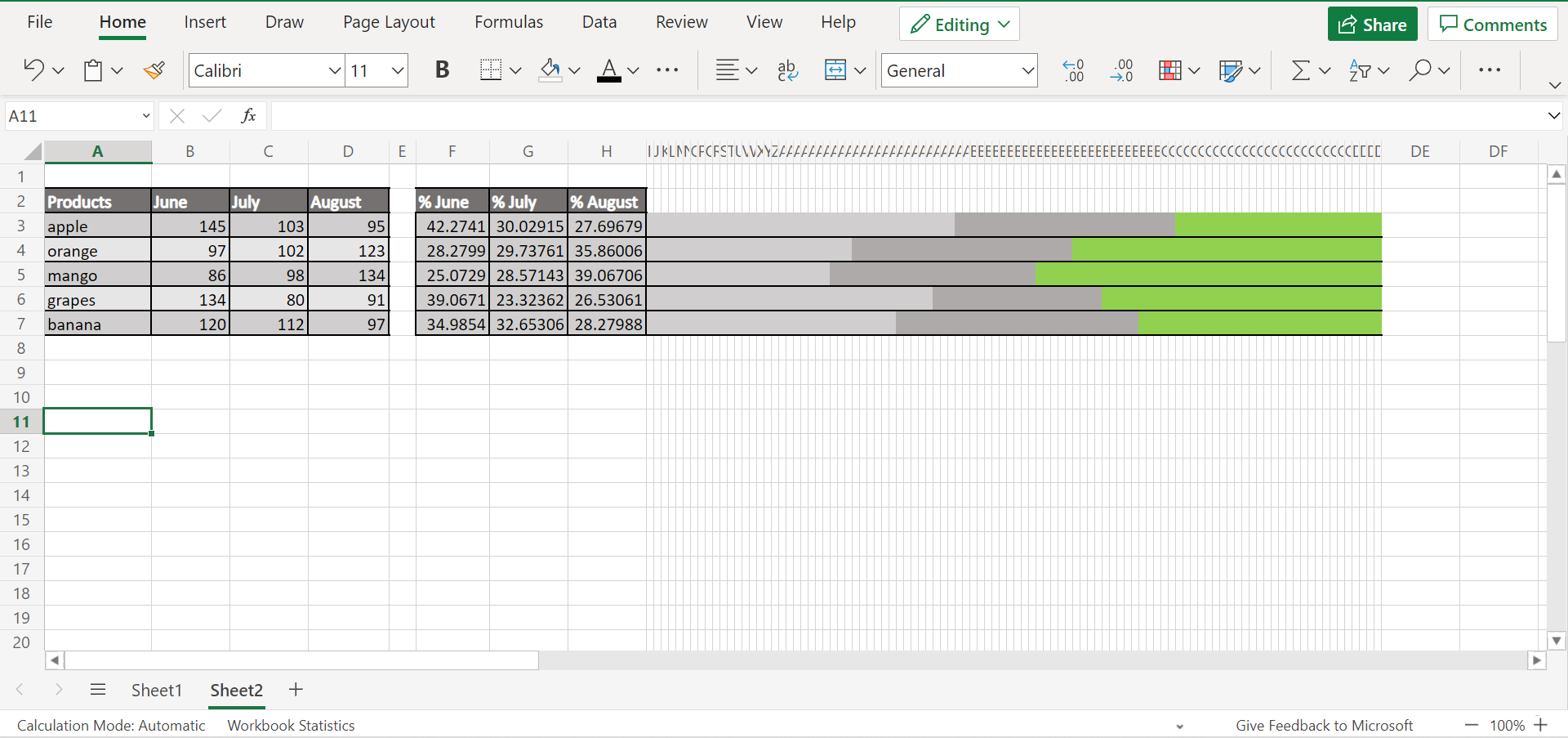
You can make your own copy of the spreadsheet above using the link attached below.
Now let’s learn the steps of how to do conditional formatting on a stacked bar chart in Excel.
How to Do Conditional Formatting on Stacked Bar Chart in Excel
In this section, we will explain the process of how to do conditional formatting on a stacked bar chart in excel using two methods.
1. First, create a new table containing two columns for the units sold. So we will separate the values that are >=100 and >100. In cell B9, input the formula “=IF(B2>=100;B2;””)”. Then, drag down to copy the formula to the entire column and type “0” in the blank cells.
2. Second, input the formula “=IF(B2<100;B2;””)” in cell C9. Similarly, drag down to copy and type “0” in the blank cells.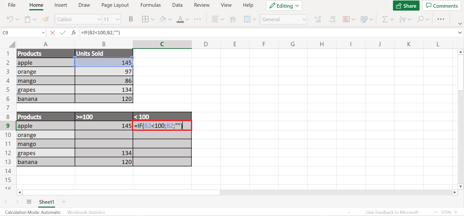
3. Third, select A9:C13. Click to Insert and go to the Charts. From there, select the Stacked Column.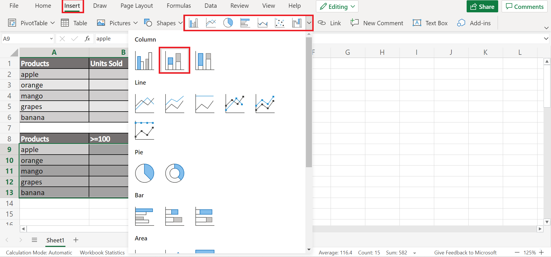
4. Once the chart appears, right-click anywhere and click Format.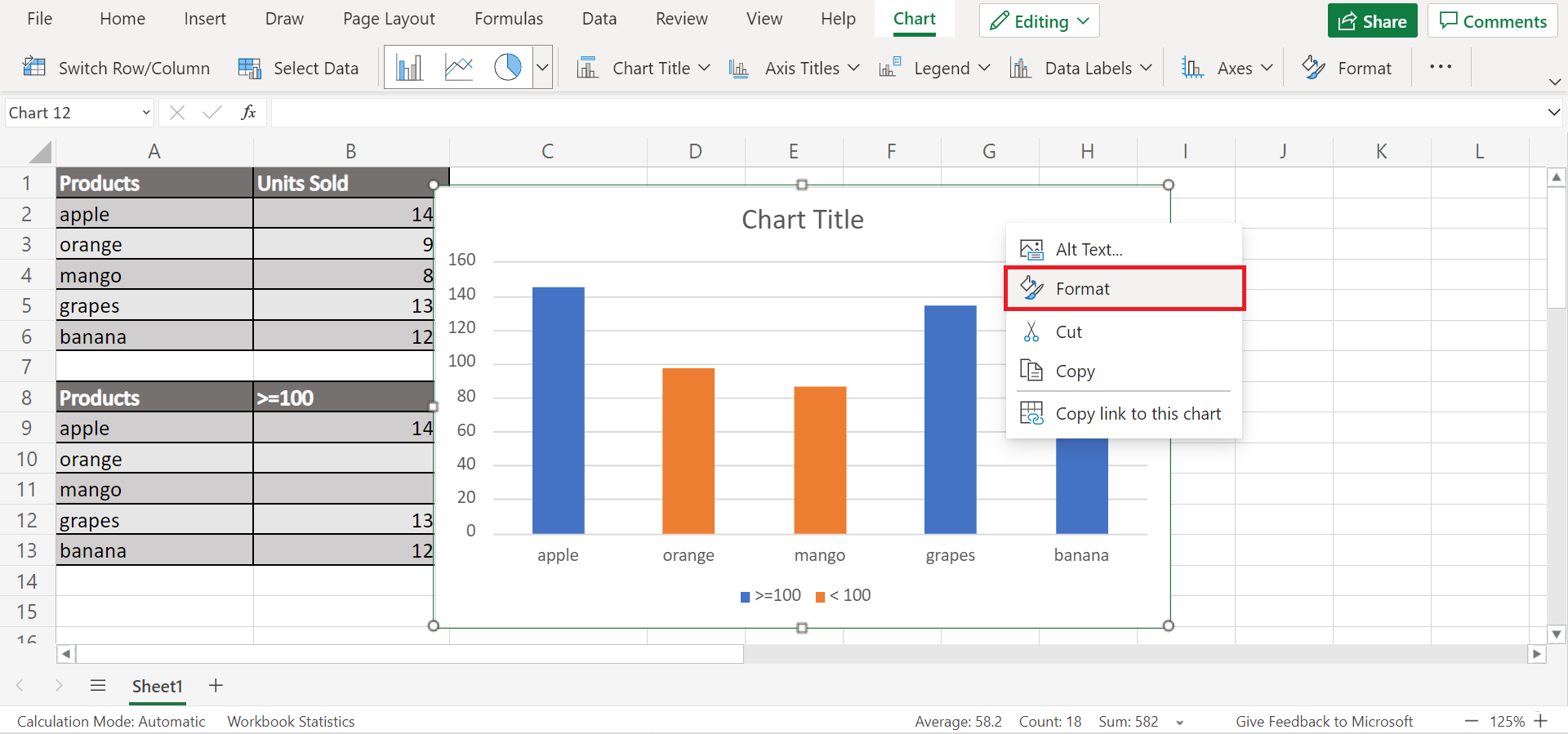
5. In the Chart, you can format the chart based on your preference. But we will go to Series <100. Since we want to highlight the products sold less than 100, we will change the fill color to red.
6. And tada! We manually did conditional formatting on a stacked bar chart.
7. Next, let’s try doing conditional formatting by making our own stacked bar chart. For instance, we are making a quarterly report, but we want to highlight the data in August.
Similarly, we will create another table. And we need to calculate the sales percentage of the product each month. To do this, input the formula “=B3/SUM($B$3:$D$3))*100” in cell F3. 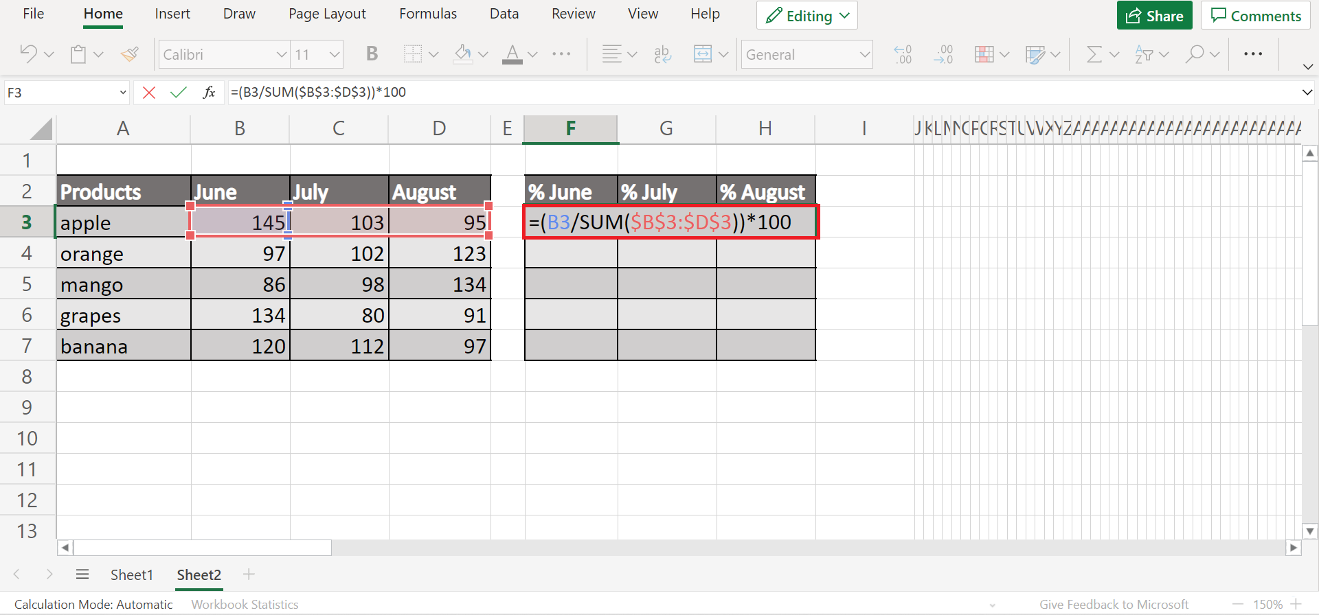
8. Then, drag the formula to the entire table to apply the same formula. So this will return the percentage equivalent to our data in the original table.
9. Next, select 100 columns next to the table. In the Home tab, click the three dots. Then, click Format and Column Width.
10. Then, change the Value to “0.1” and click OK.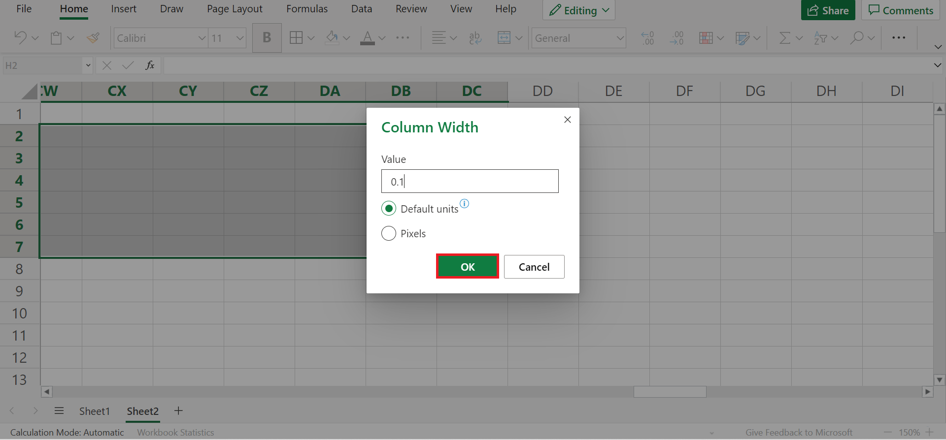
11. Make sure the columns are still selected. After, go to Conditional Formatting and click New Rule.
12. Then, check the If true then stop option. In Rule Type, select Formula. Under Format all values where this formula is true, input the formula “COLUMNS($J$3:J3)<=$F3”.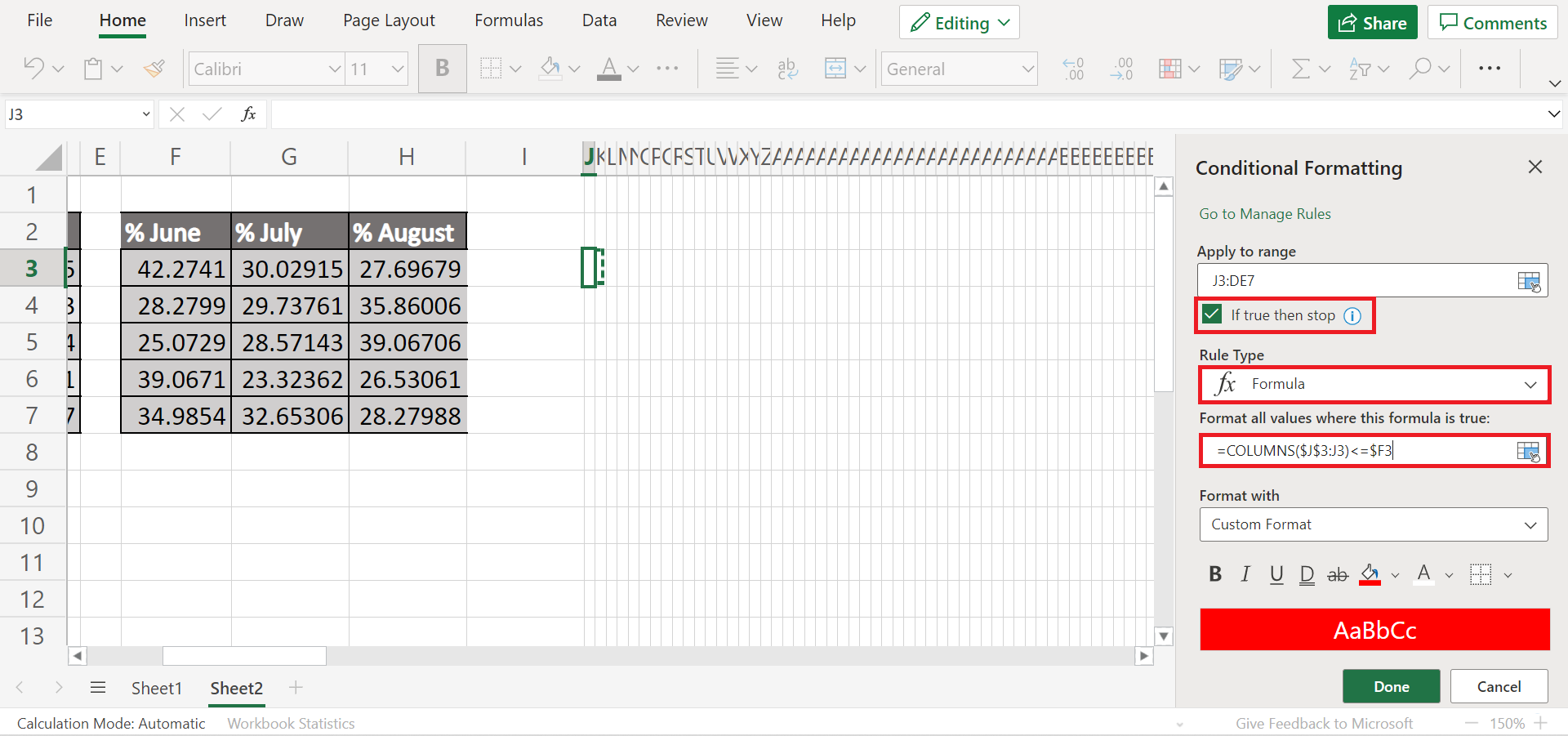
13. Then, you can change the fill to any color you want. Finally, click Done to apply the conditional formatting.
14. Repeat steps 12 and 13 to add two more new rules. In the second rule, follow the same steps but input the formula “=ANDCOLUMNS($J$3:J3)<=$F3;COLUMNS($J$3:J3)<=($F3+G3)”.
Again, follow the same steps for the third and last time. But this time, input the formula “=ANDCOLUMNS($J$3:J3)>($F3+G3);COLUMNS($J$3:J3)<=100”. Now we have three conditional formatting rules.
15. Since we want to highlight the month of August, let’s change the color of the first two conditional formatting to shades of gray and keep the bright color for August. Additionally, we can format the borders of each product to separate each bar.
16. And tada! We have manually created a stacked bar chart and applied conditional formatting to it in Excel.
That’s pretty much it! You have successfully learned two methods to do conditional formatting on a stacked bar chart in Excel. Now you can apply any of the two methods whenever you need to highlight a bar in your chart.
Are you interested in learning more about what Excel can do? You can now use the various other Microsoft Excel formulas available to create great worksheets that work for you. Make sure to subscribe to our newsletter to be the first to know about the latest guides and tutorials from us.