A funnel chart helps you see the bigger picture without compromising the quality and quantity of information you need.
It is often used in visualizing metrics per process stage. For example, if you want to know much of your audience is converted to loyal customers of your brand through their interactions with your marketing strategies.
Since a funnel is technically an inverse triangle, the values you’ll see in this chart type will most likely be arranged in decreasing order. Makes sense, right?
Let’s take the marketing funnel stages and the hypothetical audience reactions as our example. Don’t forget to make a copy of the spreadsheet that I’ve linked below. This should help you follow along more easily in this tutorial.
Let’s get right into it, shall we?
Inserting a Stacked Bar Chart
A perfect funnel-shaped chart is hard to achieve by eye-ball estimation. This is where the embedded chart builder comes in clutch. With a simple formula, you can create a Helper column that will serve as the backbone of your funnel chart.
But first, we need to insert a stacked bar chart.
- Go to Google Sheets and create a Blank worksheet. Then, encode our example data.
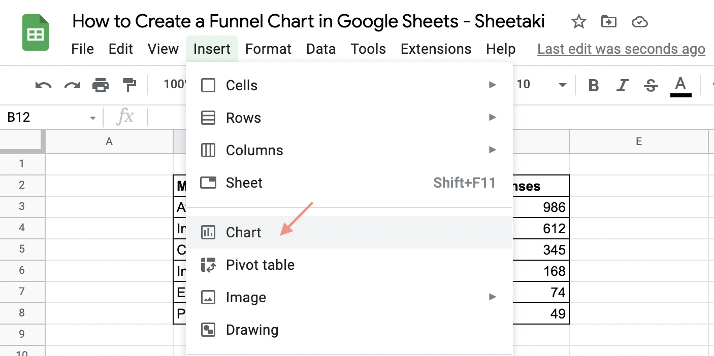
- On the Menu Bar, click Insert. Then, click Chart.
 Notice that the data set is not selected or highlighted. So, your chart area displays “No Data.”
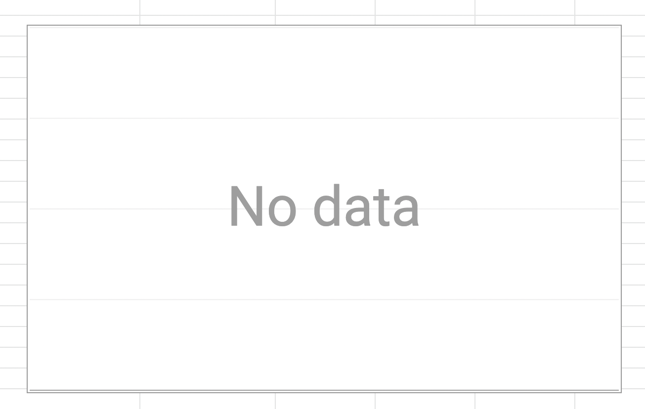
- In the Chart Editor, click Chart Type. Then, select Stacked Bar Chart.
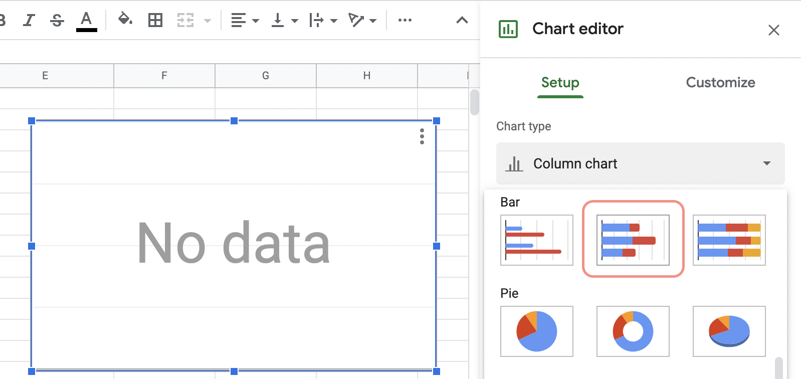
- To add content to your chart, go to Data Range and click the Table icon next to it.
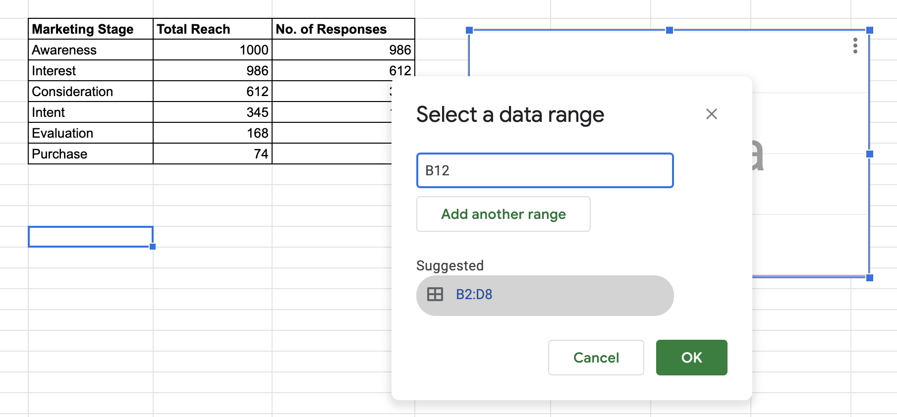
As you can see, the set data range is the highlighted cell in your worksheet. In this screenshot, mine was B12. You can manually select the data set for your chart. Or, just click Suggested. It should be the same cell addresses as your data set. But it won’t hurt to double-double-check.
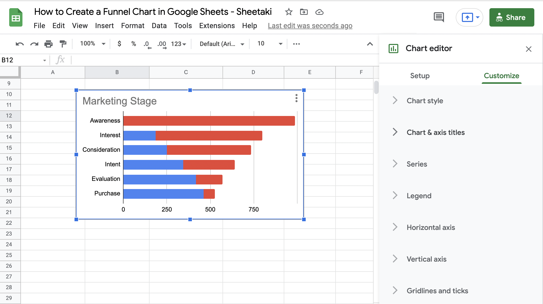
Click OK. After you’ve selected the data range. You’ll see the stacked bar chart for your data.
At this point, you could make out the funnel in the chart. But, there are still some adjustments to do before you can finally say that you have created a funnel chart.
Check out the next section.
Adding a Helper Column to Create a Funnel in your Chart
The shape of the stacked bar chart is only half of the shape we want to achieve. We want the chart to be as easy to understand and still visually appealing.
To create the perfect cone for your funnel chart, you’ll need a new column between your parameter (Marketing Stage) and metrics (Interactions).
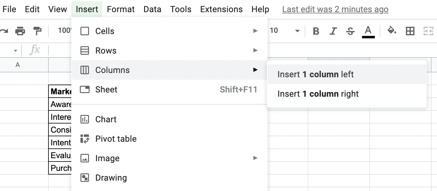
- First, select the cell for Marketing Stage, in this example it’s B2.
- Then, click Insert on the Menu Bar, then choose Columns. From the dropdown menu, select Insert 1 Column to the right.
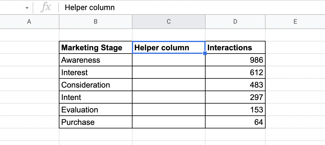
- In the new column, C2, label it as the Helper column.
- Then, insert this formula in the cell below the Helper column heading.
=(max($D$3:$D$8)-D3)/2
Note: D3 is the cell with the first numerical value in your data set.
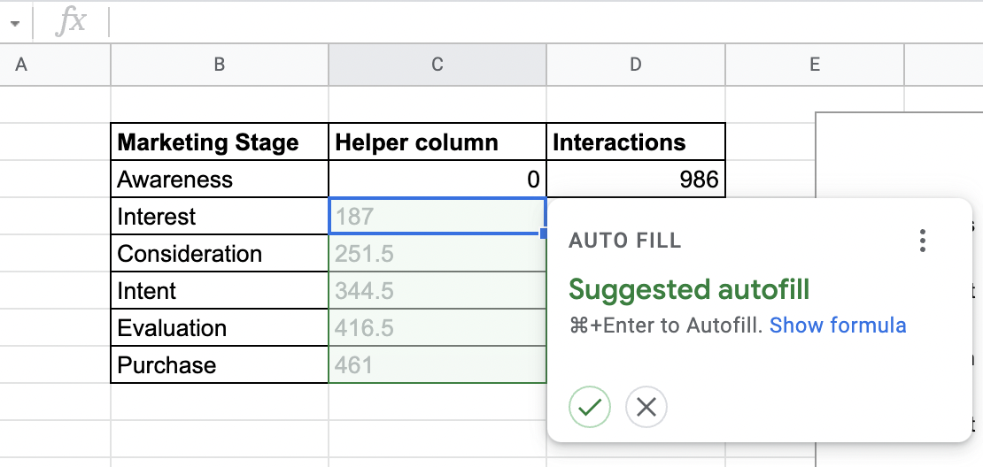
- Hit Enter. The answer to the formula you’ve entered should now be displayed in C3.
Next, you’ll be prompted to fill in the rest of the cells in the table. Continue by clicking the Check icon in the AutoFill dialog box.
By now, you should already make out the funnel shape in your chart area, thanks to the Helper column. But, frankly, the Helper column has little significance to the data you want to present, right?
Customizing the Helper Column to Highlight the Funnel in the Stacked Bar Chart
This is the final step in creating a funnel chart in Google Sheets. But, depending on how you want your chart to look, customization can take a little bit longer than usual.
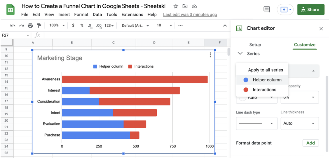
- Click Customize in the Chart Editor. You should see the different customization options for your chart.
- Then, select Series. From the dropdown menu, click Helper Column. Since it’s the Interaction series we want to focus on, we’ll be hiding the rest of the Chart contents temporarily.
Go to Fill Color and reduce the Opacity to 0%. Doing so will make it look like the only data in the Chart is that of the Interaction series.
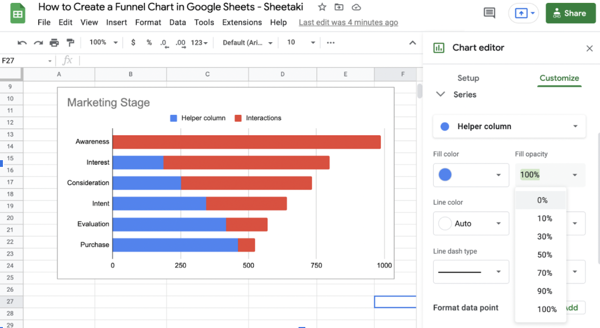
Your funnel chart should now look like this.
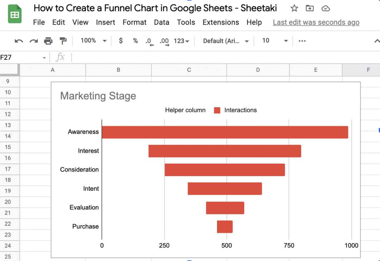
There you go! That’s how to create a funnel chart in Google Sheets. Don’t be intimidated by the Helper column and its formula. As you’ve seen and tried, you’ll only need to copy and paste it on the Formula bar. The AutoFill prompt will do the rest for you.
You Might Want to Try These
If you want to make your Funnel chart a little bit more personalized, or if you want to add more information, here are some customizations that you might want to try.
Chart style
Aside from the background color, font, and chart border color, you can change the style of your chart. The 3D and maximize chart styles are more useful for aesthetic purposes.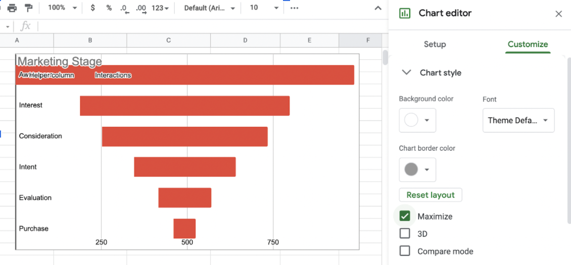
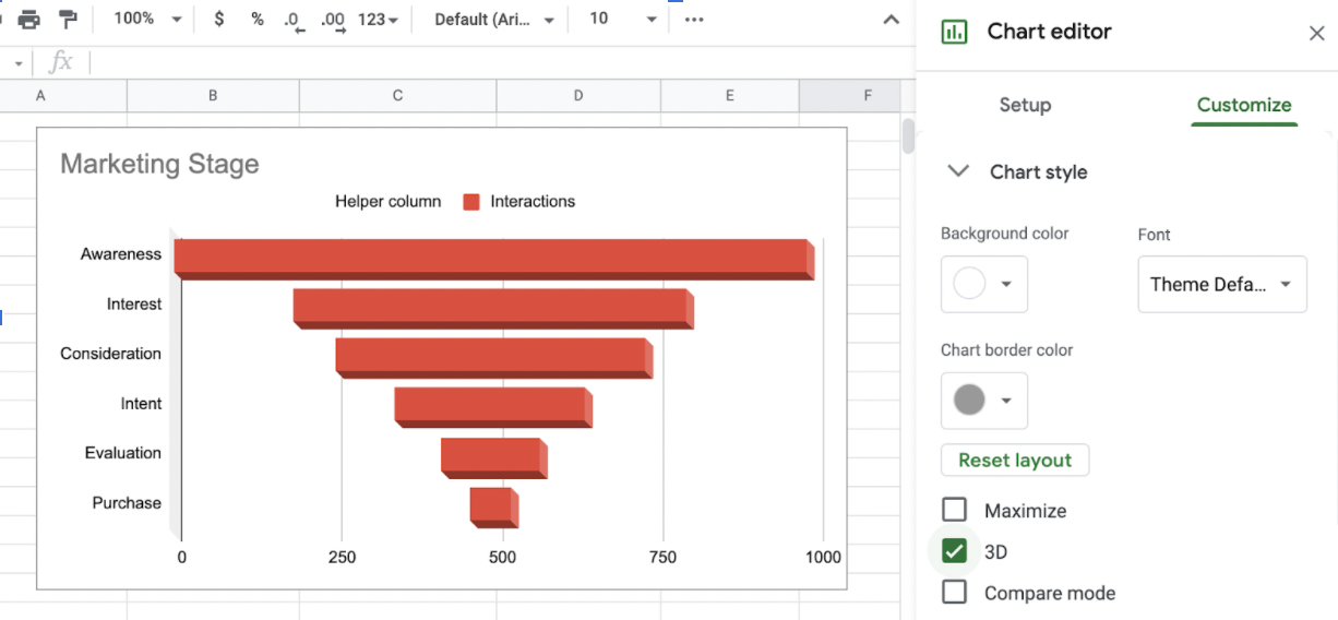
On the other hand, Compare Mode can be more beneficial when you want to present additional information or supporting data to your chart.
Chart and Axis Titles
I went ahead and added a chart title in the early sections of this tutorial for a more formal vibe. If you’re not a fan of it, Go to Chart Title and delete the Title Text.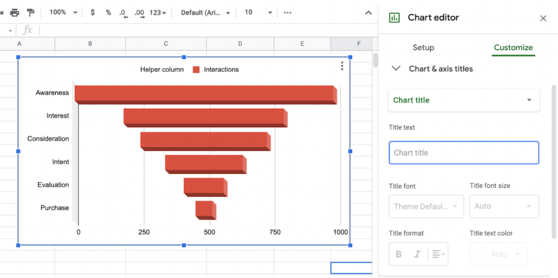
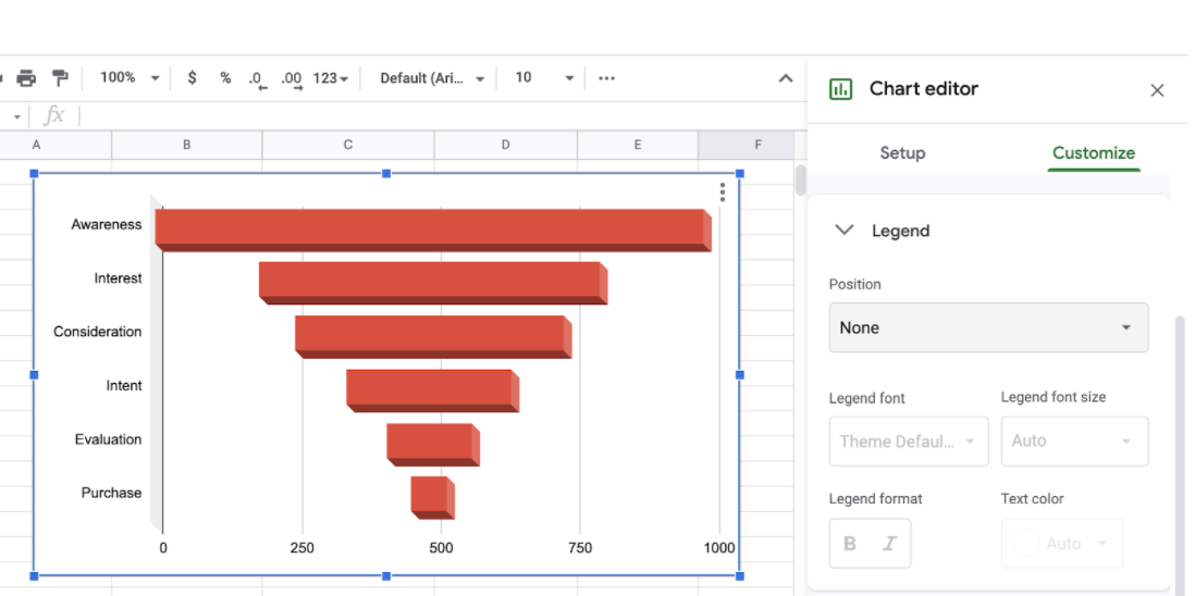
Legend
Yes, we’ve successfully hidden the Helper Column data in the chart. But, with the Legend still up there in your chart area, it can be a little bit annoying don’t you think? To remove this, change the Legend Position to None instead of Auto.
That’s pretty much all you need to know about creating a funnel chart. If you’re interested, there’s a bunch of other formulae that you can try and use in your Google Sheets. To get updates on new tips and tricks to make your Sheets journey a productive one, click on this link to subscribe. With so many other Google Sheets chart options out there, you can surely find one that can help you visualize data the best.
Make sure to subscribe to our newsletter to be the first to know about the latest guides and tutorials from us.