


Learning how to group data by month in Pivot Table in Google Sheets is useful to sort out large sets of data to make comparative studies or analyze trends by months.
The Pivot Table feature in Google Sheets is a powerful tool for calculating, summarizing, and analyzing data, allowing you to spot similarities, patterns, and trends.
Table of Contents
Let’s take an example:
Imagine we are running a business in the online skincare industry. You want to know the trend of sales in terms of gender. Hence, you sort the sales by calculating the total sales for female and male customers.
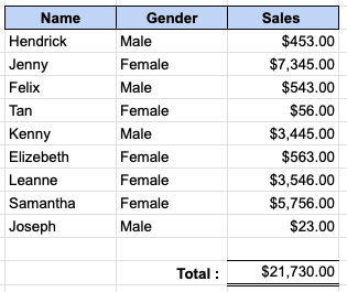
We can create a filter or use a formula such as the SUMIF function to get the sum of cells by female and male. Instead, let’s create a Pivot Table to categorize the data by female and male and get the total value for each.

Creating a Pivot Table clearly shows the business garners more sales from female consumers and should strategize marketing plans in their direction.
So how do we do that?
Easy. With only a few mouse clicks and without writing a single formula, you can create your Pivot Table report that will summarize the data for both female and male customers.
Let’s first take a look at the anatomy of a Pivot Table report in Google Sheets so you can better understand how Pivot Table reports work.
The Anatomy of Pivot Table
The four main parts of a Pivot Table are Rows, Columns, Values, and Filters.
- Rows – The rows quadrant determines which row to be displayed in the Pivot Table. For example, you wish to look at the overall sales in various months. Select the row consisting of Months for the Rows quadrant to accomplish this.
- Column – The columns quadrant determines which columns should be displayed in the Pivot Table. For example, you wish to look at the overall sales across all departments in different months. Select the row consisting of Months for the Rows quadrant and Departments for the Columns quadrant to do this.
- Value – The value quadrant allows you to group your data and choose how you want to display them. For example, you wish to display the overall sales in total, then select SUM. There are other options such as AVERAGE, MIN, MAX, etc.
- Filters – The filters quadrant is an optional feature. For example, you wish to focus only on London’s sales value. Select the Branch field for the filter quadrant to accomplish this. You can now choose the branch you want to look at from the drop-down menu and only see its data.
To understand more about how the Pivot Table works and its anatomy, don’t be shy to check out our tutorial on it! It will help you understand the Pivot Table’s main parts to fully utilize its benefits.
A Real Life Example of Grouping Data by Month in Pivot Table in Google Sheets
In this example, picture yourself running a food and beverage business with many outlets over the country. It is now year-end, and you need to consolidate each outlet’s sales by months.
Every month, each outlet will send back sales transactions that occurred every day. By the end of the year, there would be countless data of sales transactions for each day for each branch.
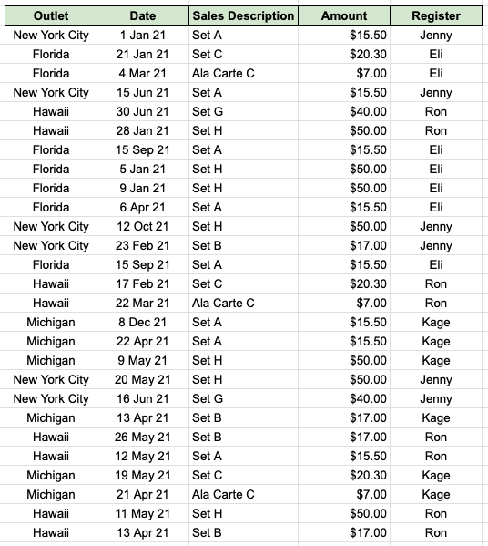
By using the Pivot Table in Google Sheets, we can easily generate a report displaying the total sales for each month for each outlet.

Do take note to group data by months in Pivot Table, the date entered into Google Sheets needs to be in proper DATE format. You can identify which data are not in the proper DATE format by using the ISDATE function.
You may make a copy of the spreadsheet using the link I have attached below.
How to Group Data by Month in Pivot Table in Google Sheets
Example 1
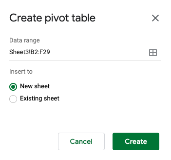
- First, we select the range of data we use to create a Pivot Table. In this case, it is B2:F29.

- Then, we select Insert and click on Pivot Table.

- Once you click on Pivot Table, a pop-up box will appear. This box will let you select if you want to create the Pivot Table in the existing sheet or in a new sheet. We will select New Sheet for this example.
- Once we click create, it brings us to a new sheet. You will see an empty Pivot Table ready for you to fill in! You will also see a Pivot Table Editor on the right side of the sheet.

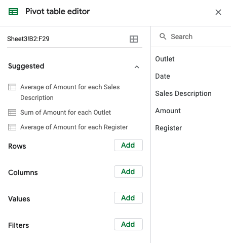
- To customize our Pivot Table to show sales by months, we will first add Date into the Rows Quadrant. For the Columns Quadrant, we will add Outlet.

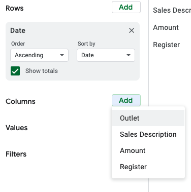
- To display the total sales, let’s add Amount into the Values Quadrant. Make sure to select SUM.

- Once the above steps are done, your sheet will look like this.

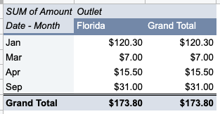
- However, we are not done! To group the data by month, we will right-click on the Date column. In the dropdown, we then select Create pivot date group and select Month.

- After that, your sheet will look like this.
There you go! A simple way to group a large amount of data by month using the Pivot Table in Google Sheets.
Another thing to take note of, if you click on a cell that is not within the Pivot Table range, the Pivot Table Editor will disappear. Do not fear, as you can simply click on a cell within the range, and the editor will resurface.
There are way more features you can play with using the Pivot Table than what was shown above. You can even add more than one row to analyze your data further. You can also add a filter to look into one specific data category.
For example, you want to only look at the Florida branch’s sales amount. Simply add Outlet to the Filter Quadrant, and there you have it!
What are you waiting for? Hurry head over to Google Sheets and try it out yourself! 🤓


1 comment
Thank you so much for such detailed step-by-step instructions. I wanted to do some analysis on personal finance. This was very useful.