Google Sheets has a useful feature that allows you to make scatter plot charts from your dataset.
Scatter plots are useful when you want to determine whether two variables in your dataset have some kind of correlation or trend. They can also be used to identify clusters and potential outliers in your data.
Let’s look at a particular scenario where we can use a scatter plot.
Let’s say you’re looking into creating a machine learning model that predicts the price of a house based on certain properties. You can look into particular aspects of the house, such as the number of floors it may have, the number of rooms, or even the total lot area of the house.
In your current dataset, you have all the previously mentioned properties and the price of each house. You feel an intuition that the price of a house trends upwards if the total lot area increases. Is it possible to graphically show if this is true?
With the built-in scatter plot feature, it becomes easy to check a trend between these two variables. This is just one way to use scatter plots. For example, we can plot the house’s age in months with the price and see if there is a distinct cluster of houses that are older and pricier rather than older and cheaper.
Generally, scatter plots are useful when both of your variables are numeric. This means that categorical data will not work well for scatter plots. Scatter plots also work best if you have many data points, and time is usually not an issue.
Besides the scatter plot itself, Google Sheets also allows you to add trendlines and error bars into your chart. Trendlines will enable you to more clearly see patterns in your data. They are often helpful for financial or scientific data.
Error bars on the other hand, are used to show the error that is expected with the value. They are often used to show the confidence interval of a particular data point.
Now that we know when to use scatter plots, let’s explore how we can use them, on an actual dataset.
A Real Example of Using a Scatter Plot
Let’s look at a real example of a scatter plot being used in a Google Sheets spreadsheet.
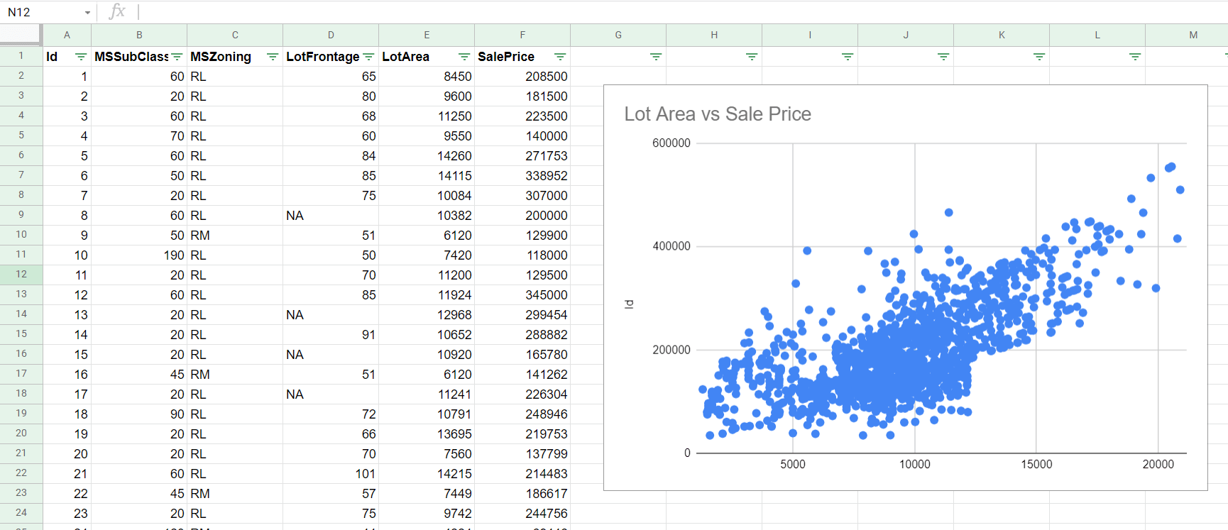
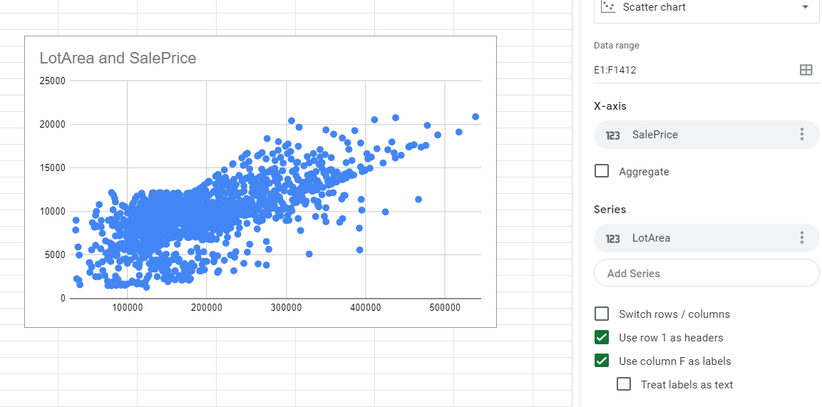
In the table below, we have a dataset of about 1,400 houses and their sale price. In our scatter plot, we used the lot area as our x-axis and the sale price as our y-axis. This means that the higher we go in the chart, the more expensive our houses are. Similarly, the further right we go, the larger the houses become. Looking at the actual chart, there seems to be some positive relationship between the sale price and lot area.
You can make a copy of the spreadsheet above using the following link:
If you’re ready to try out the scatter plot feature in Google Sheets, let’s begin setting it up ourselves!
How to Add a Scatter Plot in Google Sheets
In this section, we will go through each step needed to add a scatter plot chart in Google Sheets. This guide will show you how to set up the chart seen earlier that tracks the relationship between lot area and sale price.
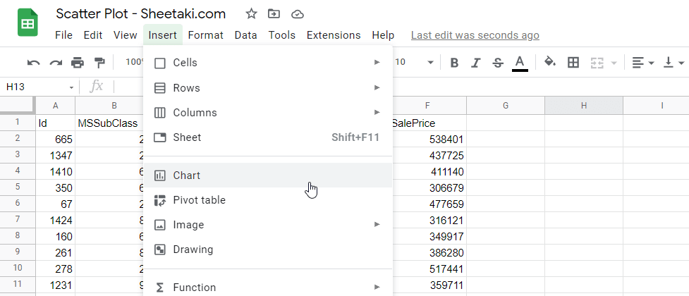
- First, let’s select the two columns which hold the variable we’ll be looking into.

- Next, we click on the Chart option under Insert.
- Google Sheets will provide a chart in the middle of your sheet, along with a chart editor panel on the right-hand side.
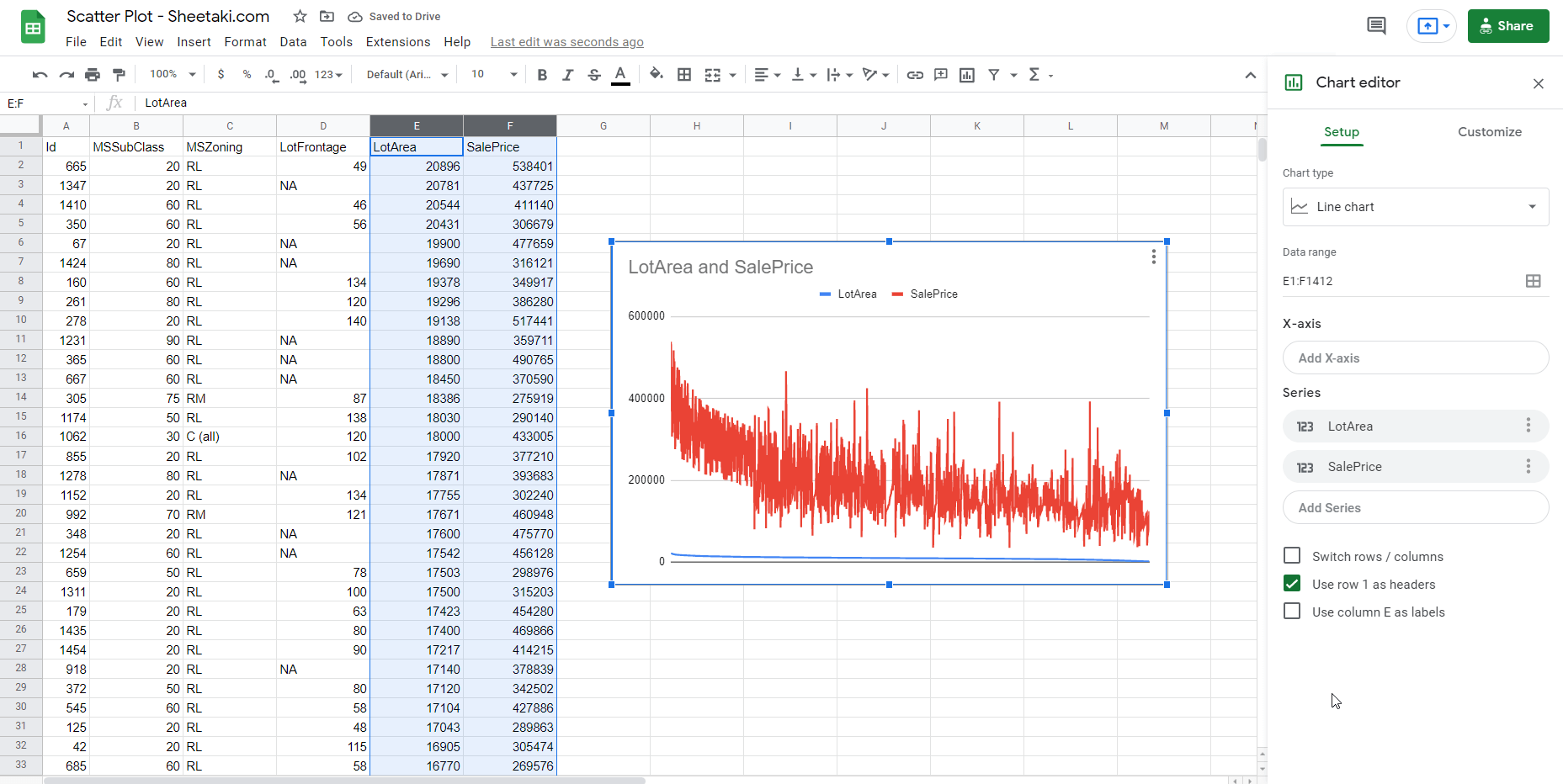
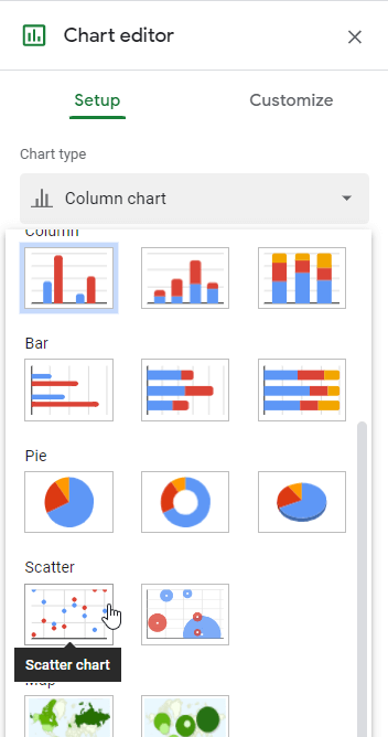
- Next, select the Scatter chart option as the Chart Type on the Chart editor.
- Make sure that the X-axis and Series are correct. In this example, our X-axis is the Sale Price, and our Series or y-axis is the Lot Area.
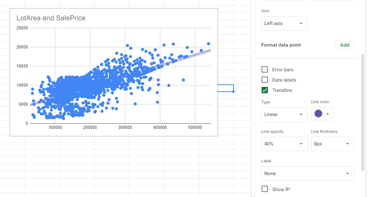
- Next, we can add a trendline to emphasize the relationship of the two variables further. In the chart editor, you can find the Trendline option under the Series section of the Customize tab. For this example, we added a purple linear trendline to our graph.
- In our earlier step, you may notice that the size of each point is a bit large and obscures the actual number of data. We can adjust the Point Size and color to make the scatter plot clearer.

- Finally, we can double-click on the title text box to give the chart a new name.

That’s all you need to remember in order to using scatter plots in Google Sheets. This chart type is useful whenever you need to visualize the relationship between two variables in a dataset.
The scatter plot chart is just one example of a chart you can insert in your Google Sheets worksheet. If you want to try other charts, there are many options out there for you instead. For example, if your dataset contains 3 or 4 dimensions, then you might want to try the bubble chart.
If you want to use dots in another way, you can also check out how to make your own dot plot in Google Sheets. These dot plots are used for visualizing univariate data. This refers to data where only one variable is being considered.
With so many other Google Sheets chart options out there, you can surely find one that can help you visualize data the best. Make sure to subscribe to our newsletter so you’ll know about the latest guides and tutorials from us.