


Let’s learn how to format individual data points in Google Sheets which may be useful to highlight certain data points in your visualization.
We can use custom formatting to let certain data points pop out in our charts visually. We can also add labels to specific points, such as a certain point in a line chart.
Let’s begin with a quick use case where we can format individual data points in Google Sheets.
In this example, let’s say you want to visualize the monthly sales of your online business last year. You also decide on creating a vertical bar chart or column chart. The output looks great, but you want to focus on April of last year. In that particular month, specific circumstances caused the business to sell much fewer units than normal.
You also want to emphasize July, the month with the most sales last year. You can attribute this rise in sales to a successful website launch, driving more customers into your online business.
With the format data point feature, it becomes quite easy to format any data point in your chart. We can use this feature in virtually all types of charts available.
Let’s learn how to use this feature in Google Sheets and later test out the function with an actual dataset.
Formatting Individual Data Points in Google Sheets
Let’s look at an actual spreadsheet with an example of data points with formatting.
In the example below, we have successfully emphasized two data points: April and July.

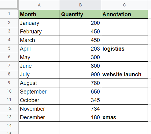
We can also use another trick to add labels to specific data points. In the example below, we added another column to our dataset called Annotation. We’ll be using this column as a Label source in our Chart Editor. As you can see, whatever is written on the annotation column appears in the corresponding data point.

Now it’s even more evident that the low sales in April is attributed to a logistics issue and that the high sales in July were due to a successful website launch.
Besides bar and column charts, we can also use the formatting feature with line charts. In the example below, we can format each data point in the line to have certain symbols and colors.

Pie charts also have their own formatting feature. You can set how far each slice of the pie chart is from the center. In the example below, we separated the green slice for emphasis.

You can make your own copy of the spreadsheet above using the link attached below.
If you’re ready to try formatting individual data points in Google Sheets, let’s begin writing it on our own!
How to Format Individual Data Points in Google Sheets
In this section, we will go through each step needed to start formatting data points in Google Sheets. This guide will show you how we could get the example shown earlier.
Follow these steps to learn how to format data points:
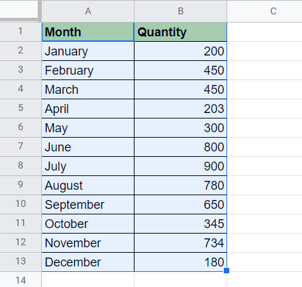
- First, select the table which we’ll use as a data source for our chart. In this example, we’re selecting the range A1:B13.
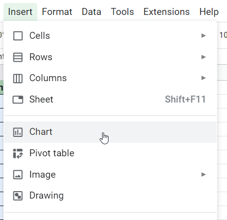
- Next, we’ll select the Chart option found under the Insert menu.
- On the Chart editor on the right-hand side of the screen, select the Column chart as the Chart type.

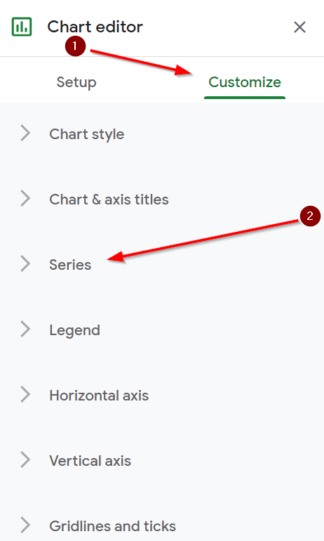
- Next, click on the Customize tab and then click on the Series section to start formatting our data.
- Under the Series section, find the label “Format data point” and click on the Add button on the right.

- A pop-up will appear with a drop-down menu to select a data point to format. For this example, we’ll first select the month of April.

- A new section will appear in the Chart editor underneath the Format data point label. In this section, you can change the color of the data point. Since we are using a column chart, we’ll be editing the color of the column.
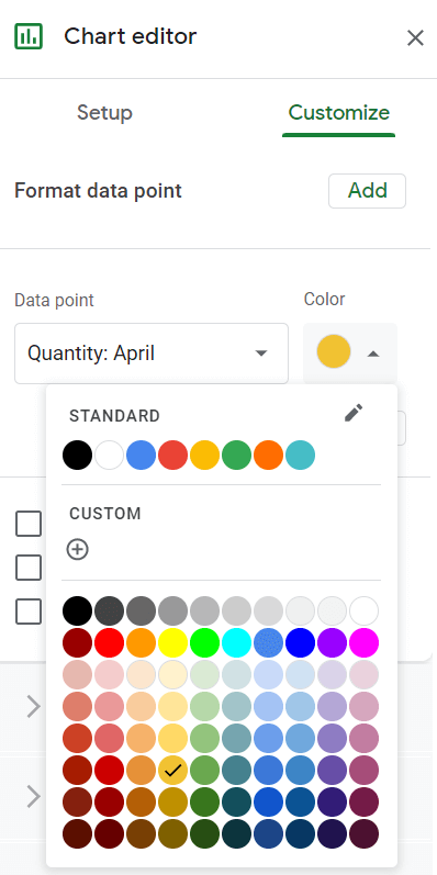
- In this example, we could format the April data point so that it has a different color from the other columns.

- If you want to add an annotation, we must first add a new column to our data source. We added a new column called Annotation to hold our additional labels. For example, we add the word “logistics” on row 5 to indicate that the lower sales were caused by logistics issues.
- In the Chart Editor, go to the Setup tab and find the Series section. We can then add labels to the column data, as seen below.

- Choose the Annotation column as the new label to achieve the result below.

That’s all you need to remember to start formatting individual data points in Google Sheets. This step-by-step guide shows how we can quickly make certain data points in our graph stand out.
Formatting data points is just one way to make your Google Sheets charts stand out. With so many other Google Sheets functions out there, you can surely find one that best suits your needs.
Are you interested in learning more about what Google Sheets can do? Stay notified of new Google Sheets tutorials like this by subscribing to our newsletter!


