The boxplot in Google Sheets is useful when you need to visualize the distribution of data in a dataset.
Though Google Sheets does not have a built-in boxplot feature, we can create a similar visualization by repurposing the candlestick chart.
A boxplot is commonly used in exploratory data analysis to summarize the distribution of data in a dataset. A boxplot can tell you the shape, variability, and center of a data set.
Once you know how to read boxplots, you can easily tell if a dataset is symmetrical, skewed, or spread out.
A box plot requires five main parts: minimum value, lower quartile, median, upper quartile, and maximum value. We’ll need to solve for each of these values based on the given data.
Let’s have a look at a scenario where we can use a boxplot function.
Let’s say that we have a dataset of numerical values. We would like to have an idea of the range and shape of the dataset. Using a boxplot, anyone who can read these visual markers can understand at a glance important information about a dataset. We can also use boxplots to easily compare two or more datasets with each other.
Though Google Sheets does not natively support boxplots, we can use the candlestick function in Google Sheets and some helper statistical functions to create our very own boxplot.
Let’s learn how to make a boxplot in Google Sheets and later use it to visualize an actual dataset.
A Real Example of Using a Boxplot in Google Sheets
Let’s look at a real example of a boxplot in a Google Sheets spreadsheet.
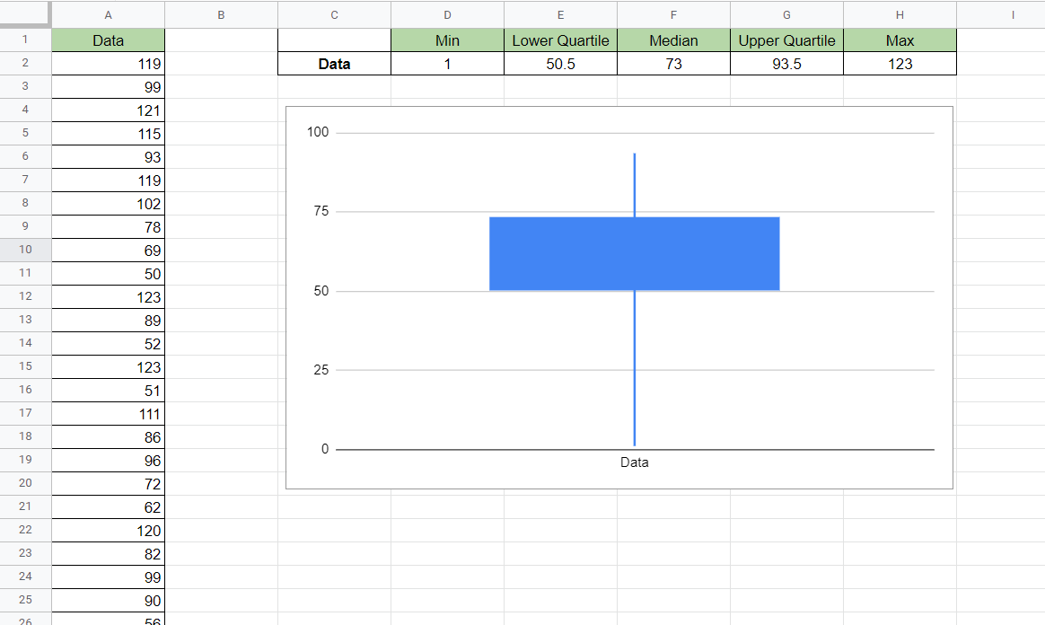
In the example below, we compared the boxplots of two different datasets.

For the first dataset, we require knowing five different markers. For simplicity, we’ll be using the entire column A or the range A:A as the dataset range.
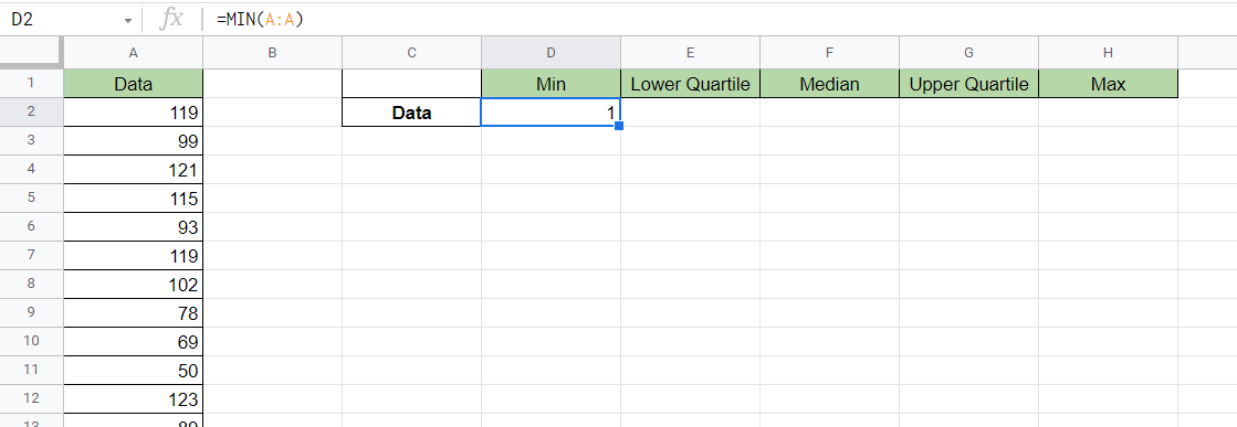
The minimum value refers to the smallest value in the dataset. The minimum value is obtained through the MIN formula:
=MIN(A:A)
Quartiles are a way of dividing your dataset into four equal parts. The lower quartile refers to the number that indicates the first quartile’s end. The upper quartile refers to the number which indicates the start of the last quartile. In a box plot, the box itself is drawn from the first to the third quartile.
To get the lower and upper quartile, we’ll have to use the QUARTILE function:
=QUARTILE(A:A,1)
=QUARTILE(A:A,3)
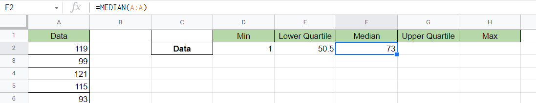
The median refers to the middle number you’ll get if the dataset is sorted. The median is obtained through the MEDIAN function:
=MEDIAN(A:A)
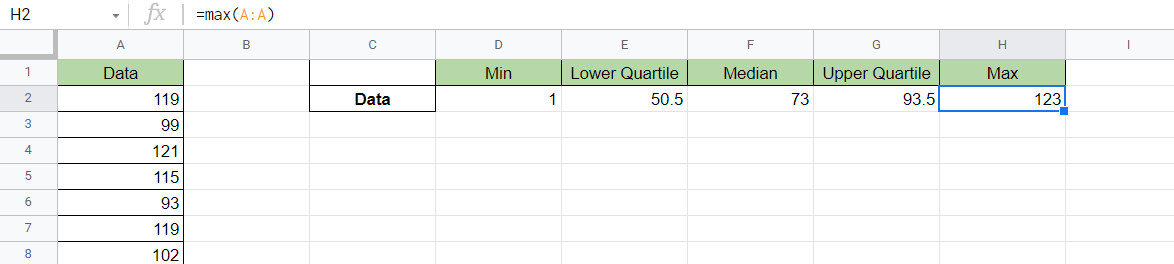
The maximum value refers to the largest value in the dataset. This value can be obtained using the MAX function:
=MAX(A:A)
You can make your own copy of the spreadsheet above using the link attached below.
If you’re ready to create your own boxplot chart in Google Sheets, let’s start writing it ourselves!
How to Make a Boxplot in Google Sheets
In this section, we will go through each step needed to start making a boxplot function in Google Sheets. This guide will show you how we were able to create a boxplot visualization of the dataset shown earlier.
Follow these steps to start creating a boxplot:
- First, we’ll fill up the table of markers that will help define our boxplot. In this example, we’ve started with the Minimum value. We get this using the
MINfunction.
- Next, use the
QUARTILEfunction to return the lower quartile of our dataset.

- Third, we’ll use the
MEDIANfunction to return the median value of our dataset.
- Next, we’ll use the
QUARTILEfunction again to get the upper quartile of the dataset this time.

- We’ll then use the
MAXfunction to get the maximum value found in our dataset.
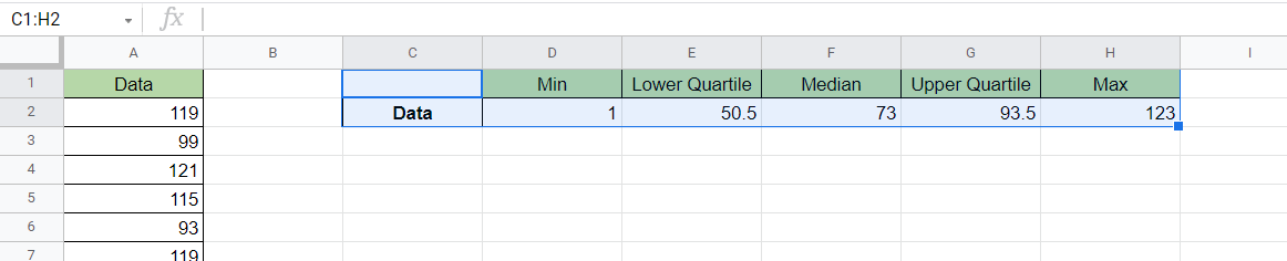
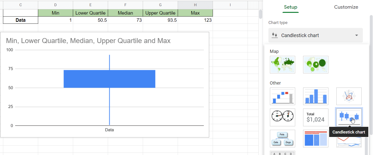
- Next, we’ll select this entire table and add a new chart by selecting the option under the Insert menu.
- When the Chart editor pops up on the right-hand side, select Candlestick chart as our Chart type. The box plot chart should automatically generate from the selected range.
Frequently Asked Questions (FAQ)
- Can I format my boxplot with a different color?
You can change the formatting of your boxplot by selecting your chart and going to the Customize tab in the Chart editor. Unfortunately, you can’t change the boxplot fill color. - How do I interpret a boxplot?
The bottom “whisker” indicates the minimum value, while the top “whisker” indicates the maximum value. A short box plot suggests that the data is less spread out. A boxplot shows that even though two datasets can have a similar median, the distribution may be very different.
That’s how you can use the candlestick chart option to make a boxplot in Google Sheets. This step-by-step guide shows how easy it is to use a boxplot to visualize the shape and distribution of your dataset.
The boxplot is just one way you can visualize your dataset in Google Sheets. With so many other Google Sheets functions out there, you can definitely find one that best suits your use case.
Do you want to know more about what Google Sheets can do for you? Make sure to subscribe to our newsletter to be the first to know about the latest guides and tutorials from us.