Making a bubble chart in Google Sheets is useful for depicting three or four dimensions of data.
Table of Contents
At times, you may find it useful to illustrate datasets in charts. These make your reports more comprehensive and appealing to your readers. One of the many charts that Google Sheets supports is the bubble chart.
A bubble chart is commonly used for displaying multidimensional data. To put it briefly, it is a type of chart that lets you visualize individual entities with their corresponding variables at once. Entities are presented as disks or bubbles in the diagram, hence the name bubble chart.
In a bubble chart, the first two variables can be represented as the X and Y coordinates. If there’s a need to present more variables, the color and size of the bubbles can serve as their representation.
Take this as an example.
A sales agent uses a spreadsheet to keep track of the products he is selling. Within the spreadsheet, there are columns intended for recording the total sales, total commission, and quantity sold per product. As you can see, there are three variables for each product. An easy way to describe these sets of data in one glance is to use a bubble chart.
That is just one of the various use cases of bubble charts. Keep in mind that bubble charts are ideal for datasets that have three or more variables. That being said, other charts may be more suited if your data is two-dimensional. You might want to check out this article to learn more about other variations of charts.
Let’s now learn how to create a bubble chart in Google Sheets.
Real Example of Making a Bubble Chart in Google Sheets
Let’s use the scenario about the sales agent earlier as our example. In the table below, you will see the list of products with their respective transaction records.

With the data above, you can eventually find out which has the highest or lowest sale, commission, or quantity sold by comparing all products. However, you’ll find it more straightforward to determine these facts if you illustrate the whole dataset into a bubble chart first:
As you edit values on the table, the chart automatically updates its data points, giving you a real-time update on data trends.
This time, I will demonstrate the step-by-step process of making a bubble chart in Google Sheets.
How to Create a Bubble Chart in Google Sheets
- Start by opening the spreadsheet that contains the data that you will use for the bubble chart. If you don’t have any data to work with, you can click the link I have attached earlier and navigate to Sheet2.

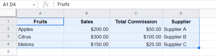
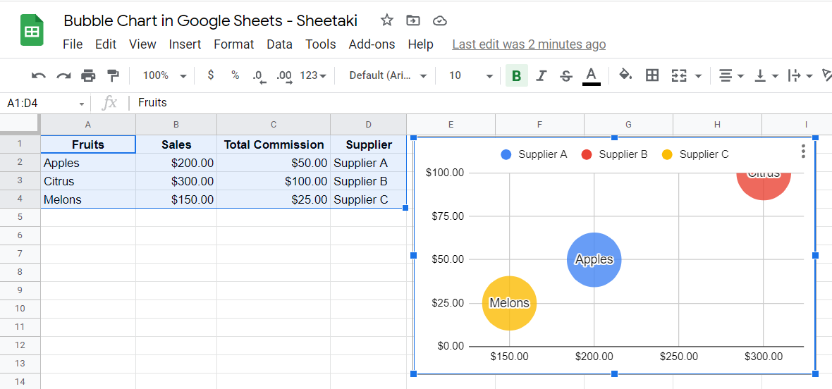
- With the spreadsheet already open, highlight the data you will use for the bubble chart. In the example below, cell range A1:D4 is selected.
- This time, click the Insert tab on the menu bar to display the drop-down list of controls.

- From the list of commands, click Chart. As soon as you click it, you’ll notice that a chart appears on your spreadsheet. Also, a Chart editor will appear on your screen. Here, make sure that the Chart type drop-down button is set to Bubble chart.

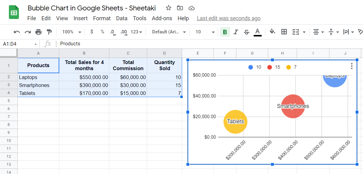
- At this point, your spreadsheet should look like this:
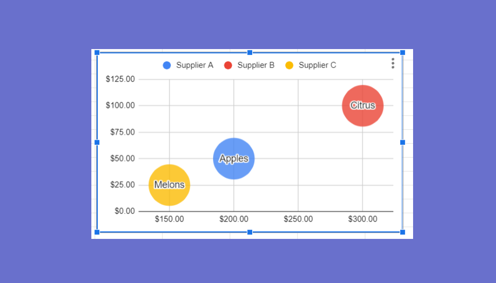
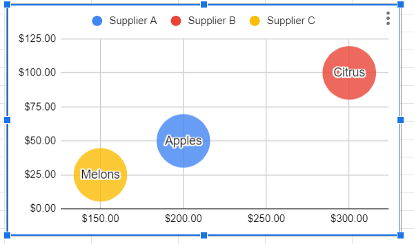
 Great work! You just created a bubble chart. However, notice that the bubble for Citrus (the red one) was not properly shown on the chart. This is because the maximum value of the vertical axis coincides with its value, which is 100.
We can fix this issue by simply adjusting the maximum value of the vertical axis. To do this, we’ll need to access the Chart editor. In case you have closed it previously, you can re-display it by clicking the chart. Right after that, click the three dots located on the upper right corner of the chart and choose Edit chart.

- On the Chart editor, navigate to the Customize section and click the Vertical axis drop-down menu.
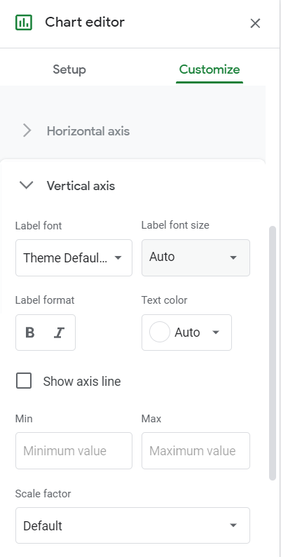
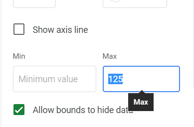
- We’ll focus on the Max field since we only need to change the maximum value of the vertical axis. Type in 125 as the maximum value.
Your bubble chart’s vertical axis will adjust accordingly. Perfect! Now, you can see all entities in the bubble chart.
For some reasons, you may need to edit the appearance of your chart. In the next section, you’ll learn how to do just that through the Chart editor.
Using the Chart Editor
The Chart editor is your ultimate tool for customizing your bubble chart. It has two sections, namely Setup and Customize.
Setup Section
The Setup section consists of settings you can use to configure the data points of your bubble chart.

- Data range – This field contains the cell range used for the bubble chart.
- ID – The ID field contains the column heading of the entities that make up the bubbles in the chart.
- X-axis – Serves as the horizontal axis of the bubble chart.
- Y-axis – This is the vertical axis of the chart.
- Series – Holds the value of the third dimension of entities. In a bubble chart, the color of the bubbles represents the Series.
- Size – In case there is a need to display a fourth dimension of entities, it will be represented by the size of the bubbles.
Customize Section
The Customize section lets you modify the appearance of your bubble chart.
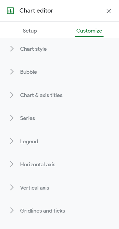
- Chart style – Here, you can adjust how your bubble chart looks. You can modify the background color, font and border color of your chart.
- Bubble – This is where you can customize the appearance of your entities or bubbles. In here, you can set the opacity, border color, and font styles of the bubbles.
- Chart & axis titles – Suppose you want to add and edit a title of your bubble chart, this is the section that you should navigate to.
- Series – This section lets you format the color and opacity of the series.
- Legend – Change the positioning and formatting of the chart legend in this section.
- Horizontal axis – Here, you can customize the font and the minimum and maximum values of the horizontal axis.
- Vertical axis – If you need to edit the appearance of your chart’s vertical axis, visit this section.
- Gridlines and ticks – This section lets you format the gridlines of your vertical and horizontal axes.
That’s about it when it comes to making a bubble chart. There are numerous charts that you can create in Google Sheets. Always remember to use this type of chart if you need to present more than two dimensions of data.
Check out our other articles regarding the essentials of Google Sheets if you would like to learn more about it.