It might be useful to know how to add error bars to charts in Google Sheets to capture uncertainty around the values in your dataset.
We can add error bars on bar charts, line charts, and area charts.
Let’s look at a scenario where it makes sense to add error bars to an existing chart.
For example, let’s say I have a bar chart which compares the forecasted sales quantity of various items I’ll be selling in the next quarter. Since these are predictions, it’s assumed that there’s a 10% error margin on the actual quantity. Is this possible to show visually?
With the error bar option, it will only take a few seconds to add a visual indicator of the error margin of each data point. This use case is just one reason to add error bars in Google Sheets. Any dataset which involves predicted or calculated values can potentially have some sort of margin of error in the final output.
Now that we understand when to add error bars to charts in Google Sheets let’s look into a real example of it in action.
A Real Example of Error Bars in Google Sheets Charts
Let’s look at a real example of error bars being used in a Google Sheets spreadsheet.
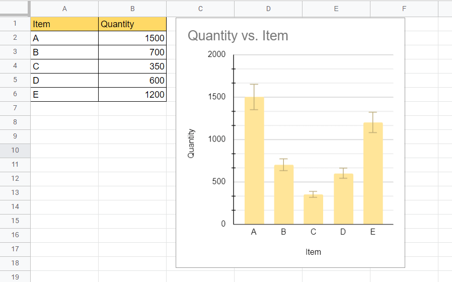
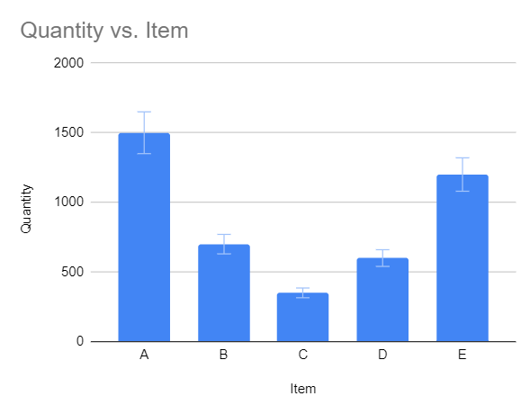
In the example below, we have a table of five items and their corresponding forecasted sales quantity. Using the chart tool, we were able to add a bar chart with an error margin of 10%.
You can make your own copy of the spreadsheet above using the link attached below.
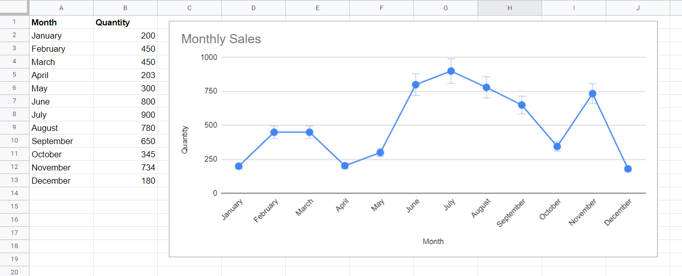
In the example below, we set up error bars in a line graph. Despite the difference in chart type, setting up an error bar for line charts is practically the same as a bar or column chart.
Similarly, we can also use error bars in area charts.

If you’re ready to try adding error bars to charts in Google Sheets, let’s begin doing it ourselves!
How to Add Error Bars to Charts in Google Sheets
In this section, we will go through each step needed to start adding error bars to charts in Google Sheets. This guide will show you how to create a bar chart from a table and easily add error bars in a few clicks.
Follow these steps to start using error bars in your charts:
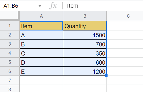
- First, let’s select the range that we would like to visualize as a bar chart. In this example, we’ve selected the range A1:B6.
- Next, we’ll head to the Insert menu and select the Chart option.

- Once selected, a chart editor will appear on the right-hand side of the spreadsheet. Make sure that the chart type is a “column chart” or “bar chart”. In this example, we’ll use the column chart option.

- Next, click on the Customize tab and select the Series section to expand it further.

- In the expanded Series section, you will find a checkbox labeled Error bars. Check this box to add an error bar to your column chart.

- Once the error bar option is selected, Google Sheets gives you an option to select which type of error bar you would like to use, as well as the margin of error to use when drawing the error bar.
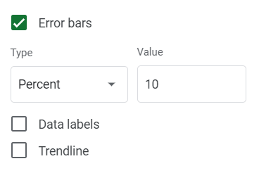
In the example below, we selected an error bar of 10% by selecting the Percentage type and giving a value of 10.
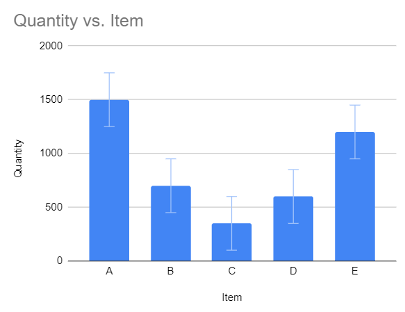
If you want a constant error bar, you can select the Constant type and provide a constant value. In the example below, each error bar shows a margin of error +/- 250 units.
Lastly, we can also use the standard deviation as the basis for drawing our error bars.
Frequently Asked Questions (FAQ)
- Which type of error bar should I use?
There are three types of error bars that you can use for your charts in Google Sheets.
If you want your error bars to have a fixed value, you can use the Constant type to set up an error bar set to a given constant.
You can also use the percentage type if you want to base the length of your error bar as a percentage of the given data point.
Lastly, you can use the standard deviation type to draw error bars according to the standard deviation of the entire dataset.
- Can I format the error bars?
Unfortunately, you can only change the type of error bar to use. No other formatting options are available in Google Sheets at the moment.
That’s all you need to remember to start adding error bars to charts in Google Sheets. This step-by-step guide shows how easy it is to visually indicate a margin of error in your data.
The error bar feature is just one way to improve your charts in Google Sheets. With so many other Google Sheets functions out there, you can surely find one that works best for your spreadsheet.
Are you interested in learning more about what Google Sheets can do?
Make sure to subscribe to our newsletter to be the first to know about the latest guides and tutorials from us.