This guide will explain how to add a regression line to a scatterplot chart in Microsoft Excel.
A scatter plot or scatter chart is a type of data visualization option available in Microsoft Excel that allows you to identify the correlation between two variables.
For example, we can use a scatterplot to determine if there is a correlation between the exam scores of students and the number of hours they spend studying.
You can also choose to overlay a trendline when you’ve added a scatter plot in your spreadsheet. Trendlines can help identify whether there is a positive or negative correlation between the two variables being plotted. The most commonly-used trendline is calculated using a simple linear regression formula.
In this guide, we will provide a step-by-step tutorial on how to add a regression line to a scatterplot graph in Excel. We will cover how to visualize your data into a scatter chart and how to enable the Trendline option to display a simple linear regression to your scatterplot.
Let’s dive right in!
A Real Example of Adding a Regression Line to a Scatterplot in Excel
Let’s explore a simple example where we may need to add a regression line to a scatterplot in Excel.
In the table seen below, we have a dataset of two variables, x and y. We want to know if these two variables have a significant correlation.

Using Excel’s scatterplot feature, we can visualize how the value of y changes as we increase the value of x. We’ve added a linear regression trendline to show the overall trend of the data as a straight line.
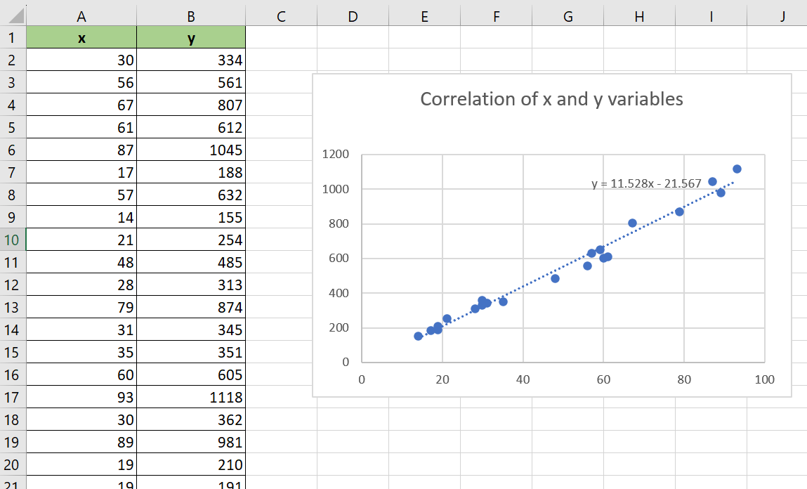
The scatterplot and trendline indicate a positive linear correlation between the x and y variables. This means that if we increase the value of x, the value of y will also increase at a linear rate.
Excel also allows us to display the actual linear regression equation used to generate the trendline. In our current example, the regression line is calculated using the following formula:
y = 11.528x - 21.567
While linear regression is the most common type of trendline, Excel also offers other types of regression. For example, users can choose to display a polynomial trendline to highlight more complex trends in their data.

Do you want to take a closer look at our examples? You can make your own copy of the spreadsheet above using the link attached below.
Use our sample spreadsheet to test out how we were able to use the Chart feature to find a regression line based on our dataset.
If you’re ready to create a scatterplot with a regression line yourself, head over to the next section to read our step-by-step breakdown on how to do it!
How to Add a Regression Line to a Scatterplot in Excel.
This section will guide you through each step needed to add a regression line to a scatterplot in Excel.
Follow these steps to start adding a regression line:
- First, select the data you want to convert into a scatterplot. In this example, we will select our two variables in the range A1:B22.

- Next, head to the Insert tab and click on the Scatter icon to expand the list of chart options. Choose the first scatterplot option.
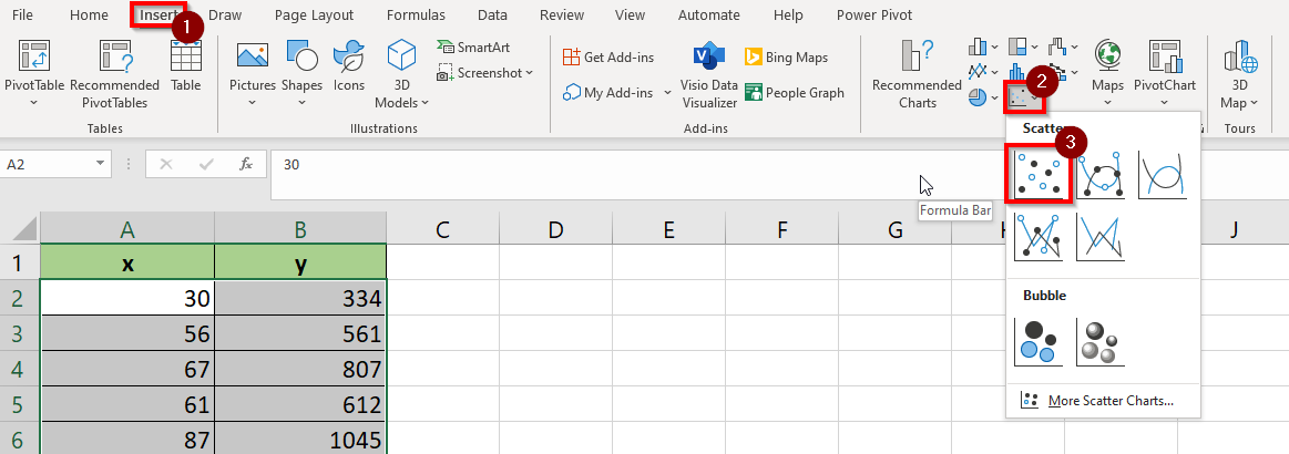
- Microsoft Excel will now generate a scatterplot based on the selected data. Do note that by default, the leftmost column will be used as the basis for the x-coordinates of each point in the scatterplot.

- Use your cursor to select the scatterplot. Click on the “+” button and check the Trendline option. Your chart should now have a trendline calculated using simple linear regression.

- You may click on the arrow next to the Trendline option to access the Format Trendline panel. Excel offers various options for how you want to calculate your trendline, including exponential, logarithmic, and polynomial.
- In the Format Trendline panel, users can also choose to display the mathematical equation used to calculate the trendline.
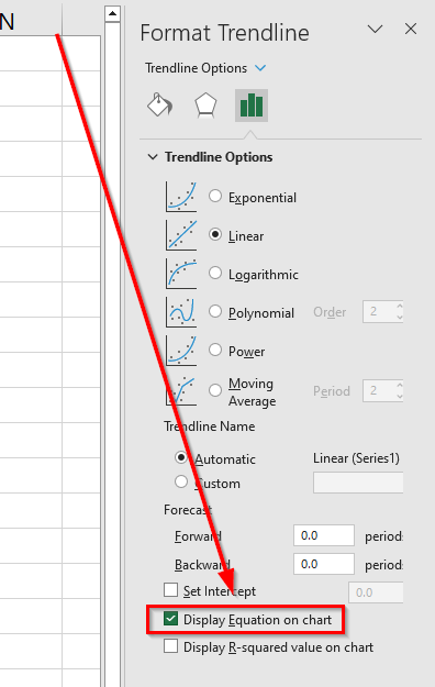
- The equation will appear as a label in the actual scatterplot chart. Users can select the element and drag the equation anywhere within the sheet.

These are all the steps needed to add a simple linear regression trendline to your scatter plot chart.
Frequently Asked Questions (FAQ)
Here are some frequently asked questions about this topic:
- What is linear regression?
Linear regression is a statistical method used to establish a relationship between a dependent variable and one or more independent variables. The goal of linear regression is to find the line or curve that best predicts the value of a dependent variable given an independent variable. - Why is the equation of the regression line useful to know?
If you know the equation of the regression line in your scatterplot, you can use that to predict future values. For example, if my dataset has a regression line with the equation y= 2x +1, then I know that y=21 if my x variable is equal to 10.
This tutorial should cover everything you need to know to add a regression line to a scatterplot chart in Excel.
We’ve explained how to add a trendline to a scatterplot using the Chart options available in Microsoft Excel.
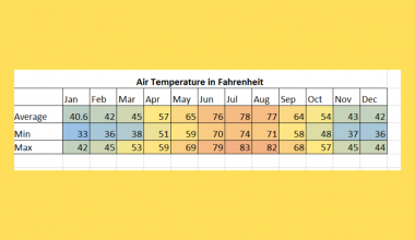
The scatterplot graph is just one example of Excel’s many built-in data visualization options. For example, another way to visualize correlation is through a heatmap table. You can read our step-by-step guide on how to build your own heatmap in Excel to learn more.
You may also check our guide on how to perform cubic regression in Microsoft Excel to know more about how you can use the Trendline feature to analyze your datasets.
That’s all for this guide! If you’re still looking to learn more about Microsoft Excel, be sure to check out our library of Excel resources, tips, and tricks!