


This guide will show you how you can set up a heat map with or without numbers in Excel.
Heat maps are a great way to visualize a range of numerical data. In Excel, we can use conditional formatting to give certain colors different value in a range based on a color scale.
Heat maps are best used for reports and tables with a wide range of data that might be difficult to compare. People normally have an easier time finding brighter and darker colors in a range than a simple table of numbers.
Let’s take a look at a quick example of a sheet that we can convert into a heatmap.
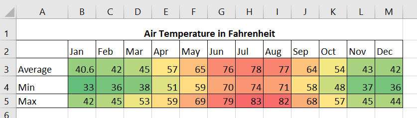
Suppose you have monthly weather data from the past 12 months. You have the average air temperature, precipitation, and humidity for each month as well as the minimum and maximum recorded values.
Is it possible to format the cells so that the hotter months are indicated in red, while the cooler months are colored green?
Coloring each cell manually is both difficult and time-consuming for users. Instead, Excel can automatically format your dataset by using their Conditional Formatting tool.
The conditional formatting tool makes it easier to find patterns and trends in your data. The tool allows you to set rules on how to format your cells based on the cell’s value.
The conditional formatting tool has a built-in Color Scales option that we can use to create a color map quickly.
Now that we know when to use a heat map in Excel, let’s check out how it looks on an actual sample spreadsheet.
A Real Example of a Heat Map in Excel
Let’s take a look at a real example of the heat map formatting being used in an Excel spreadsheet.
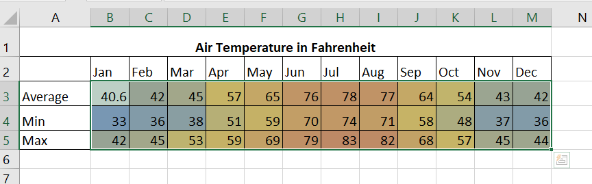
The table below shows data on air temperature in a given year. Using a heat map color scale, we can quickly see some patterns in the data. The most apparent pattern being the months of June, July, and August being the hottest period of the year.
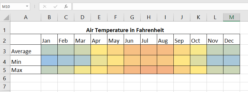
In the second example, we have the same data but are presented with a different color scale. This time colder months are indicated with a blue hue. We’ve also used cell formatting to hide the numbers.
You can make your own copy of the spreadsheet above using the link attached below.
If you’re ready to make your own heat map in Excel, follow our guide in the next section to learn how to do it yourself!
How to Make a Heat Map With or Without Numbers in Excel
This section will guide you through all the steps we need to make a heat map in Excel.
You’ll learn how we can use the conditional formatting tool on a range of values to give the range its own color scale. We will also explain how you can create a heat map without numbers.
Follow these steps to start using the heat map formatting:
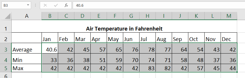
- First, select the range of cells you would like to format. In this example, we will be creating a heat map with the cell range B3:M5.
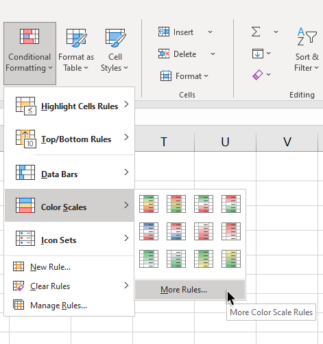
- In the Home tab, look for the Conditional Formatting icon. Look for the Color Scales option in the drop-down menu. Select a color scale that works best for your heat map. For this example, we’ve selected the second option.

- Your range should now look like this. You can always remove the formatting by selecting the Clear Rules option in the dropdown menu seen earlier.
- If you would like to create your own color scale, select the More Rules… option in the dropdown menu seen below.
- The New Formatting Rule dialog box will allow you to select up to three colors for your color map. These colors correspond to your minimum, midpoint, and maximum values.
 Users can even set the lowest or highest value for their color chart. This means that any values exceeding these limits will have the same color. This will be useful for ranges with outliers in their data.
 - Click the OK button to set the new rules to the specified range.

- If you want to hide the numbers in your heatmap, you can use number formatting. First, select the range of your heatmap.
- Next, press Ctrl+1 to bring up the Format Cells dialog box.

- Make sure that you are in the Number tab. Select Custom as the category and input “;;;” into the Type box.

- Click on the OK button to apply the new format to our cell range. Your heatmap should now have the numbers hidden from view.
That’s all you need to remember to start making your own heat map in Excel. This step-by-step guide shows how easy it is to visualize and find patterns in datasets quickly.
The conditional formatting tool is yet another convenient option you can use to improve your worksheets in Excel. With so many other Excel functions out there, you can surely find one that works for you.
Are you interested in learning more about what Excel can do?
Make sure to subscribe to our newsletter to be the first to know about the latest guides and tutorials from us.


