This guide will explain how to create a bell curve graph in Google Sheets.
We’ll need to use several statistical functions to get certain properties from our source dataset. After finding these properties, we’ll use the NORM.DIST function to generate the actual normal distribution for plotting.
When handling populations, it is often useful to use statistical methods to find the probability distribution. This distribution models the probability that a particular variable has a certain value.
The bell curve graph is the plot of a normal probability distribution. The plot is characterized as a symmetrical curve that is concentrated around a peak and decreases on either side. The peak of this curve corresponds to the mean of the dataset.
This type of distribution, also known as the Gaussian distribution, is helpful because many variables in nature follow this probability distribution.
For example, if we were to survey the average heights from a population of 100 people, we will see that the height values will follow a normal distribution.
If you want to display the bell curve of your data on your spreadsheet, you will have to determine some properties. These include the mean and standard deviation of your dataset. Afterwards, we can use the NORM.DIST formula to fill up a table that we can use to plot the graph.
Let’s learn how to create a bell curve ourselves in Google Sheets and later test out the function with actual values.
A Real Example of Creating a Bell Curve Graph in Google Sheets
Let’s look at a real example of statistical functions we can use to help create our bell curve graph.
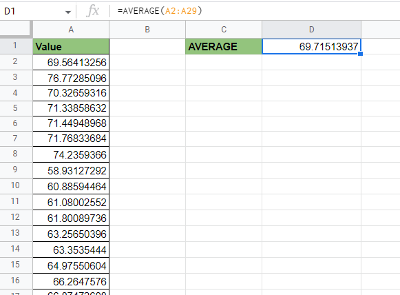
In this example, we have a list of values that follow the normal distribution. Using statistical functions such as AVERAGE, ST.DEV, and NORM.DIST, we created another table. We used this table to plot an actual bell curve when converted to a line graph.

Using this bell curve, we can see how most of the results are clustered around the values between 65 and 75.
To get the mean of our population, we used the following formula:
=AVERAGE(A2:A29)
After finding the mean, we can proceed to find the standard deviation:
=STDEV.P(A2:A29)
Using the mean and standard deviation, we can compute for the lower limit and upper limit of our bell curve graph.
=G1-3*G2
To fill up the source data for our bell curve graph, we must start with a sequence from the lower and upper limits. We can use the SEQUENCE function to create a range that increments by 1.
=SEQUENCE(G4-G3+1,1,G3)
Lastly, we can use an ArrayFormula to compute the NORM.DIST values of each number in the sequence. We will input the mean and standard deviation computed earlier.
=ArrayFormula(NORM.DIST(C2:C37,$G$1,$G$2,false))
You can make your own copy of the spreadsheet above using the link attached below.
If you’re ready to create your own bell curve graph in Google Sheets, let’s begin writing it ourselves!
How to Create a Bell Curve Graph in Google Sheets
In this section, we will go through each step needed to create your own bell curve graph in Google Sheets. This guide will show you can use statistical functions to retrieve detail that is useful to plot a bell curve.
We’ll explain how to create a plotting table that holds the actual values we’ll be converting into a line chart.

In this example, we’ll be using a table of 28 values that follows the normal distribution.
Follow these steps to begin creating your bell curve graph function:
- First, look for the mean or average of the population sample. We can compute the mean using the
AVERAGEfunction.
- Next, we should determine the population’s standard deviation using either the
STDEV.SorSTDEV.Pfunction.

- We’ll use both the mean and standard deviation to determine the lower and upper limits of our plot. We can derive these limits by adding and subtracting thrice the standard deviation from the mean.

- Next, we’ll use our
SEQUENCEformula to set up the Sequence column. Afterwards, we can use the ArrayFormula seen earlier to compute the normal distribution given the specific number in the sequence.

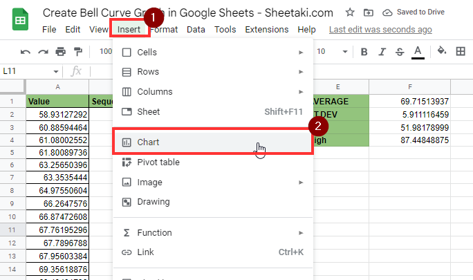
- Now that we have our table for plotting, we can now add our line graph. Select the Chart option under the Insert menu.
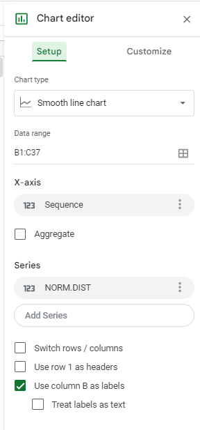
- In the Chart editor, select the Smooth line chart as the chart type. For our data range, we’ll select the range B1:C37 that contains our sequence and
NORM.DISTcolumns. Ensure that the Sequence column is set as our X-axis and ourNORM.DISTcolumn is set as a series.
- After making these changes, your line chart should now resemble a bell curve graph that models the probability frequency distribution of your dataset.
Frequently Asked Questions (FAQ)
- What is the difference between STDEV.P and STDEV.S?
STDEV.Pis used when your dataset contains the entire population. If your dataset only includes a smaller sample, it’s recommended to use theSTDEV.Sfunction instead.
This guide should be all you need to start creating a bell curve graph in Google Sheets. This step-by-step tutorial shows how you can use statistical functions to find the mean and standard deviation. From these values, we can create a table that plots the probability frequency distribution of your sample.
Creating a bell curve graph is possible in Google Sheets because of its wide library of statistical functions and data visualization options. With so many other Google Sheets functions out there, you can surely find one that suits your use case.
Are you interested in learning more about what Google Sheets can do?
Make sure to subscribe to our newsletter to be the first to know about the latest guides and tutorials from us.