A candlestick chart is a visualization tool available in Google Sheets that helps track movements in the value of a variable over time. In this article, I will take you through how to create a candlestick chart in Google Sheets, customize it, and interpret the results.
Let us take a closer look with the help of an example. Candlestick charts are popular in the financial world and are mainly used to show price movements in a company’s stock value. Consider the following example:
The following table shows the stock prices of a company X on three different days of the week:

This data is represented by a candlestick chart in the following format:

The first thing you notice is that while one box is filled (blue color), the other is hollow. And this is a general rule while plotting candlesticks – in instances where the opening value is less than the closing value, the candlesticks are filled. Opening and closing values are determined by the time of the day. These generally denote what are called ‘gains’, when the value has increased on a given day. Similarly, in instances where the opening value is more than the closing value (what is called ‘losses’), the candlesticks are hollow.
These charts provide a great way to understand variations in stock prices on a particular day, week, month, or over any period of time.
In this guide, I’ll show you how you can get started and help you create your first candlestick chart with Google Sheets.
Let’s jump right in. 🤜
How to Create a Candlestick Chart in Google Sheets
- The first and probably the most important step in creating a candlestick chart is to prepare the base data properly. The stock values of a company are usually available in what is known as the OHLC (Open-High-Low-Close) format, with each of these values being captured as a column entry in a table. Google Sheets, however, requires your data to be in the order of the LOCH (Low-Open-Close-High) format. Therefore, make sure that the columns are in LOCH order, with the date column being the first column prior to plotting the chart. If there are additional columns, place them at the end of the table, maintaining the Date – Low – Open – Close – High order at the beginning.
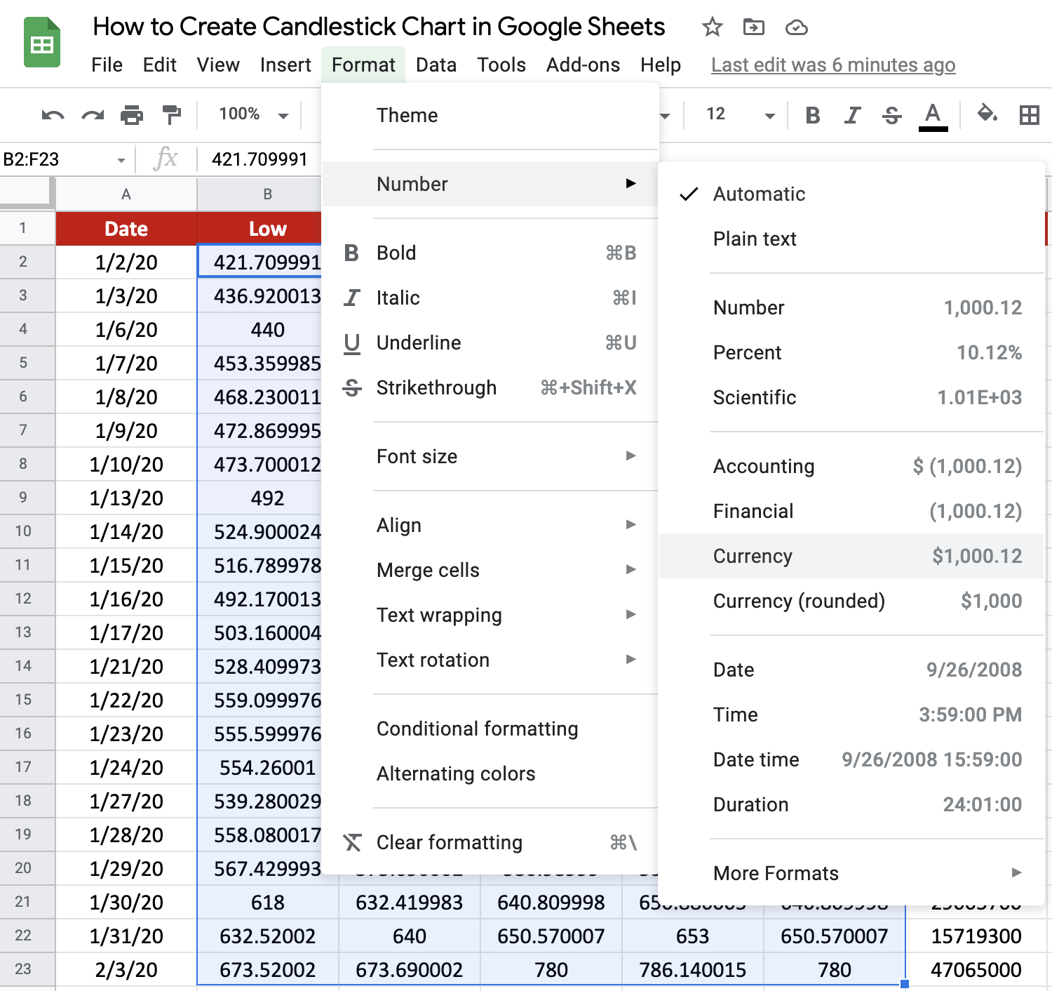
- Once the columns have been rearranged, we need to set the formats for the price and date columns. Select all the price values (second column to the fifth column, once you have rearranged the LOCH format), and navigate to Format -> Number -> Currency as shown below:
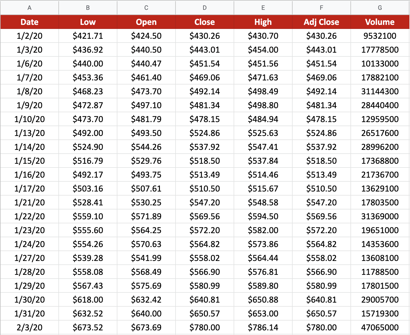
- Make sure the date values in the dataset are in plain text format. For this, you can select the dates in your dataset and navigate to Format->Number->Plain text. If you’ve done these three steps correctly, you should have a table as shown below. For this guide, I’ve chosen the Tesla company’s stock prices for the month of January 2020:
The data is now ready to be visualized.
- Select the first five columns: Date, Low, Open, Close and High. The selection in this table shown above would be A2:G23.
- Click the Insert menu from the menu bar and select the Chart option.

- This should display a candlestick chart on the Google Sheet and a Chart editor sidebar on the right side of your screen.

- Why does it plot the candlestick by default? This is because Google usually tries to display the chart it thinks is the best representation of the selected data once it understands the structure of the same. Ideally, you should have a candlestick chart plotted by default. In the instance it doesn’t, proceed to step 8.
- To convert the plot to a Candlestick plot, select the Setup tab from the Chart editor sidebar shown on the right-hand side of the screen and click on the dropdown menu under Chart type. From the options that are available under the Setup tab, select ‘Candlestick chart’. You should see it either under the ‘Suggested’ or the ‘Other’ category. You should now see a candlestick plot on your screen.

That’s it. Your candlestick plot is ready! 🙂
How to Customize a Candlestick Chart
Google Sheets provides some cool customizations you can apply to the chart to make it look neater and more beautiful. Let’s look at a few of them:
- Give your chart a personalized title. Google Sheets had named my candlestick chart “Low, Open, Close, and High. It’s not quite informative now, is it? Double click the chart title. You can change it to a custom name more specific to the plot. For example, I am giving the title “Tesla Stock price movement in January 2020”.
- Click on the three dots at the top right-hand corner of the plot, and select Edit chart. Under the Chart editor, click on the Customize tab and select the option Vertical axis.
- Set an appropriate Min and Max value to make the chart look neater. In this example, I’ve set the vertical axis range to 400 to 800

- The Chart style option in the Chart editor lets you set the background color, border color, etc. If you would like the chart to be against a darker background, select the Background color option and select the black color. Change the Text color under the Horizontal axis and Vertical axis to match the Chart Title’s text color. Your plot should now look as shown below:

- Try your hand at some of the other options under the Customize tab, like Label font to change the font for the horizontal and/or vertical axis, Label font size to set the font size for the x and/or y-axis values and Label format to make the x and/or y-axis values bold and/or italicized and many more, which are found within the dialogue box itself.
- Finally, once you’ve created your beautiful candlestick chart, simply click on the X symbol in the top right-hand corner of the Customize tab.
And voila! Your candlestick chart is ready.
How to Interpret a Candlestick Chart
The chart consists of a ‘candle’ for each time period (hence the name “candlestick chart”). In the example above, we have one candlestick for each day in January 2020. The candlestick represents the price variation between the opening and the closing price of Tesla stock for each day. The base of the candlestick represents the opening price and the top represents the closing price of the stocks for the respective day.
When the candlestick is filled with blue, it means the closing price of the stock was lower than the opening price. If it is hollow, it means the closing price of the stock was higher than the opening price. Generally, we have come to see that a filled candlestick is shaded in green (denoting a ‘gain’ in stock price) and a hollow one is represented in red (denoting a ‘loss’ in stock price). However, it is not possible to change the colors of the candlesticks in Google Sheets, so you have to make do with blue.
Just above and below the candlestick’s body are the shadows or wicks of the candlestick. The wick on top shows the highest price of the stock for the day, while the wick at the bottom shows the lowest price of the stock.
There are other such inferences you can make from a candlestick plot, and these are known to be used to make predictions about the future prices of the stocks to identify trading opportunities. But that’s outside the scope of this guide.
That’s pretty much it. I hope you can now create Candlestick charts in Google Sheets on your own. 🙂 You may make a copy of the spreadsheet using the link I have attached below:
Experiment with it using the other numerous Google Sheets formulas to create even more powerful charts.