


This guide will explain how to create a Win-Loss sparkline chart in Excel to visualize positive and negative values easily.
A sparkline in Excel is a small chart that fits in a single worksheet cell that can help visualize data. The win/loss sparkline can help keep track of trends at a glance.
The win-loss sparkline chart is a special variant of the column chart that plots only two possible outcomes: a positive or negative value. The chart does not take the sizes or magnitude of data into account.
In the win-loss chart below, we’ve visualized four data points. At a glance, we can quickly see that all but the third data point have a positive value.

The win-loss chart also takes note of values that equal zero. Data points that equal zero show up as a blank space in the win-loss chart. In the example below, we can tell that the third data point is 0 or ‘draw’.

Let’s take a look at an example of a dataset that we can visualize with a win-loss sparkline chart.
Suppose you want to keep track of a football tournament. You have a dataset of the scores of each team in the past matches. You want a quick visualization of how many wins, losses, and draws each team has received.
With the win-loss sparkline chart, we can create a simple visualization that can tell us how a specific team is performing. A win-loss chart makes it easy to determine which teams have been on a winning streak or which teams have more losses than wins.
This use case is just one way to use the win-loss sparkline chart in Excel. For example, you can also use the chart for tracking stock performance or sales data. With the sparkline chart, you can determine how frequently a sales team hits its weekly target.
Now that we know when to use the win-loss sparkline chart in Excel, let’s look into an actual spreadsheet that uses it.
A Real Example of a Win-Loss Sparkline Chart in Excel
Let’s take a look at a real example of the win-loss sparkline chart being applied to an Excel spreadsheet.
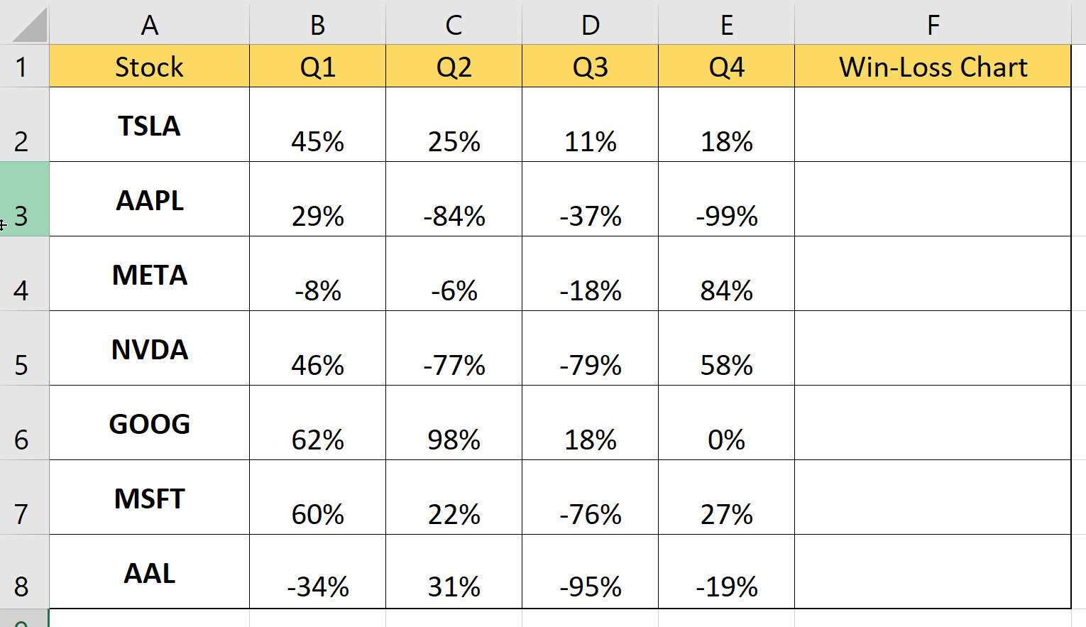
In the table below, we have a stock price tracker. For each stock, we have the percentage change in price for each quarter. A positive percentage change indicates growth, while a negative percentage change tells us that the stock has decreased in value. We’ve added a win-loss sparkline chart to give the user a quick glance at the price movement for each quarter.

You can make your own copy of the spreadsheet above using the link attached below.
If you’re ready to try out the win-loss sparkline chart function in Excel, let’s begin writing it ourselves! Head over to our next section and follow our step-by-step guide.
How to Create a Win-Loss Sparklines Chart in Excel
This next section will guide you through each step needed to add a win-loss sparkline chart in Excel. You’ll learn how to create a visualization of positive and negative outcomes that fit in a single cell.
Follow these steps to start using the win-loss sparkline chart:
- First, add a new column next to your data. This new column is where we will place the sparkline charts for each row.
- Next, head over to the Insert tab and click on the Win/Loss sparkline option.

- In the Create Sparklines dialog box, select the data you want to visualize. In this example, we’ll choose the range B2:E8. This range covers the stock movements of our seven stocks from the first to fourth quarter.

- Next, select the range you want to place the sparkline charts. We’ll specify the cell range F2:F8 to place our visualization in the column we’ve added earlier. Click on OK to apply these settings.
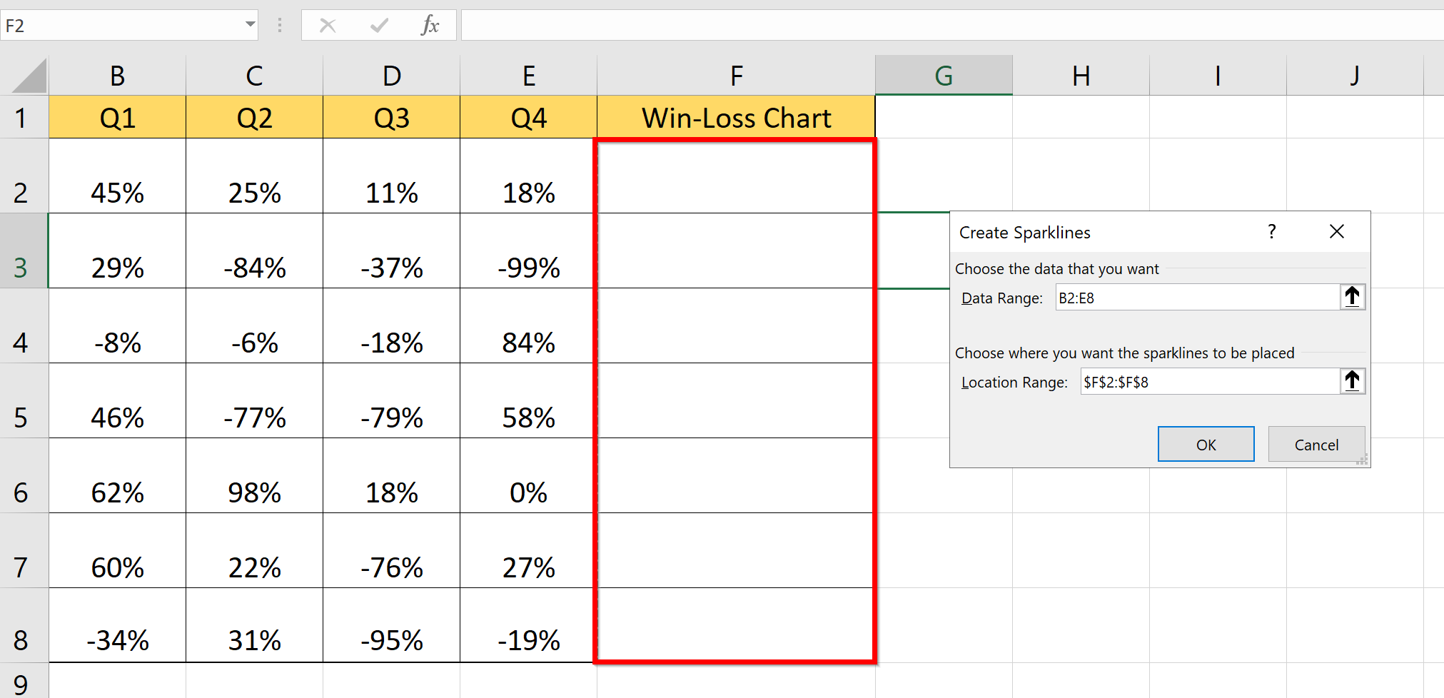
- A sparkline should now appear for each entry in your chosen data range.

- Select one of the sparkline charts to bring up the Sparkline tab. Under the Sparkline tab, you can change the format of the sparkline. In the example below, we’ve changed the color scheme from blue and red to black and red.

Frequently Asked Questions (FAQ)
- When should I use a win-loss chart over a line or column chart?
Win-loss charts are best used for tracking data with positive, negative, and neutral outcomes. For example, when keeping the score of a basketball championship, it would make more sense to keep track of wins and losses rather than how many points a certain team scored in each game.
This step-by-step guide should be all you need to begin adding your own win/loss sparkline chart in Excel. Our guide shows how this type of sparkline can help visualize wins and losses.
The win-loss sparkline chart is just one example of an Excel feature that can help visualize your data. With so many other Excel functions available, you can surely find one that can best visualize your data.
Are you interested in learning more about what Excel can do? Subscribe to our newsletter to find out about the latest Excel guides and tutorials from us.


