The Geographical Map Chart in Google Sheets is useful when you need to visualize geographic data.
This type of chart can be used to compare data between different countries or states.
Let’s look at a scenario where we can use the geographical map chart in Google Sheets.
You are planning to launch a mobile game within the next few months. Your marketing team has provided a list of countries with a decent mobile user population. Since your marketing budget is limited, you would like to reduce the initial campaign list to a specific group of countries.
You want to create a visualization of which countries have the most mobile users to help your team make a decision. With the geographical map chart function, it becomes quite easy to make a map chart in Google Sheets.
This use case is just one way to use the geographical map chart in Google Sheets. We can use the map chart to plot census, economic, and even weather data. The map chart option has multiple formatting options that can help tailor your visualization to your particular use case.
Now that we know when to use a map chart, let’s look into how to use it and work on a sample dataset.
A Real Example of Using a Geographical Map Chart in Google Sheets
Let’s look at a real example of a geographical map chart in Google Sheets function being used in a Google Sheets spreadsheet.
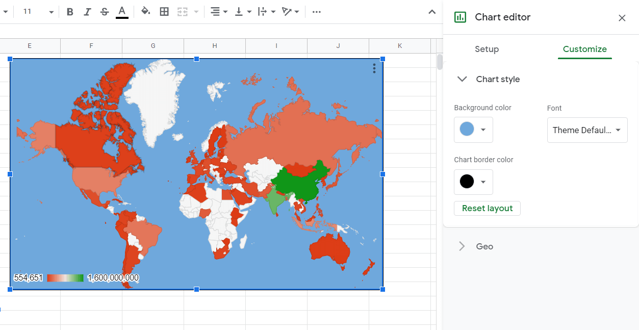
We have a dataset of the number of mobile users per country in the spreadsheet below. We were able to use a map chart to visualize which countries have the most users. The darker colors indicate a higher population.
The visualization quickly shows that locations like Brazil, the United States, and Indonesia are major hotspots for mobile users.
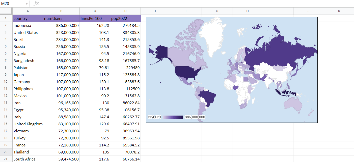
The map is also interactive. Hovering over any country will show a popup of that country’s number of mobile users. For example, we can see that Brazil has 284 million mobile users.

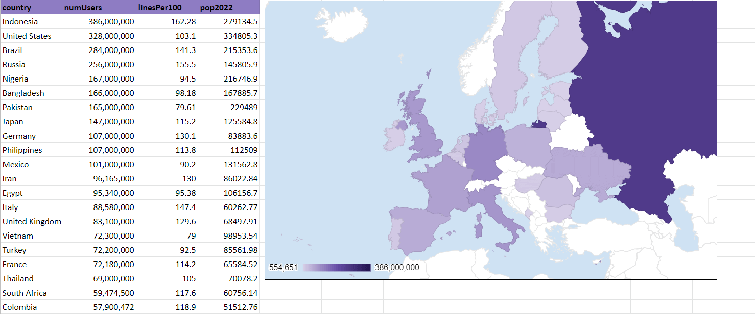
We can also zoom in on specific regions of the world. In the example below, our map chart focuses on Europe.
You can make your own copy of the spreadsheet above using the link attached below.
If you’re ready to try adding a geographical map chart in Google Sheets, let’s start setting it up ourselves!
How to Create a Geographical Map Chart in Google Sheets
In this section, we will go through each step needed to add a map chart in Google Sheets. We’ll be using the mobile phone usage data used in the previous examples.
Follow these steps to start using the Geographical Map Chart:
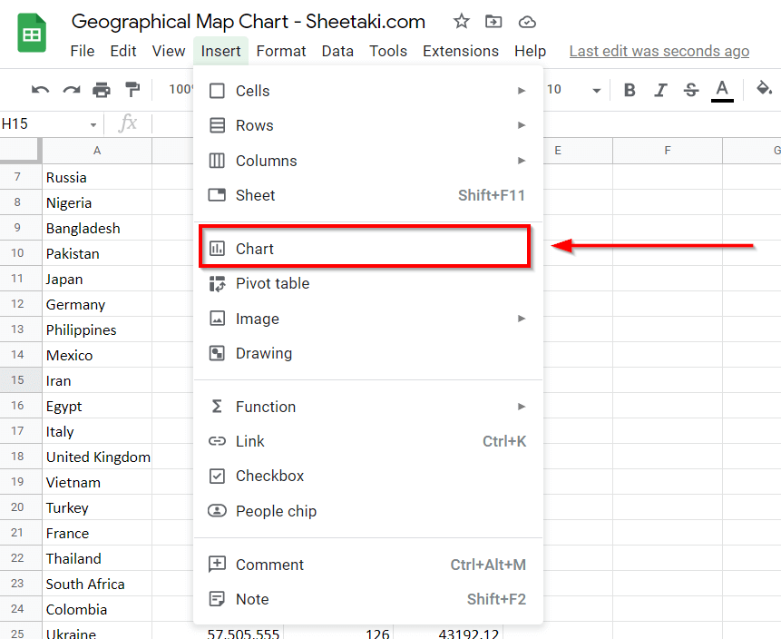
- First, we’ll have to add a Chart to our spreadsheet. We can find the Chart option under the Insert menu.
- You’ll find a Chart editor appear on the right-hand side of your screen. We can use this editor to select which chart to create and what data to use. We’ll also find formatting options here.
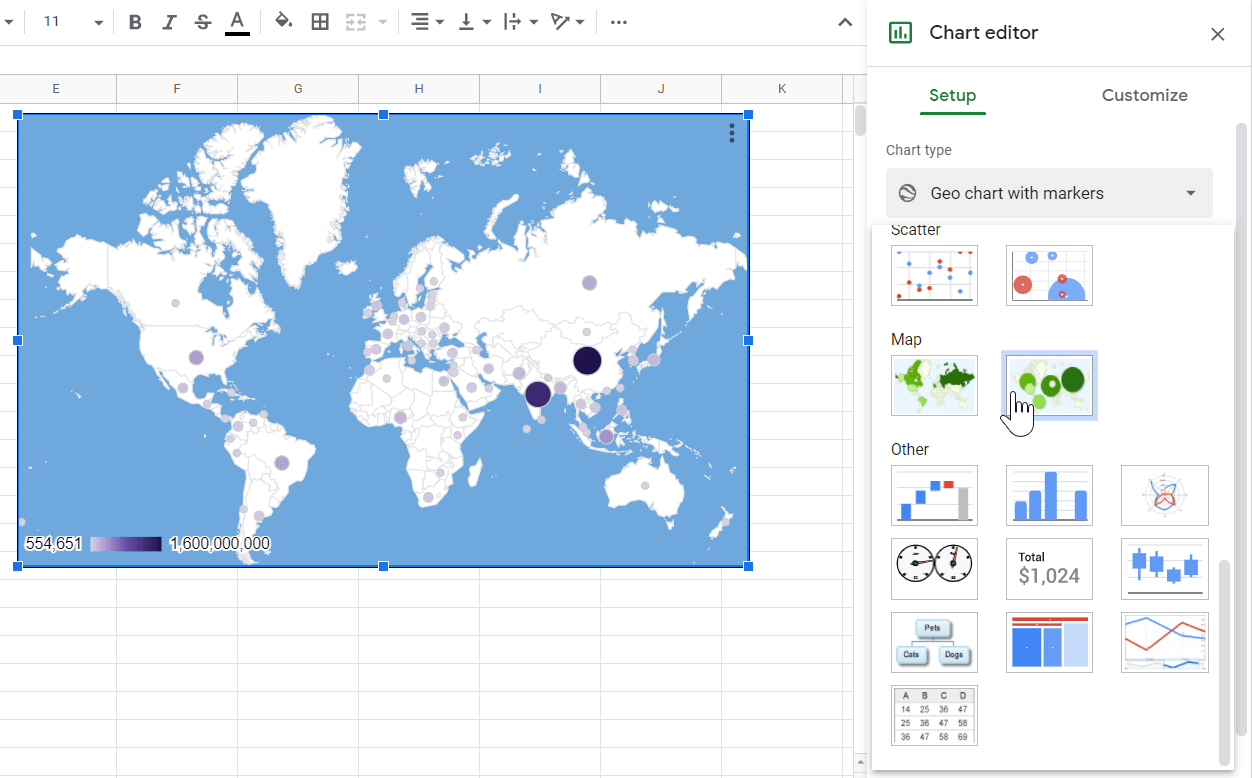
- In the Chart editor, head over to the Setup tab. In the Chart type option, look for the Map chart. There are two possible variations of the Map chart. For this example, let’s choose the first option.

- Ensure that the Region data source corresponds to the column in your dataset that indicates the country or state. The Color data source will determine which column to base the colors on.

- We can look at the option in the Customize tab to further customize our chart. Changing the background color to a solid blue color makes it easier to understand the map.
- We can also change the color scale. Below, we changed the Min, Mid, and Max values to follow a simple purple gradient.

- We can also change the Region to focus on in our map chart. The region is set to “World” by default and shows the entire world map. Other options include Asia, Europe, Africa, and more. In the example below, we focused our map chart on Europe.

- Google Sheets also allows us to use a map chart with markers instead of filling the regions with colors. Besides a sliding scale of color, each marker is also adjusted in size.
Frequently Asked Questions (FAQ)
- Does the Map Chart only accept countries?
The Map Chart also accepts cities, provinces, and states as a data source for the region. - When should we use the Map Chart?
Consider using the map chart to compare geographic data for more than two countries. Map charts can help show trends found in countries and regions close together that can’t be shown in bar or line charts.
That’s all you need to know to get started on creating a geographical map chart in Google Sheets. This step-by-step guide shows how easy it is to create, edit, and customize your interactive map visualization in Google Sheets.
The Map Chart option function is just one example of a charting option in Google Sheets. With plenty of other Google Sheets functions out there, you can definitely find one that suits your data and use case.
Are you interested in learning more about what Google Sheets can do for you? Stay notified of new Google Sheets guides like this by subscribing to our newsletter!