This guide will discuss how to create a Q-Q plot in Excel.
A Q-Q plot can help us inspect data distribution to determine whether it follows a normal distribution.
Commonly people use a quantile-quantile plot, or Q-Q plot, to determine or assess whether a data set possibly came from some theoretical distribution. So we can use a Q-Q plot to easily determine whether the data has a normal distribution or exponential.
Furthermore, creating a Q-Q plot provides a great way to visually present a data set and check whether the data values follow a normal distribution.
To create a Q-Q plot in Excel, we would need to use a few built-in functions to prepare the values in the data set. Then, we can use the available graphs in Excel to insert a Q-Q plot.
Let’s take a sample scenario.
Suppose you have values from a data set that you assume are normally distributed. However, you wanted to check that assumption visually. To do this, you created a Q-Q plot in Excel to verify if the values in the data set follow a normal distribution.
Before moving on to a real example of creating a Q-Q plot in Excel, let’s first learn the syntax of the functions we need.
The Anatomy of the NORM.S.INV Function
The syntax or the way we write the NORM.S.INV function is as follows:
=NORM.S.INV(probability)
Let’s take apart this formula and understand what each term means:
- = the equal sign is how we start any function in Excel.
- NORM.S.INV() is our
NORM.S.INVfunction. So this function is used to return the inverse of the standard normal cumulative distribution. And this should have a mean of zero and a standard deviation of one. - probability is our only required argument. And this is the probability referring to the normal distribution, a number between 0 and 1 inclusive.
The Anatomy of the RANK Function
The syntax or the way we write the RANK function is as follows:
=RANK(number, ref, [order])
Let’s take apart this formula and understand what each term means:
- = the equal sign is how we begin any function in Excel.
- RANK() refers to our
RANKfunction. So this function is used to return the rank of a number in a list of numbers. Furthermore, its size is relative to other values in the list. - number is a required argument. And this refers to the number we want to find the rank.
- ref is another required argument. So this refers to an array of or a reference to a list of numbers. Additionally, non-numeric values in the list are ignored.
- order is an optional argument. And this is a number we input to determine how we rank the values in the list. If we want to rank in descending order, we can input 0 or omit the argument. If we want to rank in ascending order, we can input any non-zero value.
Great! Now we can dive into a real example of creating a Q-Q plot in Excel.
A Real Example of Creating a Q-Q Plot in Excel
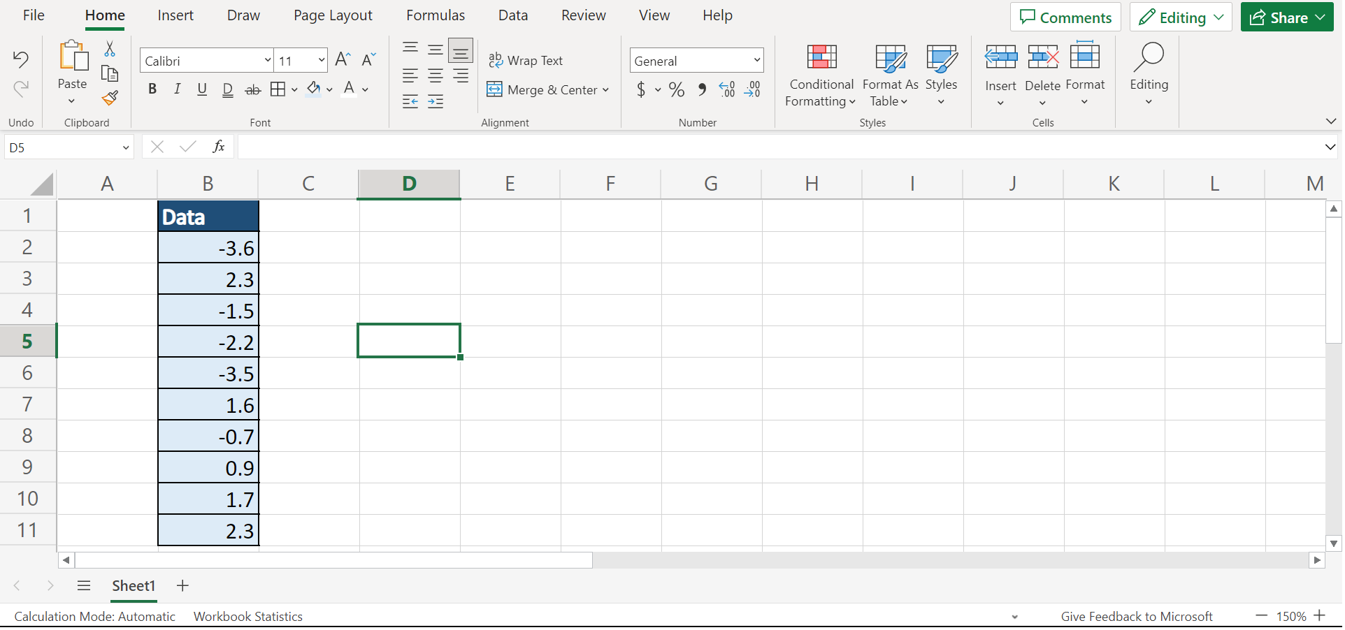
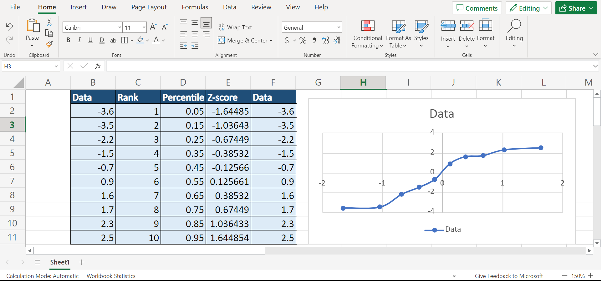
Let’s say we have 10 values in our data set. And we want to visually check whether the values in our list follow a normal distribution. So our initial data set would look like this:
Luckily, we can easily create this scatterplot in Excel using the built-in functions and tools. Firstly, we need to sort the values in the data set. Secondly, we will rank each value in the data set. Thirdly, we will calculate the percentile of each value in the data set.
Afterward, we can finally calculate the z-score for each value in the data set. So a z-score tells us how much the value differs from the data set’s standard deviation. And the higher or lower the z-score is, the further away the value is from the mean point.
When we finish calculating all the needed values, we will use the z-score and data values to plot our Q-Q plot. Then, we need to insert a trendline in our plot to visually verify our assumptions.
So our final data set would look like this:
You can make your own copy of the spreadsheet above using the link attached below.
How to Interpret a Q-Q Plot in Excel
To verify the assumption that our data set is normally distributed, we want to create a Q-Q plot using the values in our data set. So a Q-Q plot is a graphical tool to help us inspect if a set of data possibly came from some theoretical distribution.
Although creating a Q-Q plot is somewhat subjective, it is a great tool that allows us to visually see if our assumption is possible. Furthermore, it can help us learn how our assumption is violated and what values in the data set cause that violation.
Essentially, a Q-Q plot is a type of scatterplot created by plotting two sets of quantities against one another. So we can see the points in the scatterplot forming a roughly straight line if both quantities came from the same distribution.
To interpret a Q-Q plot, we need to check the trendline. If the values in our data set fall roughly along a straight line, then the data follows a normal distribution. If the values tend to deviate from the straight line at a 45-degree angle, this can indicate the data does not follow a normal distribution.
Amazing! Now we can move on to the process of creating a Q-Q plot in Excel.
How to Create a Q-Q Plot in Excel
In this section, we will discuss the step-by-step process of creating a Q-Q plot in Excel. Furthermore, each step has detailed instructions and pictures for you to follow.
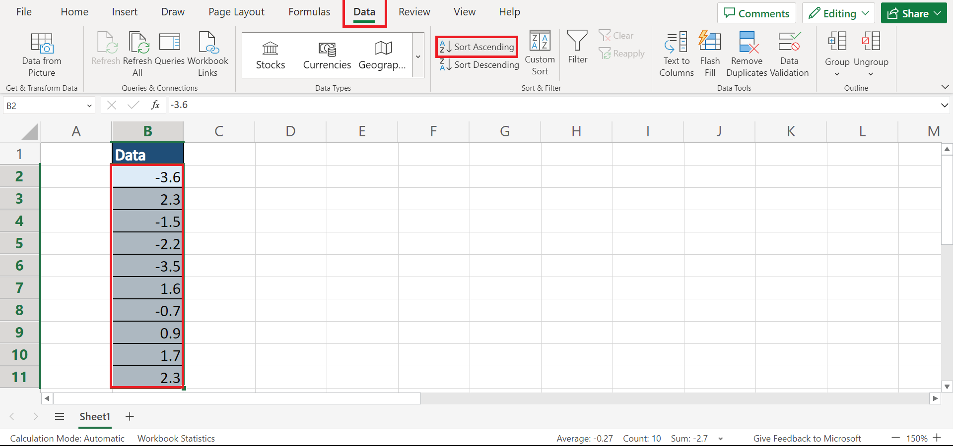
1. Firstly, we need to sort our values. To do this, we can go to the Data tab and click the Sort Ascending icon found in the Sort & Filter section.
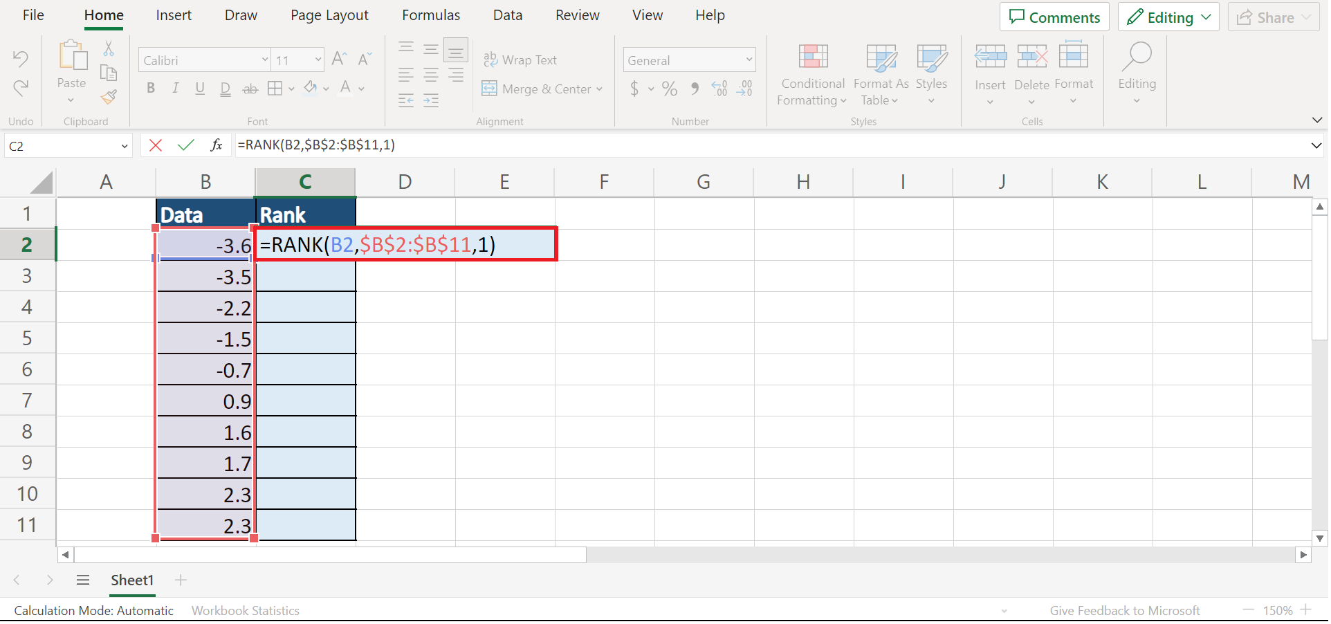
2. Secondly, we will rank each value in the data set. So we can simply input the formula “=RANK(B2,$B$2:$B$11,1)”. Lastly, we will click the Enter key to return the result.
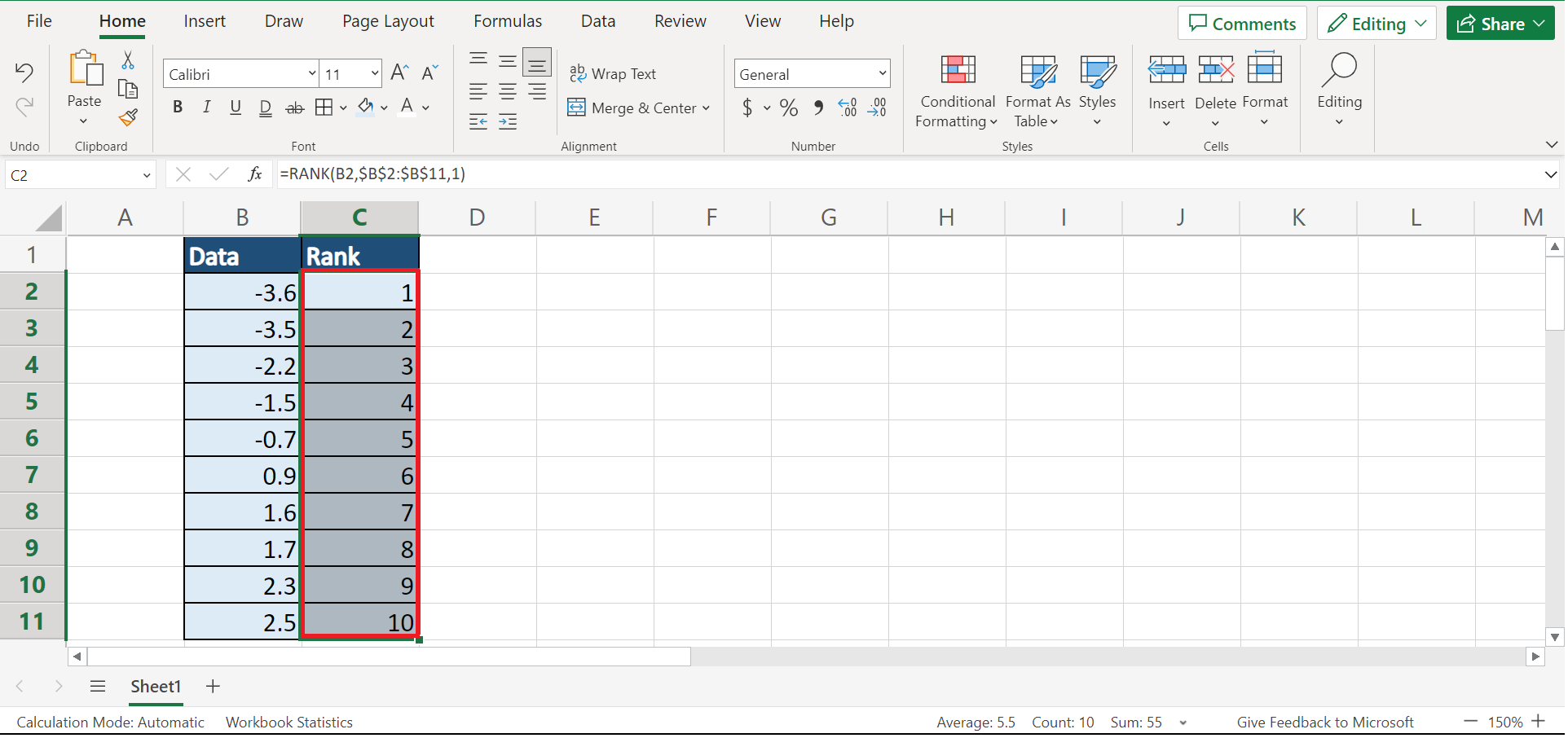
3. Thirdly, we will drag down the Fill Handle tool to copy the formula to the other cells.
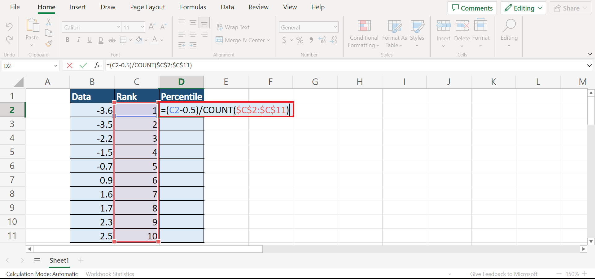
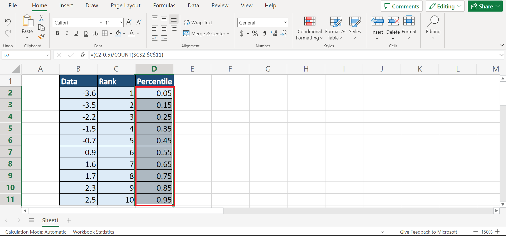
4. Next, we will find the percentile of each value using the COUNT function. To do this, we will type in the formula “=(C2-0.5)/COUNT($C$2:$C$11)”. Then, we will press the Enter key to return the result.
5. We will drag down the Fill Handle tool to apply the same formula to the other cells.
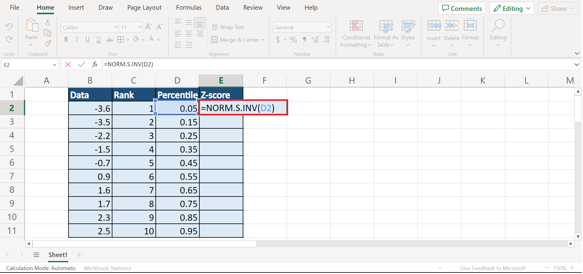
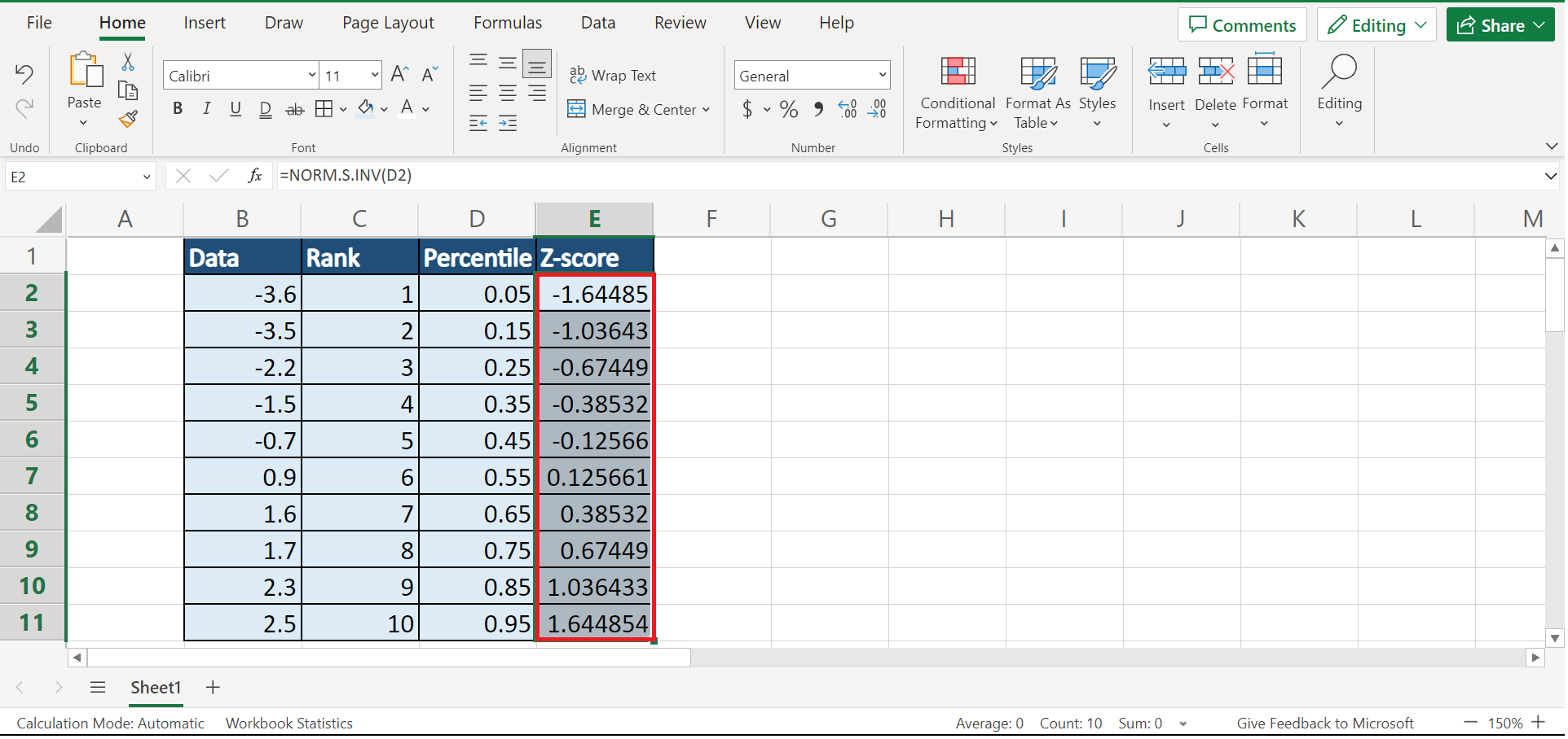
6. Then, we will calculate the z-score of each value. So we will input the formula “=NORM.S.INV(D2)”. Lastly, we will click the Enter key to return the result.
7. Next, we will drag down the Fill Handle tool to get the z-score of the other cells.
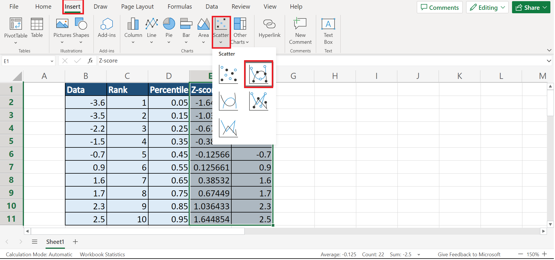
8. Afterward, we will copy the original data set next to the z-score column. Then, we will highlight the two columns and go to the Insert tab. In the Charts section, we will select the Scatter icon and click Scatter with Smooth Lines and Markers.
9. And tada! We have successfully created a Q-Q plot.
And that’s pretty much it! We have discussed the process of creating a Q-Q plot in Excel. Now you can apply this method to your work whenever you need it.
Are you interested in learning more about what Excel can do? You can now use the NORM.S.INV function and the various other Microsoft Excel formulas available to create great worksheets that work for you. Make sure to subscribe to our newsletter to be the first to know about the latest guides and tutorials from us.