


This guide will explain how to plot a cumulative distribution function or CDF in Excel.
The graph of a cumulative distribution function can describe the probability of a certain value being less than or equal to some value x.
Table of Contents
The cumulative distribution function of a random variable is a method that determines the probability that the variable is less than or equal to x.
Let’s take a look at a quick example of a scenario where we can benefit from a CDF plot.
Suppose you are looking at a dataset of people’s heights. We know that the probability of a randomly-chosen height being less than or equal to some value x changes as x increases.
Since increasing x allows more entries to fall under the value of x, the probability should also increase. We can use a cumulative distribution function to plot how the probability increases as our value x increases.
Now that we know when to plot a CDF in Excel, let’s learn how to set it up on an actual Excel spreadsheet.
A Real Example of Plotting a CDF in Excel
The following section provides a simple example of how to plot a cumulative distribution function. We will also explain the formulas and tools used in these examples.
First, let’s take a look at our given sample data.
We have a dataset of x values ranging from 5 to 20. This range will be the range we want to plot in our scatter plot later after setting up the cumulative distribution function.

In this example, we’ll be using a normal distribution for our cumulative distribution function. We must describe our normal distribution by providing the mean and standard deviation. In this example, our distribution has a mean of 14 and a standard deviation of 3.

Next, we’ll create a new column to place the equivalent cumulative distribution for a given value x.

To get the values in Column B, we’ll use the following formula:
=NORM.DIST(A2,$E$1,$E$2,TRUE)
The NORM.DIST function returns the normal distribution for a specified mean and standard deviation. We set the fourth argument to TRUE to indicate we want a cumulative distribution function rather than the probability density function.
Once we have our values, we can use columns A and B as data points for a scatter plot. The graph seen below visualizes the result of our cumulative distribution function.

Do you want to take a closer look at our examples? You can make your own copy of the spreadsheet above using the link attached below.
Use our sample spreadsheet to test out how different values for the mean and standard deviation can change the output of our CDF.
If you’re ready to try plotting a CDF yourself, head over to the next section to read our step-by-step breakdown on how to do it!
How to Plot a CDF in Excel
This section will guide you through each step needed to plot a cumulative distribution function in Excel. You’ll learn how to use the NORM.DIST function to find the equivalent CDF of a given set of x values. Next, you’ll learn how to use a scatter chart to plot the CDF in Excel.
Follow these steps to start plotting a CDF in Excel:
- First, indicate the mean and standard deviation to use for our normal distribution.
- Next, create a new column to place our cumulative distribution function.

- We’ll use the
NORM.DISTfunction to find the equivalent value for a given x. Add a cell reference to the first column as the first argument.

- Next, we’ll reference the mean of the normal distribution. We’ll add the ‘$’ symbol to the cell reference to convert it into an absolute reference. This will be helpful later when we use the Fill Handle tool.

- For the third argument, we’ll add another absolute reference to the standard deviation of our distribution.

- Set the fourth argument to TRUE to indicate that we’ll use the cumulative distribution function of
NORM.DIST. Afterwards, hit the Enter key to evaluate the function.

- Use the Fill Handle to fill the rest of the column.
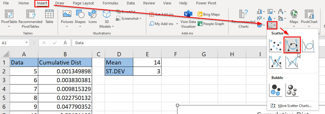
- Next, we’ll plot our cumulative distribution function data. In the Insert tab, click on the option for a scatter chart with smooth lines and markers.
- You should now have a chart that plots the cumulative distribution function of the range specified in your dataset.
These are all the steps you need to plot a cumulative distribution function in Excel.
This step-by-step guide is a quick introduction to plotting a CDF in Microsoft Excel.
You should now understand how to use the NORM.DIST function to return an equivalent CDF value for each x in a dataset. We’ve shown how to use a scatter chart to plot and visualize the result of our cumulative distribution function.
Plotting the cumulative distribution function is just one example of a statistical method you can perform in Excel. Our website offers hundreds of other functions and methods to help you get more out of Microsoft Excel.
With so many other Excel functions available, you can find one appropriate for your use case.
Don’t miss out on our team’s new spreadsheet tips, tricks, and best practices. Subscribe to our newsletter to stay updated on the latest guides from us!


