This guide will explain how to create a Lorenz curve in Excel.
You’ll learn how to use the Lorenz curve as a graphical representation of wealth or income inequality.
The Lorenz curve was first developed in 1905 by Max O. Lorenz to show how much of the overall income or wealth is distributed to the bottom x% of a population.
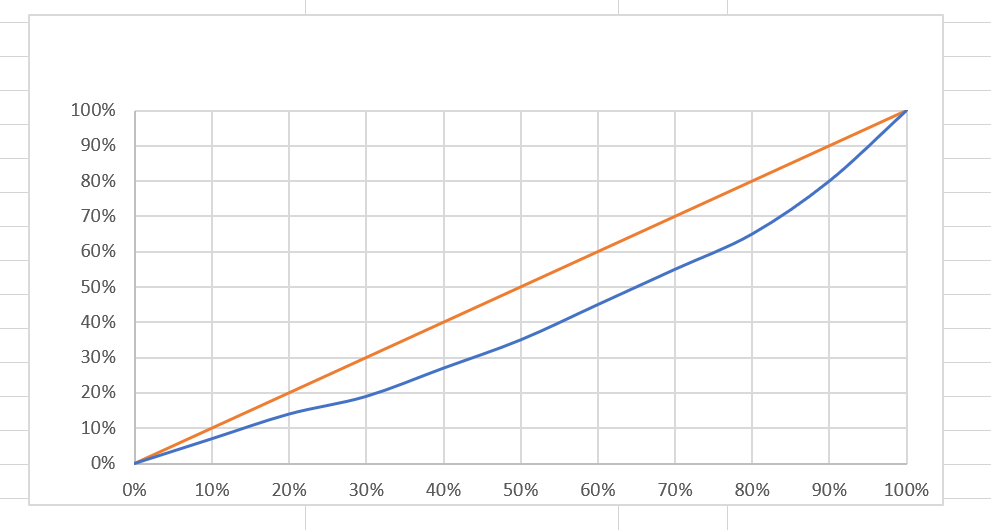
The Lorenz curve’s x-axis plots the cumulative share of people from lowest to highest incomes. The y-axis plots the cumulative share of income earned.
Every Lorenz curve includes a 45-degree line called the line of equality. This line represents the distribution where x-y or when the income or wealth is perfectly distributed.
The Lorenz curve also always starts at point (0,0) and ends at point (1,1). The Lorenz curve will always be beneath the line of equality.
How can we create a Lorenz curve in Microsoft Excel?
We can use a scatter plot chart with smooth lines to create our own Lorenz curve in Excel. We’ll need to format our income or wealth distribution data such that the values are written as cumulative percentages of the total.
This use case is just one way to use the Lorenz curve. The concept is also helpful in other fields, such as biology or in business modeling. For example, consumer finance models use the Lorenz curve to measure the percentage of delinquencies that can be attributed to the lowest x% of parties in terms of risk scores.
Now that we know when to create a Lorenz curve in Excel, let’s learn how to use it and work on an actual sample spreadsheet.
A Real Example of Creating a Lorenz Curve in Excel
The following section provides several examples of how to use this function. We will also go into detail about the formulas and tools used in these examples.
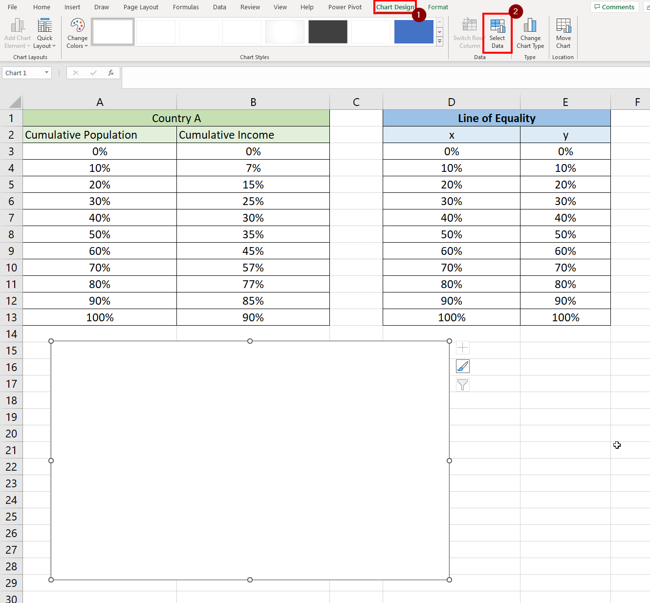
First, let’s take a look at our sample data. The table below shows the income distribution of the bottom x% of the population in terms of how much they earn annually.

Let’s try to understand how to interpret this table. In row 4 we can see that the bottom 10% of the population accounts for 7% of the total income. Meanwhile, the bottom 50% of the population accounts for 35% of the country’s annual income.
Our spreadsheet also contains a table for the line of equality. Since this describes a scenario where all income or wealth is distributed equally, x and y are equal.

We’ll use a scatter plot chart to create the Lorenz curve.
Do you want to take a closer look at our examples? You can make your own copy of the spreadsheet above using the link attached below.
Use our sample spreadsheet to test out how we added two series to our scatter plot to create our Lorenz curve.
If you’re ready to try setting up your own Lorenz curve, head over to the next section to read our step-by-step breakdown on how to do it!
How to Create a Lorenz Curve in Excel
This section will guide you through each step needed to create a Lorenz curve in Excel. You’ll learn how we can use a scatterplot chart to convert a table of income distribution data.
Follow these steps to add a Lorenz curve to your spreadsheet:
- In the Insert tab, click on the Scatter chart option.

- Excel offers multiple types of scatter charts. Choose the third option to create a scatter chart with smooth lines and no markers.

- You should now have a blank chart object in your spreadsheet. While the chart is selected, click on the Chart Design tab and click on Select Data. This option will allow the user to choose what ranges to use as a series in the scatter chart.
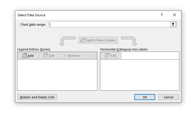
- In the Select Data Source dialog box, click on the Add button under the Legend Entries (Series) label.
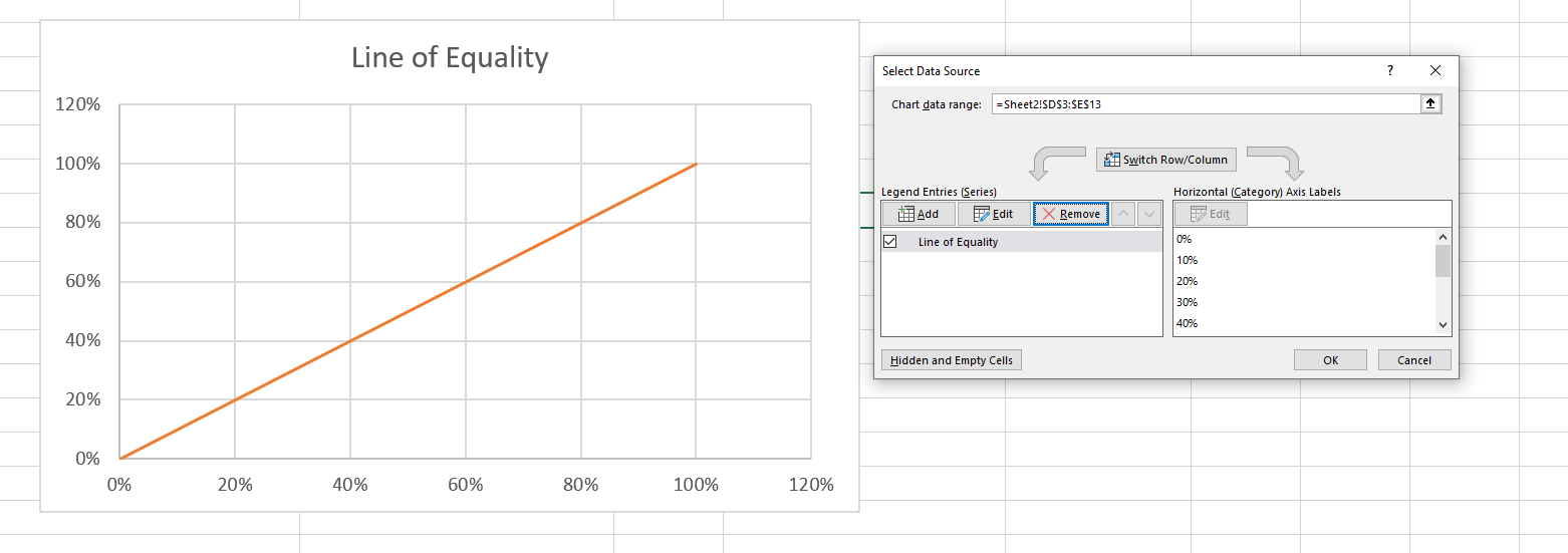
- Let’s add the line of equality to our chart. Type ‘Line of Equality’ as the Series name and choose the appropriate ranges for the series x and series y values. In this example, we’ll use the cell range D3:D13 and E3:E13 as our x and y values. Click on OK to add the series to the chart.

- The line of equality should now appear on the scatter chart. Click on Add to add the income distribution data to our chart next.
- We’ll now add the income distribution data for Country A to our chart. In this example, we’ll use the cell range A3:A13 and B3:B13 as our x and y values. Click on OK to add the series to the chart.
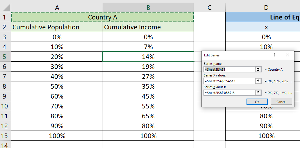
- You should now have two series in the Select Data Source dialog box. Click on OK to exit this menu.

- You should now have a complete Lorenz curve in your Excel spreadsheet.

These are all the steps needed to create a Lorenz curve in Excel.
This step-by-step guide should provide you with all the information you need to add a Lorenz curve to your spreadsheet.
We’ve also explained how you can interpret the Lorenz curve yourself. Understanding the logic behind the graphical representation will help you interpret your data more clearly.
Scatter plots are just one example of the many visualizations you can use in your Excel spreadsheets. Our website offers hundreds of other functions and methods to help you get more out of Microsoft Excel.
With so many other Excel functions available, you can find one appropriate for your use case.
Don’t miss out on our team’s new spreadsheet tips, tricks, and best practices. Subscribe to our newsletter to stay updated on the latest guides from us!


