A Pareto chart in Google Sheets is a kind of combo chart that has both bars and lines to quantify the importance of factors.
This is also called a sorted histogram. While both Pareto charts and histograms visualize frequencies, the former necessitates keeping the data in order from largest to smallest frequency.
Table of Contents
Companies use Pareto charts to make managerial decisions. With factors arranged to show what’s most frequent and what percentage they contribute to the problem, you can see which ones are problematic or beneficial. In particular, you’ll see which factor you can act on to make a difference in your organization.
Say I’m selling carrot cakes and trying to improve the quality of my business so that I can hopefully increase my sales. I would check on the reviews and instinctively try to fix all the problems my customers have found. However, this is not the best use of energy according to the Pareto principle or the 80/20 rule.
The Pareto principle states that 80% of your problem is the result of 20% of its causes. This means that you only really need to focus on a vital few factors to solve the majority of the issue. A Pareto chart will help you identify those important points. There are also cases wherein all factors have to be addressed and the chart will still be useful to identify what to address first.
A Pareto chart should help when I’m deciding how to improve the quality of my product. This chart is also useful for cases like identifying what audit findings will make the most impact on organization performance.
Let’s learn how to make a Pareto Chart in Google Sheets together using my hypothetical carrot cake business situation.
Real Example of Creating a Pareto Chart in Google Sheets
Take a look at the example I’m presenting to see what a Pareto chart will look like in Google Sheets.
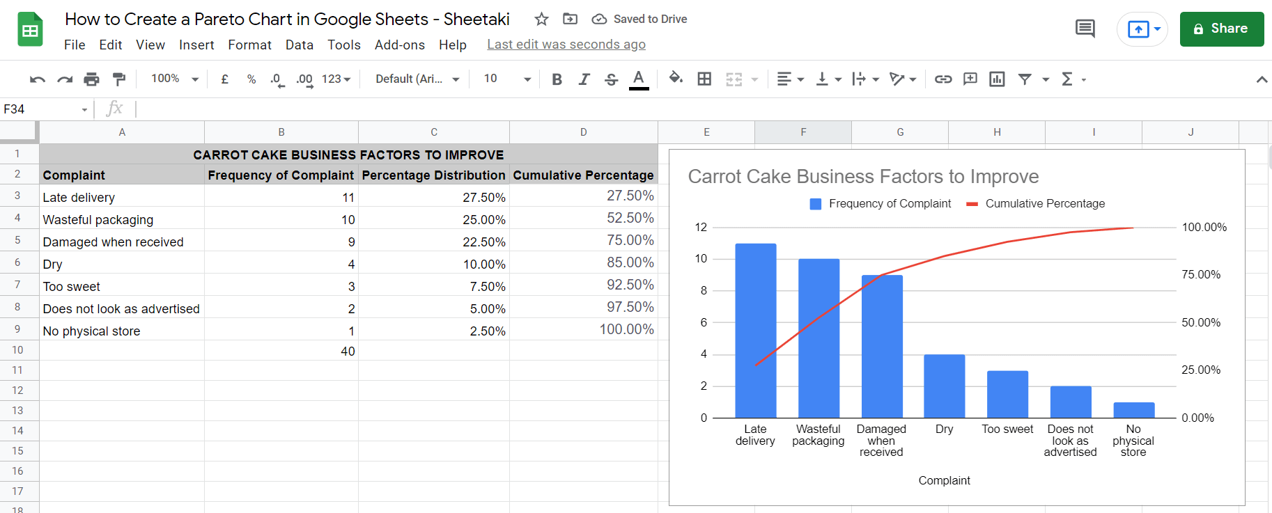
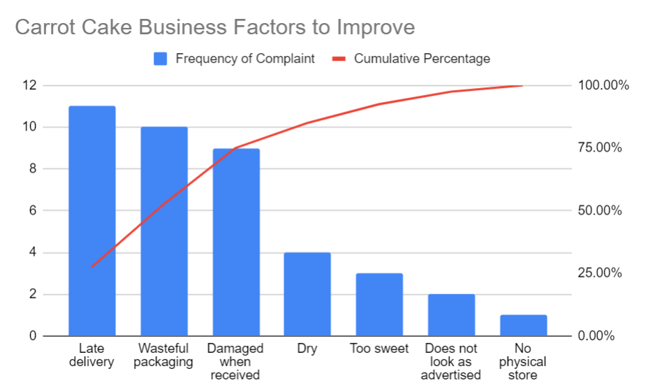
In the photo, you see a table on the left and a combo chart on the right but not all columns on the table are adapted as a series on the chart. The chart only shows the frequency of complaints and cumulative percentage but not the percentage distribution.
This is because the percentage distribution is only relevant for the calculation of the cumulative percentage but not for the Pareto chart itself.
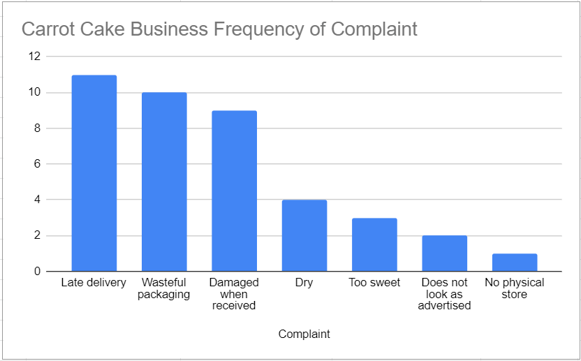
As mentioned before, the Pareto chart is used to identify the most relevant factors to consider in a list. In our example, let’s look at the chart and see what these are.
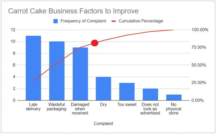
The red dot on the line graph is where around the 80/20 split of the complaints is. On its left is the vital few (20%) and on its right are the trivial many (80%).
This means that in order to fulfill customer satisfaction, it’s best for me to focus on taking action to solve the complaints regarding “Late delivery”, “Wasteful packaging”, and “Damaged when received”.
You’ll see that while a bar chart is effective at showing which issue is pointed out the most, it doesn’t serve the purpose that a Pareto chart does.
You can make a copy of the spreadsheet I made using the link attached below:
Alright, now I’ll show you how I made that chart with comprehensive steps.
How to Create a Pareto Chart in Google Sheets
To make a Pareto Chart in Google Sheets, it would be useful to know how to do the following:
- Arranging data in descending order
- Calculating for percentages
- Calculating for cumulative frequencies
- Plotting the Chart
Google Sheets lets you do these steps in an efficient manner with formulas and settings we’ll talk about later on.
Arranging Data in Proper Order
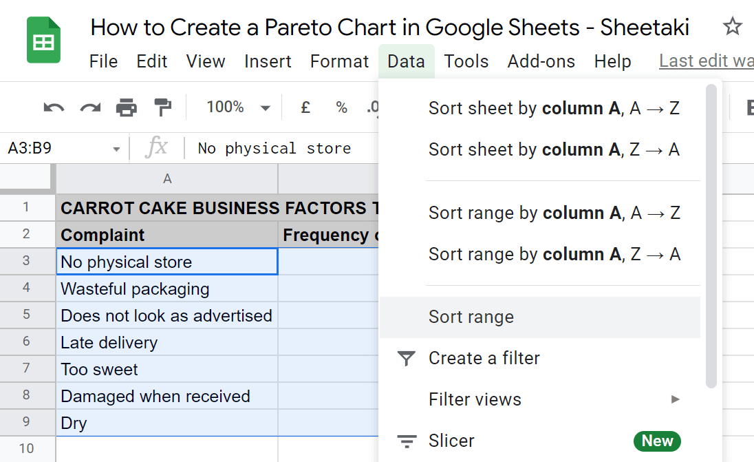
- First, input the finding types and the count on separate columns. In this case, our findings are complaints.

- Next, we’re going to arrange the data in descending order. To do this, select the columns you just made. In this case, that’s A3:B9. Then, click on the Data tab found below the title of the document. From here, select Sort Range.
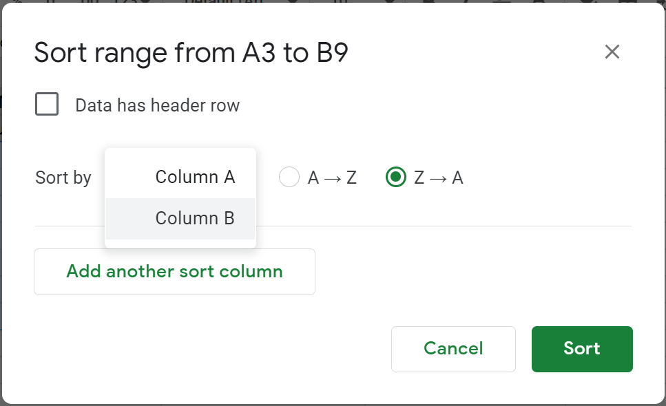
- At this point, a dialogue box should appear. By default, Sort by is set to Column A. Change that to Column B. Then, make sure to select Z → A. When you’re done, click the Sort button on the lower left.
This should arrange your data in descending order.
Calculating for Percentages
- Now, we’re going to add another column to the right for the percentage distribution. To calculate for percentages, select the first row. That’s C3 in this case. Then, enter the following formula:
=B3/sum($B$3:$B$9)
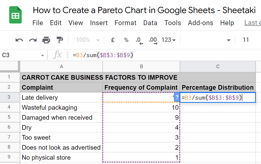
The result is the percentage of the highest frequency complaint out of all types of complaints. Note that having the dollar sign ($) written like how it is on the formula makes the data cell constant. You can toggle this by pressing F4.
- With part of the function constant, simply click and drag the cell (C3) up to the last row of the table. This will apply the same formula accordingly.

- At this point, convert the results to percentages. To do this, select the data first. In this case, that’s C3:C9. Then, click on the Format tab below the title of the document. Next, click on Number and select Percent on the options.

Calculating for Cumulative Frequencies
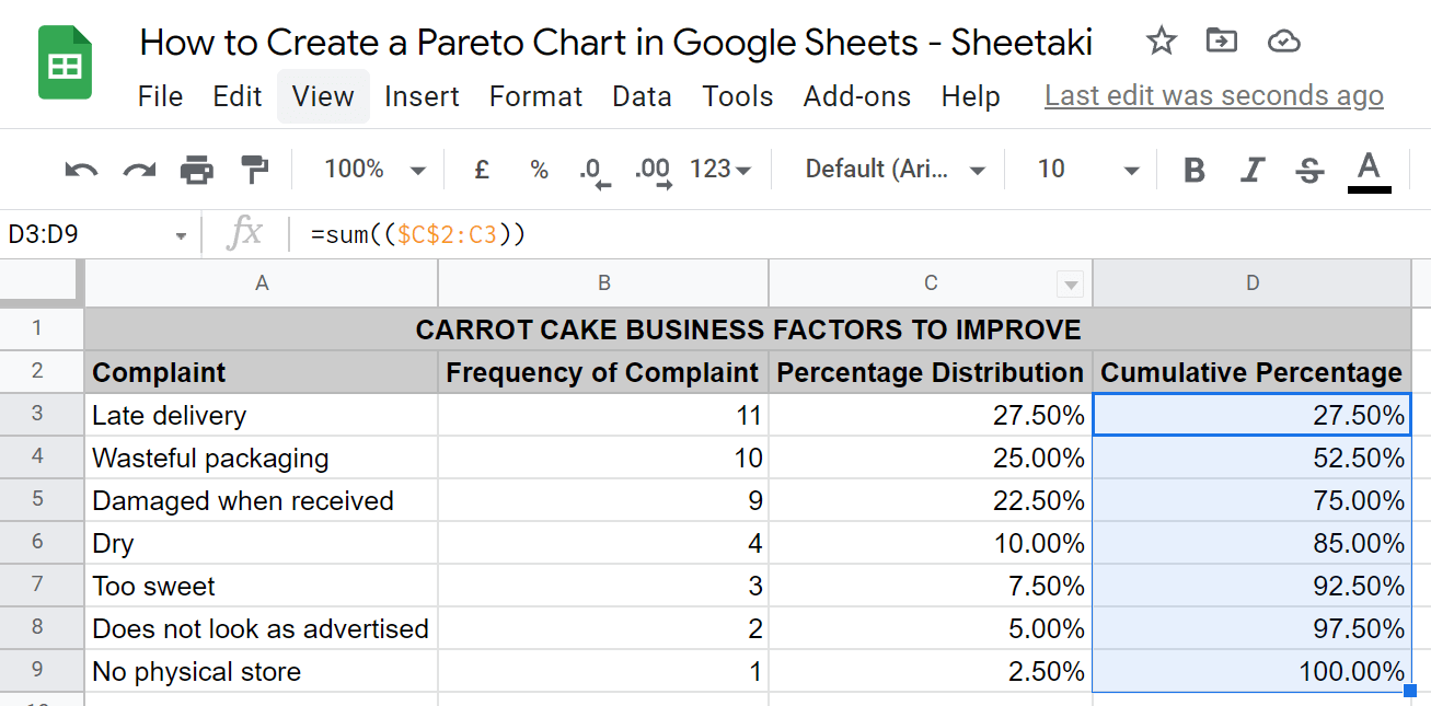
- Next, we’re going to calculate the cumulative percentage on another column to the right. To do this, copy the formula below and paste it on the first row of the new column (D3):
=sum(($C$2:C3))
The same principle of having a constant in the function applies. This adds the data in the row before and the row where the result of this formula will be.

- Similar to before, we’re going to click and drag the cell (D3) up to the last row of the table. The last row should have 1 as the result.

- Then, also convert the results to percentages with the same steps before.
Plotting the Pareto Chart in Google Sheets
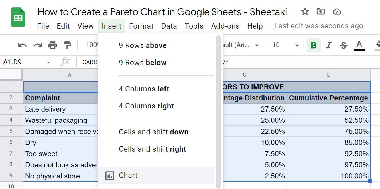
- Finally, we’re going to plot the Pareto Chart. To do this, select the whole table first. Then, click on the Insert tab below the title of the document and select Chart.
- By default, a Combo chart should appear. If not, select that option under Chart type in the Chart editor.

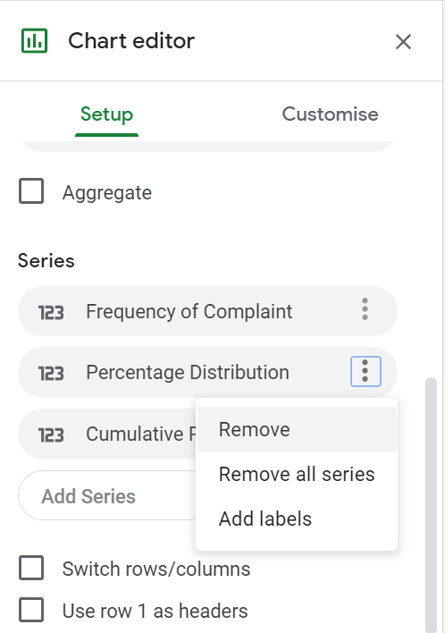
- Now, let’s edit that chart to show what we intend. Stay on the Setup settings. First, remove Percentage Distribution under Series. As mentioned before, this is only there for the calculation of the cumulative percentage, which is what’s needed in a Pareto chart.
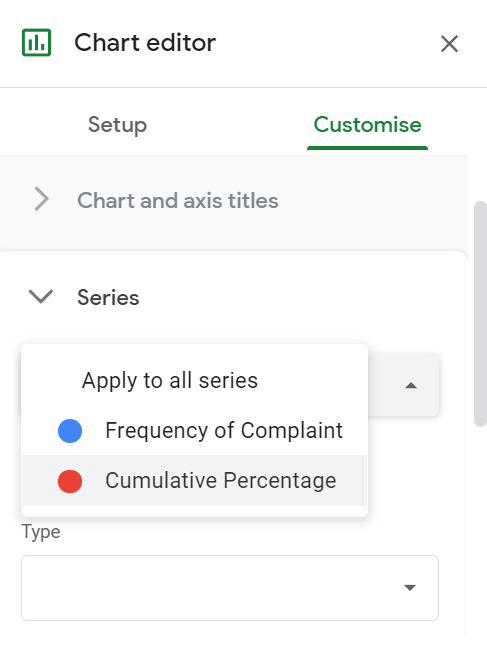
- Next, go to the Customise settings under the Chart editor. Click on Series among the list. In the Series selector, change the default Apply to all series to Cumulative Percentage.
- Then, change the Axis from the default Left axis to Right axis.

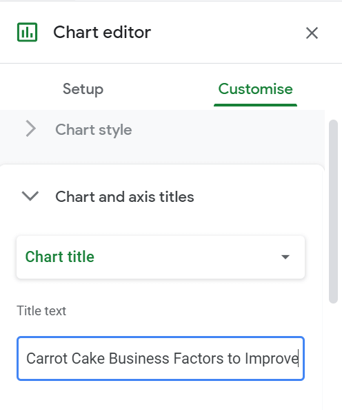
15. At this point, all there’s left to do is change the title of the table accordingly. To do this, navigate to the Chart and axis titles section under Customise settings. Select Chart title under the Title type selector, then, enter your desired label under Title text.
That’s it. You’ve just learned how to create a Pareto chart in Google Sheets.
You can also experiment with the chart editor to customize your Pareto chart even more.
Aside from the functions mentioned here, there are other formulas available to make your data manipulation even more pro. If you have any more inquiries, let us know in the comment section, and make sure to subscribe for more Google Sheets how-tos.