


If you want to have a visual presentation of the chunks of information about your work or project, you may use scorecards. In Google Sheets, scorecard charts call attention to your Key Performance Indicators.
Key Performance Indicators or KPIs are excellent project trackers. They help measure accomplishments in a specific undertaking more objectively. Pair this index with scorecard charts in Google Sheets to make things more efficient.
Often, you’d want to easily see the highlights instead of going through all the material for the project. This is where displaying KPIs with Scorecard charts in Google Sheets comes in handy.
So, do you fancy learning more? Well then, let’s get started.
Table of Contents
How to Add a Scorecard Chart in Google Sheets
The usual KPIs displayed in Google Sheets are total and average costs and sales. Sometimes, you’d want more specific values. Like, average expenditure per quarter. Or, which ranked as the top-selling item for the month?
It doesn’t mean that those KPIs are the only ones you can use a scorecard chart for. You aren’t limited to what KPIs you can input on Google Sheets. However, make sure they’re all important and necessary. Otherwise, there won’t be any highlights, right?
Here’s a step-by-step guide for you.
- First, insert your KPI data onto Google Sheets. You may choose to do either of the two, whichever is convenient to you:
-
- Open your KPI file on your computer. Then, copy and paste the data onto your Google Sheets.
- Directly encode your KPI data onto your Google Sheets. Click on the Blank template under the Start a New Spreadsheet section of Google Sheets Home to get started.
Let’s use this data set for example, so you can follow along more easily.

- Once your data is in, click Insert on the Menu Bar. Then, choose Chart from the dropdown menu. You should see the Chart Editor toolbox on the right side of your screen.

- In the Chart editor tab, click the chart type and scroll down the menu until you find the Other section. From the options, select Scorecard.
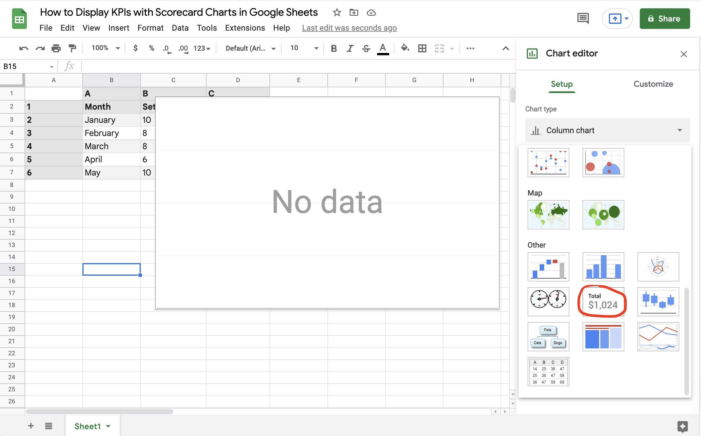
That’s how you add a scorecard chart on your Google Sheets. But we’re not stopping here because we have yet to learn how to display KPIs with scorecard charts in Sheets. For now, let’s continue reading the rest of the sections.
How to Show Data from One Cell on your Scorecard Chart
Showing data from one cell displays the desired information on your scorecard chart. Here’s how to do that.
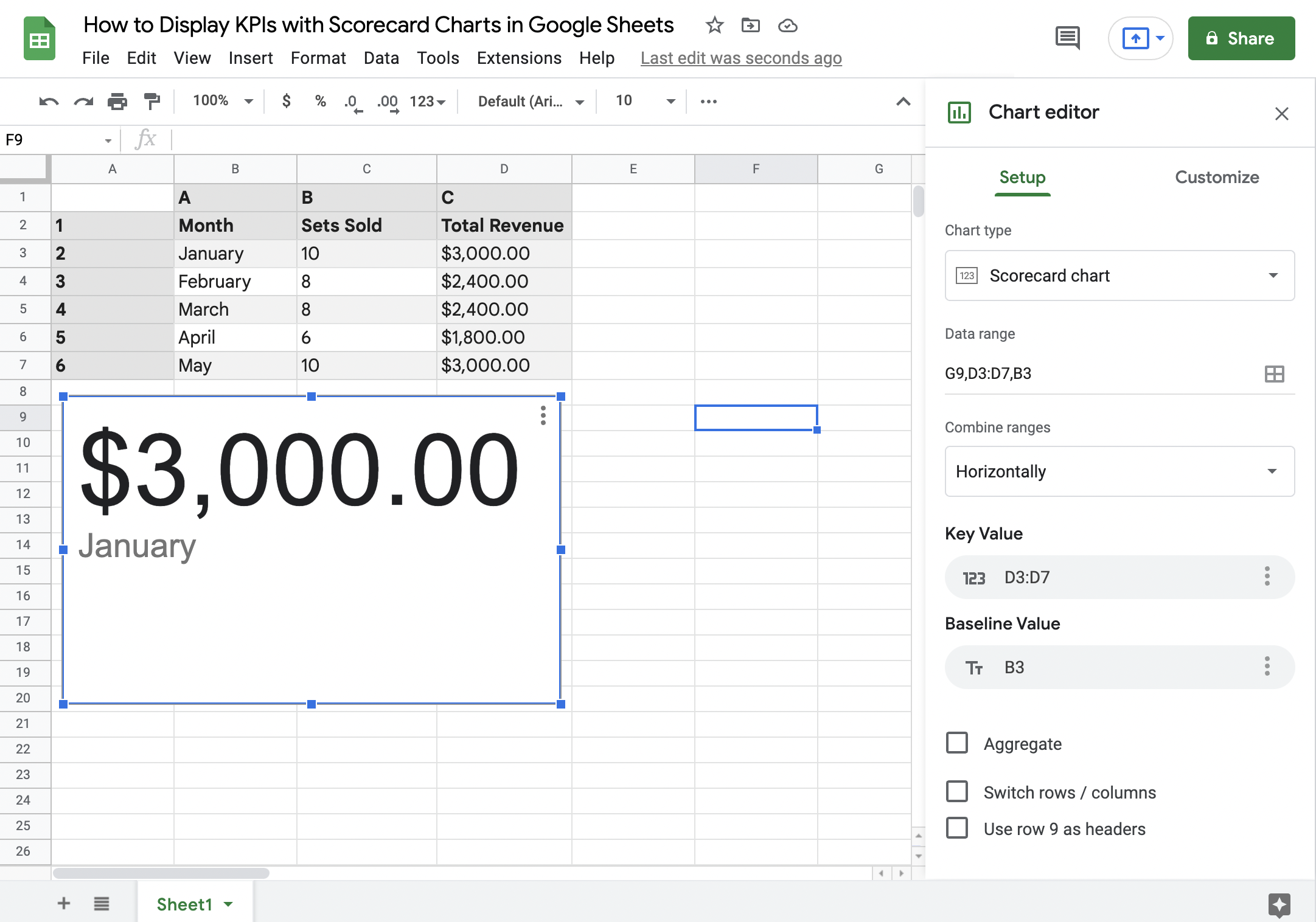
After selecting the scorecard chart from the Chart Type menu, you should see the Chart Editor toolbox again. But this time, it should be similar to the image below.

As you can see, Sheets requires data for Key Value. To insert data, click on Key Value and select a data range.

The Key Value will be displayed bigger on the scorecard. This means that this is the value you’ll want to call your attention to. In support, you can also add in the Baseline Value, which adds more information that you need to help visualize the values better.
In this example, you can see the Total Revenue (Key Value) for January (Baseline Value).
Now, you might be thinking about what other things you can do with Scorecards on Google Sheets. That’s what we’re talking about in the next section.
How to Show Insights from Multiple Cells on your Scorecard Chart
Insights from multiple cells help give a bird’ eye view of all your KPIs. Take a look at the example. Let’s say you want to determine the total revenue of your business for the first quarter of the year.
- First, you need to click again on Key Value in the Chart Editor toolbox. However, instead of choosing a single cell, select the Total revenues for January to March.
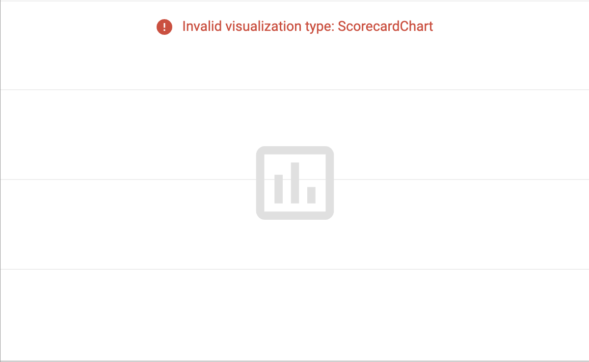
- Remember to click Aggregate under Baseline Value. Otherwise, you’ll get prompted with this image below.
- Since the scorecard chart automatically updates based on your inputs, you should already see new values on display.
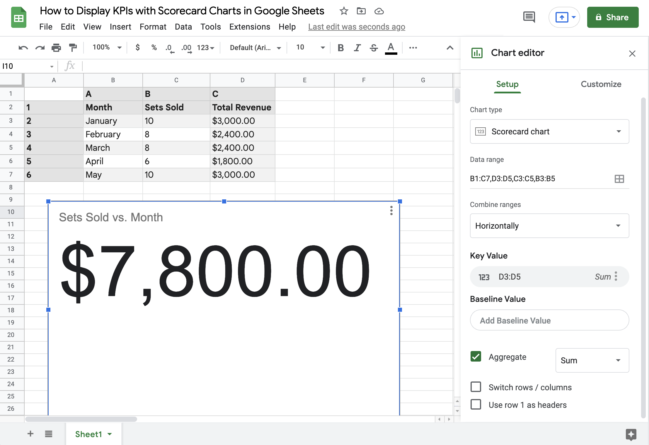
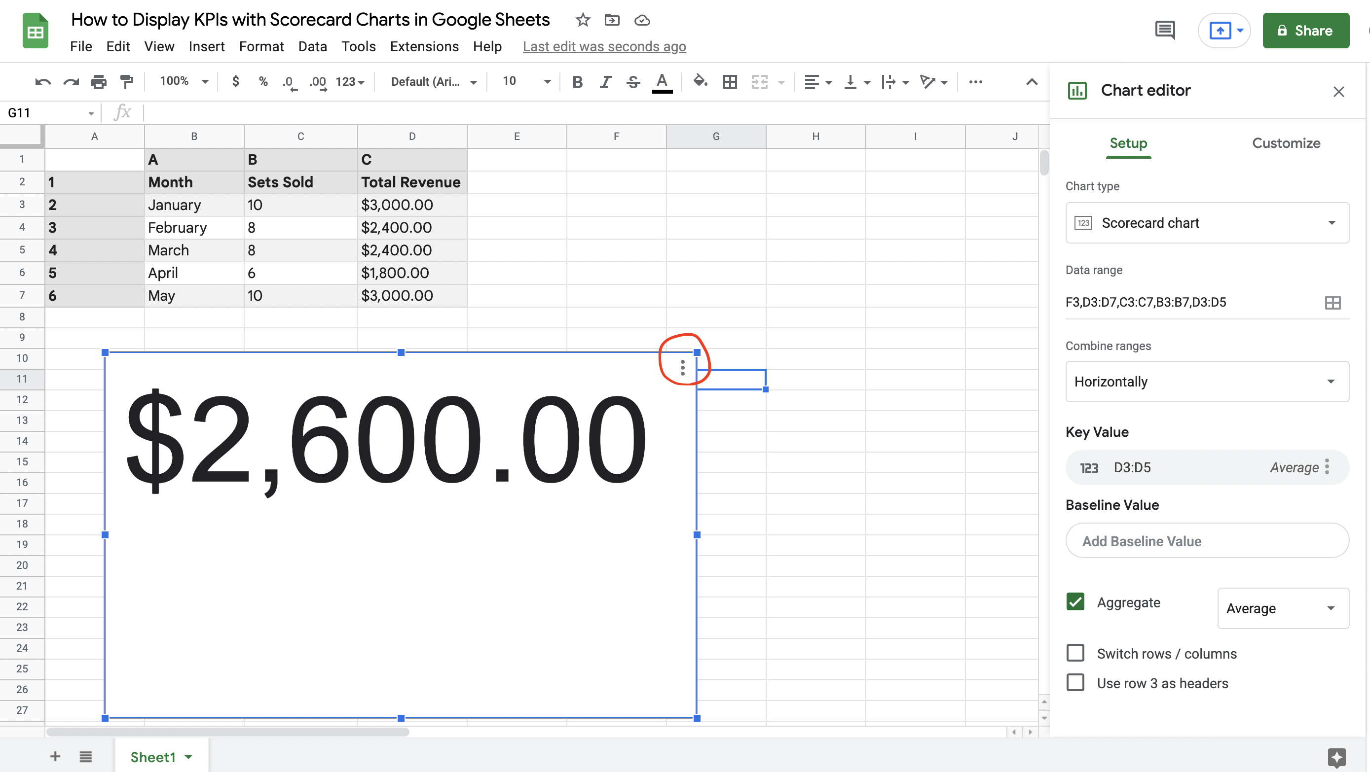
- By default, you can get the Sum value of the multiple cells that you’ve highlighted. On the other hand, if you want other values, click the dropdown menu next to Aggregate. Here, you can choose to get other values for your data such as Average, Min, Max, Median, and Count. From our example, here’s how the average revenues per month of the first quarter look like.

If you want to learn how to compare your KPIs through time or under different circumstances, the final section of this article should help you out.
How to Compare KPIs Using a Scorecard Chart
If you have seen other scorecard charts, you might be intrigued about the red and green values under the biggest values on display. Remember the Baseline Value that we have mentioned in the second section? Here’s where they come right in.
- Click the three vertical dots at the right corner of the scorecard chart to open the Chart Editor toolbox again.
- Go to the Baseline Value and Select D3 to D7 as the data range. You should see a piece of new information in the green text displayed in the scorecard chart.
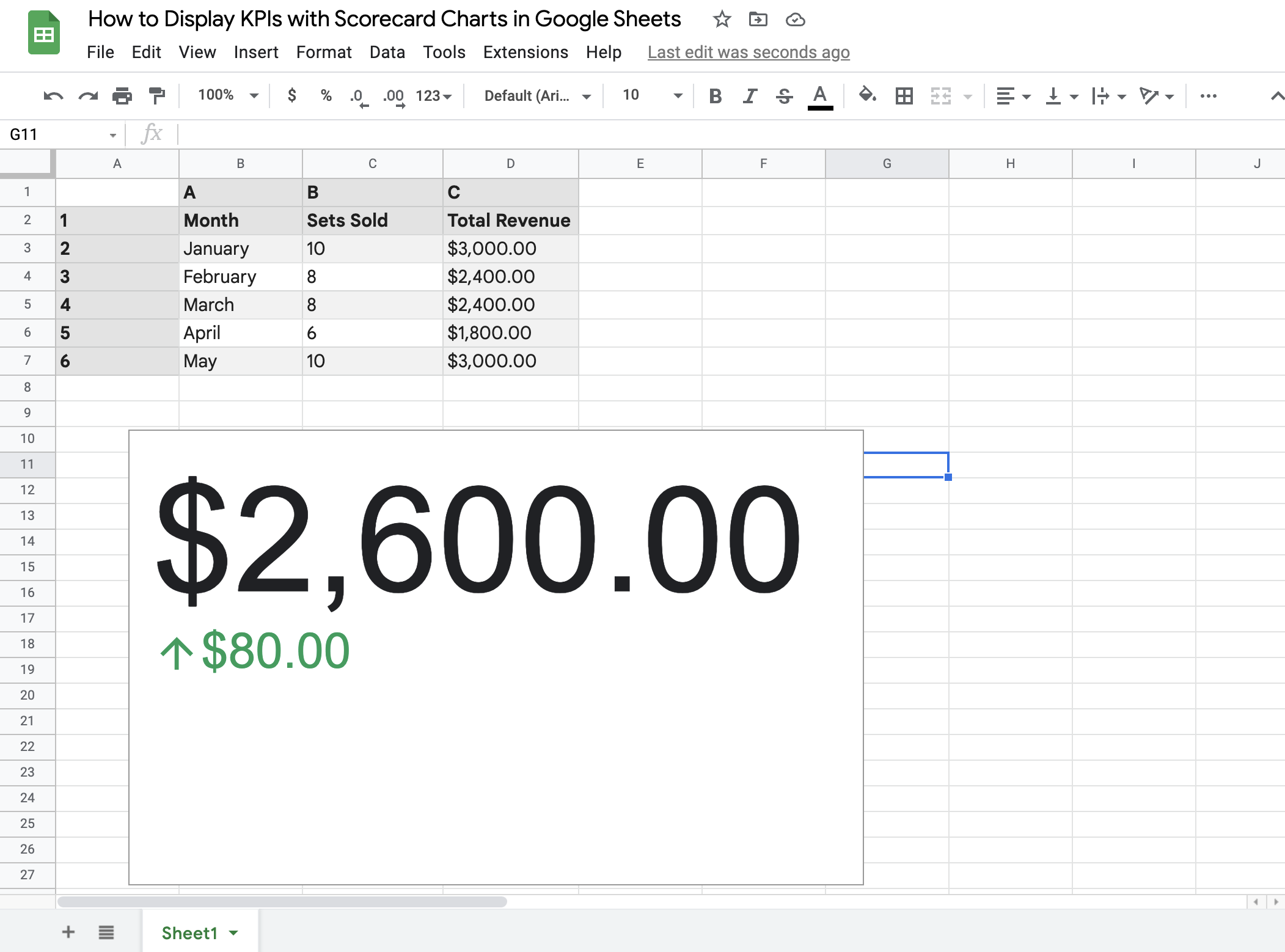
By default, the setting you’ve chosen for the Key Value will also apply to the Baseline Value. Hence, they’re both averages of the multiple cells you’ve selected. If you want to change it, hover your cursor above the word Average next to the three vertical dots in the Baseline Value bar. Then, choose a different value. Like, median, for example.
If you have noticed, we’ve only made changes to the scorecard chart’s Setup in the Chart Editor. Let’s talk a bit more about customizing your scorecard chart in the final section.
How to Customize your Scorecard Chart in Google Sheets to Display your KPIs
You can make your scorecard chart look more visually appealing using your Chart Editor.
- Double-click the Scorecard chart or click the Click Customize.
- After that, choose the element you’d want to change:
- Chart Style. You may change the background or chart border color by clicking the dropdown color selection menus. Depending on your default theme on Google Sheets, you may have a preset Font for your scorecard chart. However, you may also change it here.
- Key Value. As for the key value, you may change the font size, color, style, and format. Depending on the KPI values you are working on, you may also change the scale factor from 0.1 to 1,000,000,000.
- Baseline Value. If you want to compare your baseline value to the key value besides the absolute change, you can also do that. Click the first dropdown menu from the Baseline value section and choose Percentage change.

Aside from the font size, color, style, and format, you can also change the colors for the change in value. By default, green denotes a positive change and red for a negative one.
- Chart and axis titles. You can add a chart title or subtitle if you need it to make your chart easier to distinguish from one another.
Now, you have everything there is to know about displaying KPIs with scorecard charts in Google Sheets. You may also spice things up by adding customization to the scorecard if you wish to present it to a larger audience.
Hopefully, making scorecard charts in Google Sheets has become less daunting with the help of this tutorial. Ready to give it a try? Encode your KPIs on your Google Sheets now and have a go at it!


