


This guide will explain how to add a vertical line to a line chart in Google Sheets.
Users may want to draw a vertical line to represent a specific target, division, or milestone date in a given line chart.
Let’s take a look at a quick example of a scenario where the user might want to add a vertical line to a line chart.
Suppose you have a population dataset with both historical and projected data. You want to represent the population growth as a line chart. To avoid confusion, you want to add a marker to indicate the separation between historical and projected data.
For example, the chart may show the population for the past ten years and the projected growth in the next ten years. Is it possible to add a vertical line to your line chart to represent the shift from historical to projected data?
Google Sheets does not have a built-in feature to add a vertical line directly to your graph. However, users can use a workaround that converts a second series into a vertical line. This workaround involves adding a new column to your dataset specifically for this marker.
Now that we know when it can be useful to add a vertical line to a line chart, let’s look into a few sample spreadsheets that use this method in their charts.
A Real Example of Adding a Vertical Line to a Line Chart in Google Sheets
Let’s take a look at a real example of a Google Sheets spreadsheet that adds a vertical line to a line chart.
In the example below, we have a dataset of weekly sales shown as a line chart. A red vertical line is used to separate the chart into two halves.
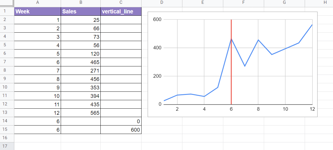
To get the red vertical line, we need to add two data points. To add a vertical line in the Week 6 point, we can add two points with the week set at 6. We add a new column called vertical_line to determine how high the vertical line will be. In this example, we set up our vertical line to reach the top of the visible y-axis, which is 600.
In the example below, we’ve added two vertical lines to our line chart. Each vertical line requires an additional column in our dataset.

You can make your own copy of the spreadsheet above using the link attached below.
If you’re ready to add a vertical line to your line charts, read our step-by-step guide in the next section!
How to Add a Vertical Line to a Line Chart in Google Sheets
This section will guide you through each step needed to add a vertical line to a line chart in Google Sheets. You’ll learn how to modify your dataset and chart style to achieve a straight line that divides your graph.
Follow these steps to add a vertical line to a line chart:
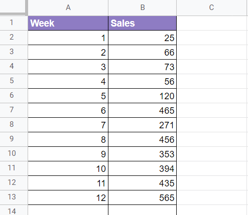
- First, select the dataset you want to convert into a line graph. For this guide, we’ll use a dataset of weekly sales shown below.
- We want to add a vertical line in the sixth week. To achieve this, add a new column to the dataset labeled ‘vertical_line‘. Afterward, add two new rows to the table. Each row should have the indicated week and a corresponding number that determines how high the line will be. For this example, we will draw our vertical line from 0 to 600.

- While the entire dataset is selected, click on the Chart option under the Insert menu.

- Your dataset should now be visualized as a line chart. The additional rows we’ve added to our table are rendered as a vertical line in the graph.
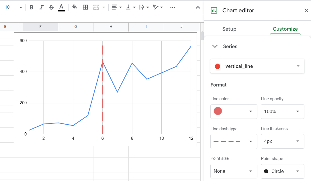
- Users can customize the vertical line using the Chart editor’s Customize menu. In the example below, we’ve increased the thickness and line dash type of the vertical_line series.
- This method also supports datasets with multiple series. In the example below, our line graph plots two data series alongside our vertical line.

Frequently Asked Questions (FAQ)
- Can I add labels to the vertical line
Users can add another column to the dataset to specify labels for each vertical line. The option to add labels can be found in the Chart editor’s Setup tab. In the example below, we’ve added labels to our vertical lines to indicate the end of various phases in a sales strategy.

This step-by-step guide should be all you need to add a vertical line to a Google Sheets line chart. Our guide shows how you can add an additional column to your dataset to set up a vertical line for your visualization.
Using a line chart is just one way you can use Google Sheets to visualize your dataset. With so many other Google Sheets functions available, you can surely find one that suits your use case.
Are you interested in learning more about what Google Sheets can do? Subscribe to our newsletter to find out about the latest Google Sheets guides and tutorials from us.


