This guide will discuss in detail how to analyze quantitative data in Excel.
Quantitative data in research refers to using numbers, charts, or tables rather than words or text, variables, and factors. So this would mean analyzing our data and representing it with charts or tables.
And Excel is an excellent tool to use when dealing with quantitative data analysis. Because it has many built-in tools available for data analysis, analyzing quantitative data is easier and more efficient in Excel.
Let’s take a sample scenario wherein we need to analyze quantitative data in Excel.
Suppose you are a graduating student who needs to complete a research paper. And you have already collected the data from the survey. Now you only need to analyze your data to complete your research. And you opted to use Excel since it would make the task faster and more efficient.
Great! Now let’s dive into a real example of analyzing quantitative data in Excel.
A Real Example of Analyzing Quantitative Data in Excel
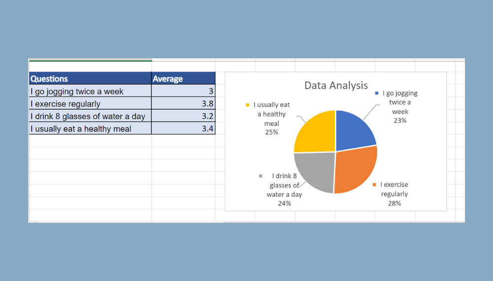
Let’s say we have collected data from our research survey. And the next step would be to organize and analyze the data. Finally, we need to represent the results through charts or tables. So our data set would look something like this:

Firstly, we need to arrange and filter our data. More importantly, we need to remove duplicated data. Furthermore, we can easily remove duplicate values using conditional formatting.
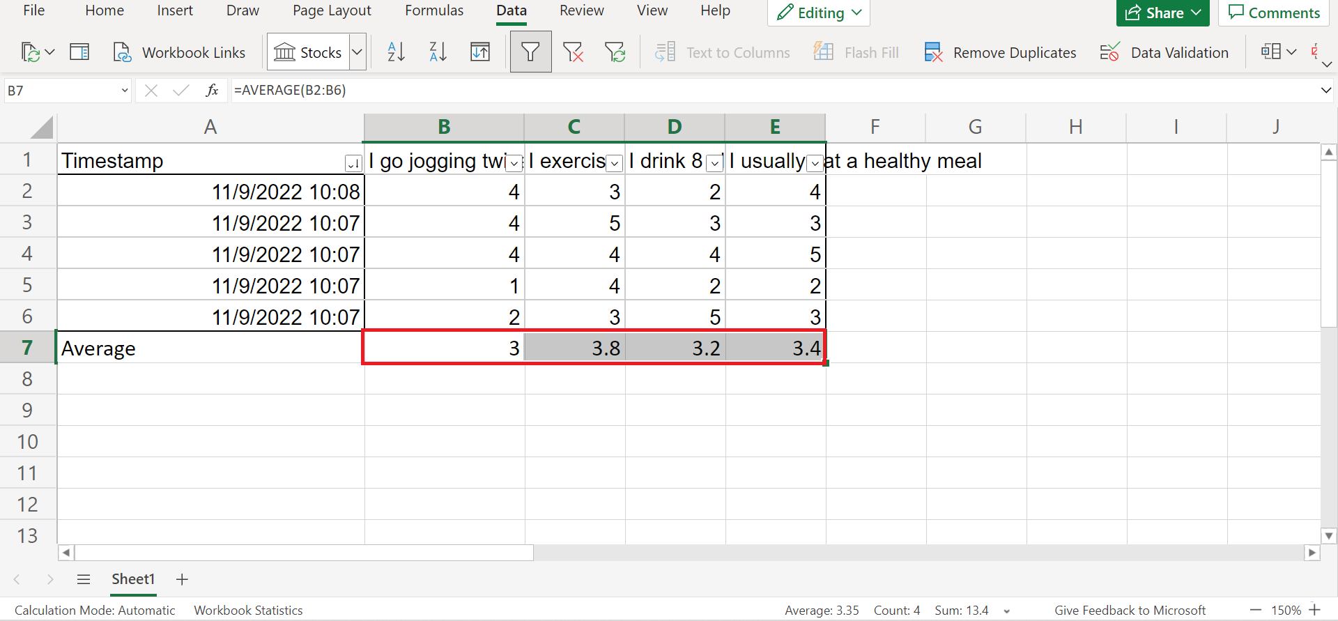
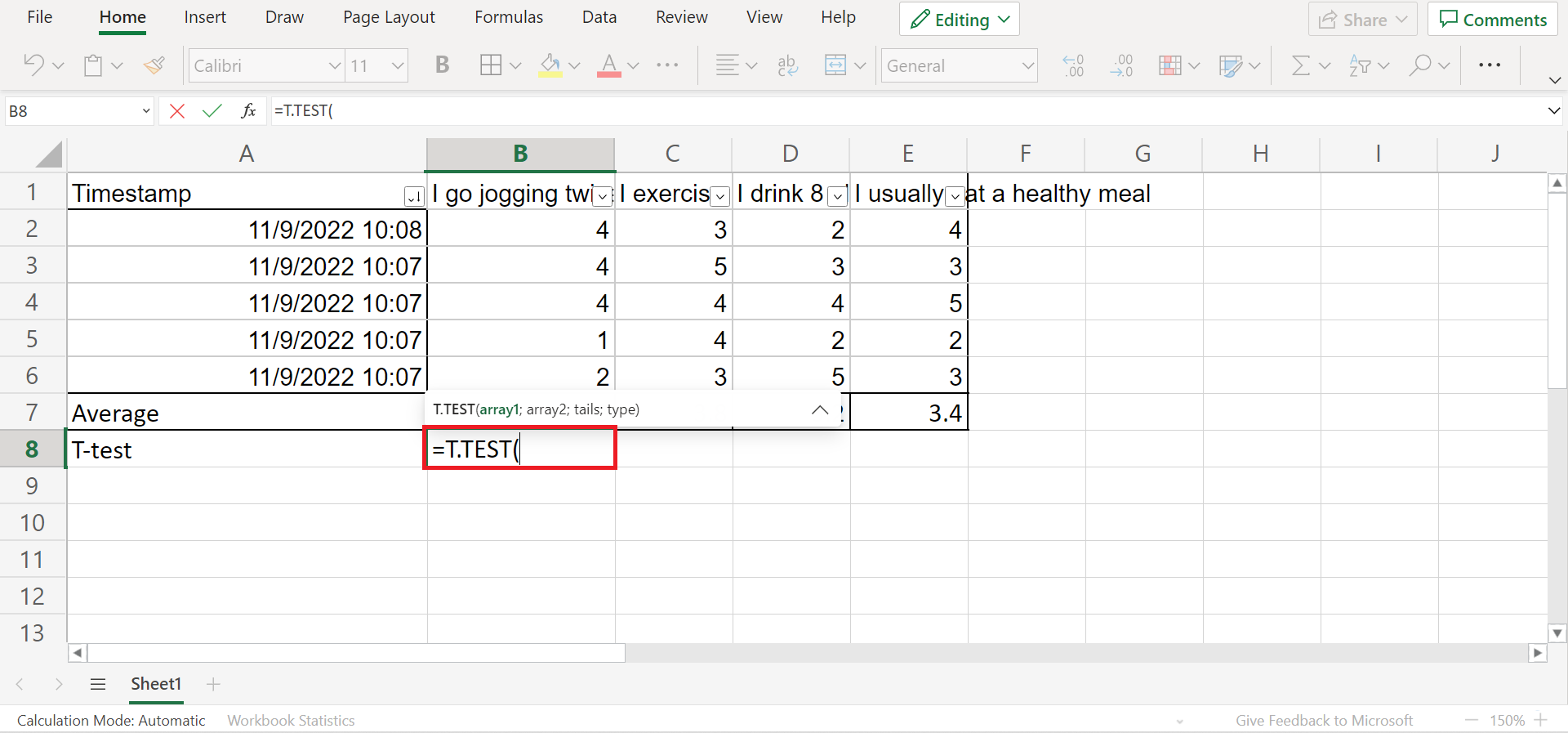
Secondly, we can also calculate the average results for each question in our survey. Additionally, we can also calculate the t-test using the T.TEST function in Excel.
Thirdly, we will create a clean table containing the results of each question. Afterward, we can make a chart to display our results using the clean table.
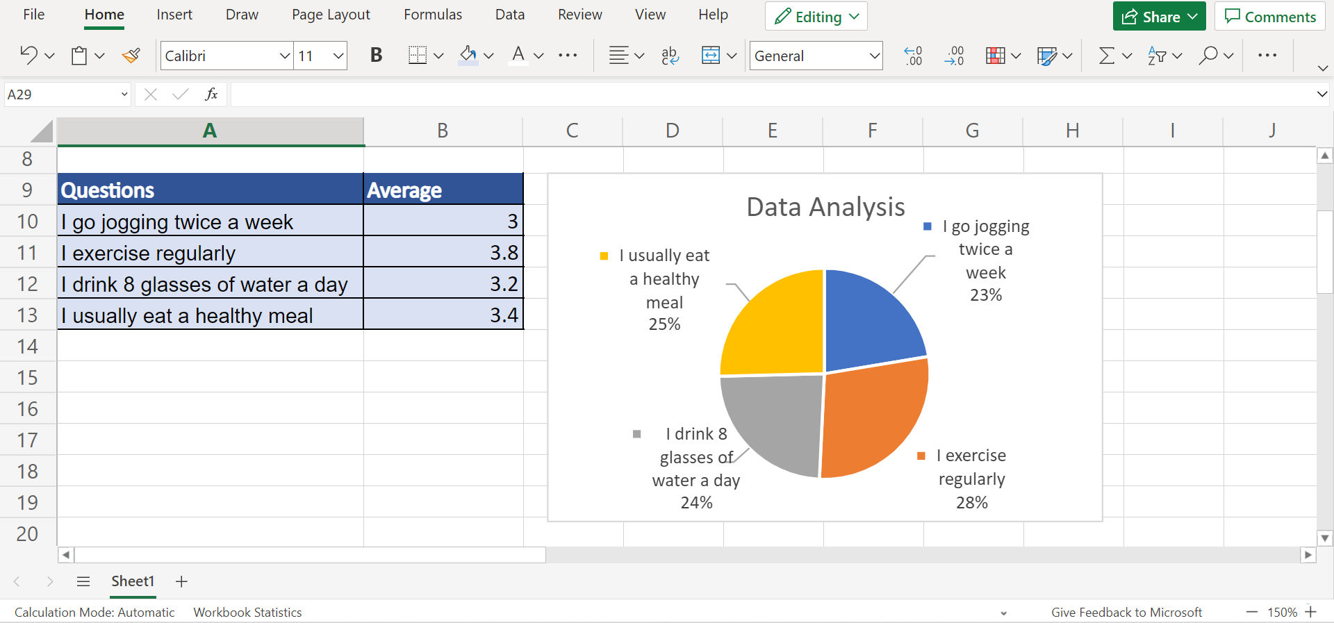
And our final output would look something like this:
You can make your own copy of the spreadsheet above using the link attached below.
Awesome! Now it’s time to learn the step-by-step process of how to analyze quantitative data in Excel.
How to Analyze Quantitative Data in Excel
In this section, we will explain the process of how to analyze quantitative in Excel, from organizing the data to analyzing and displaying the results with charts or tables.
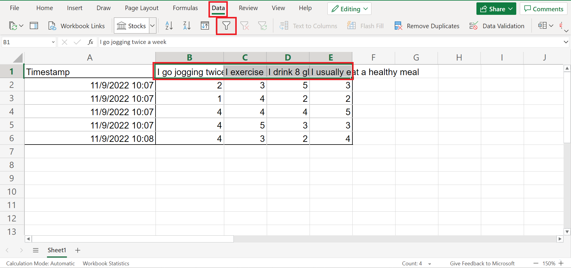
1. Firstly, we need to organize our data set. So select the headers of the data set and go to the Data tab. Then, click on the Filter icon to apply a filter to the headers.
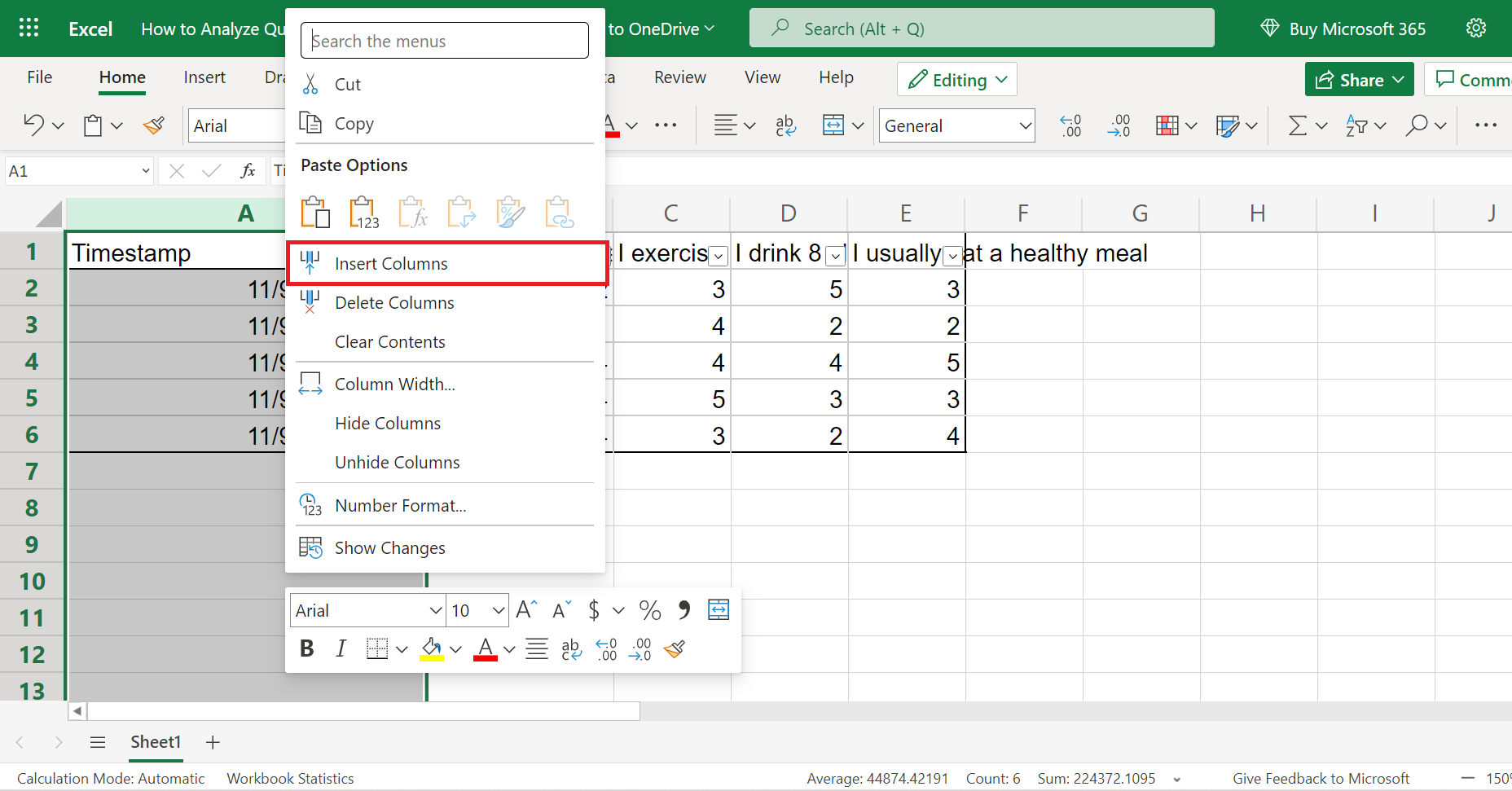
2. Secondly, we need to check for duplicated values and remove them. To do this, we first need to create a unique ID to identify them. So select column A and right-click. Then, select Insert Columns in the dropdown menu. And this will insert a new column on the left where we will input our unique ID.
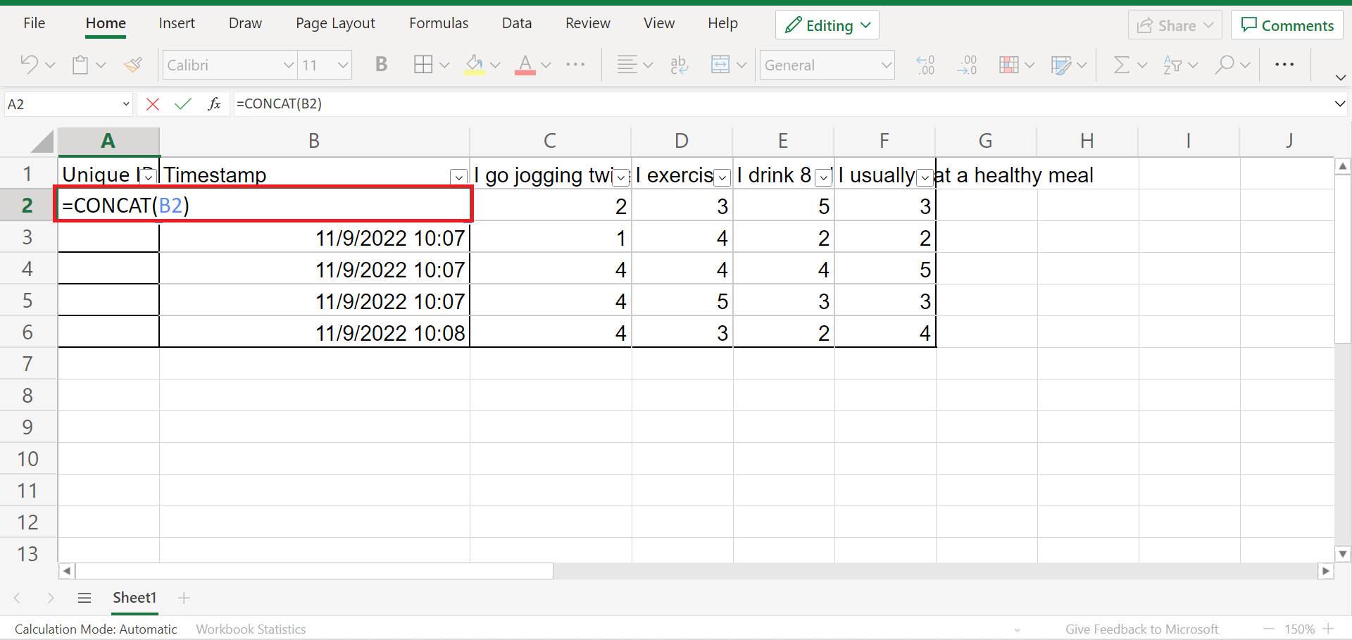
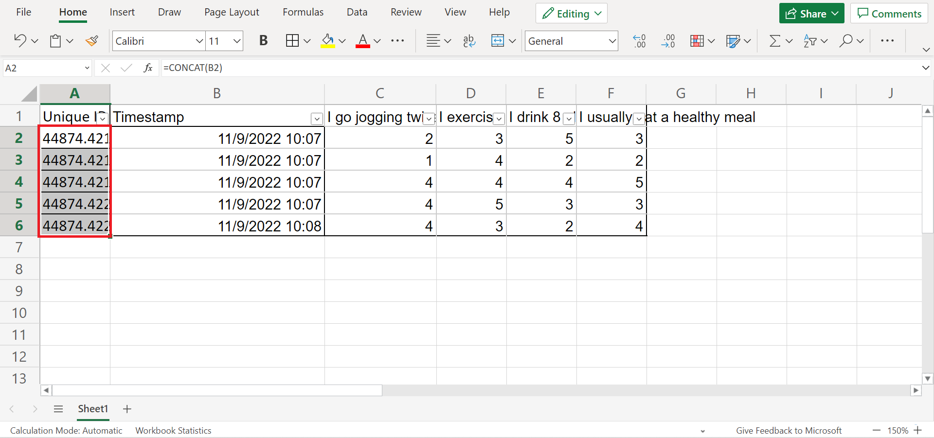
3. Thirdly, we will use the CONCAT function to create our unique ID. So input the formula “=CONCAT(B2)” in cell A2. Then, press the Enter key to return the result.
4. Next, drag down the formula to copy to the rest of the column and obtain a unique ID for each response.
5. Afterward, select columns A and B and go to the Home tab. In the Home tab, select Conditional Formatting. Then, select Highlight Cell Rules. Finally, click Duplicate Values.
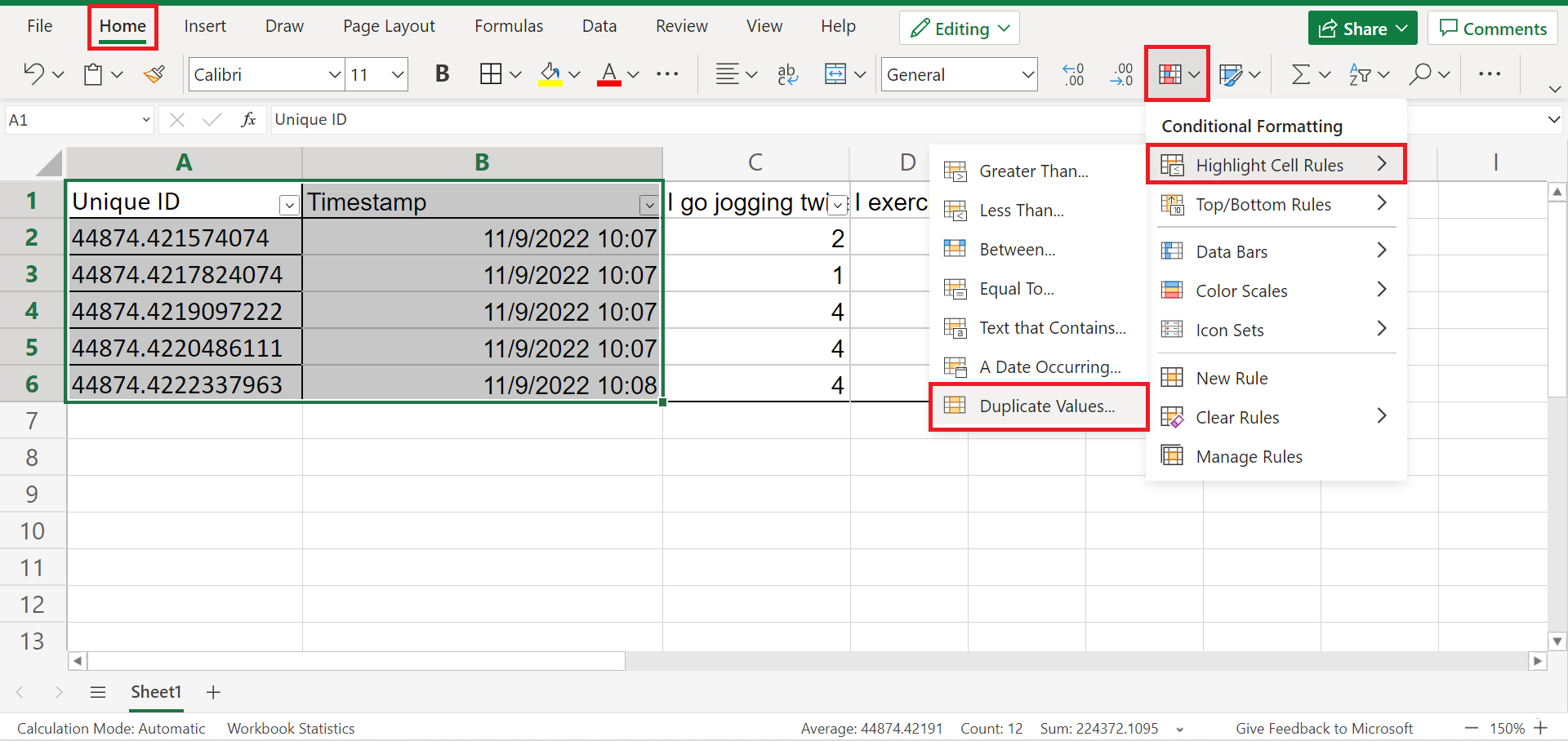
6. And the Conditional Formatting window will appear. Unless you wish to change the highlight colors, we can simply click Done to apply the format.
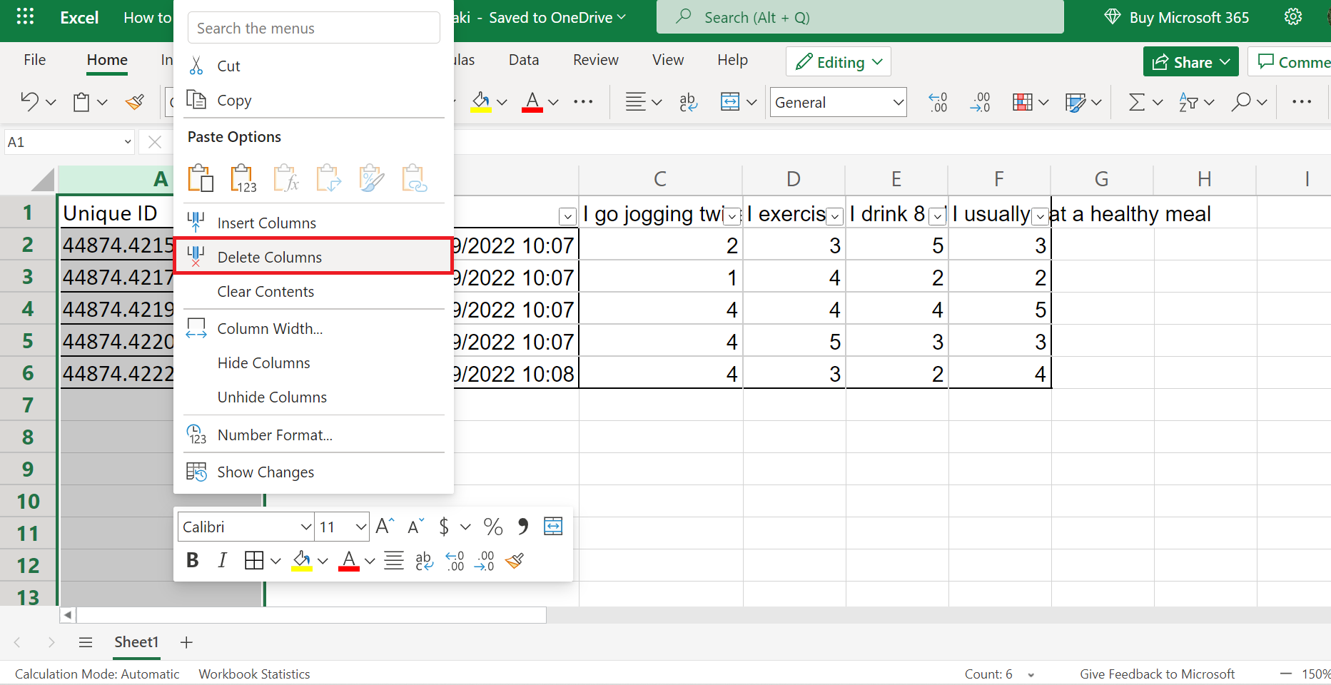
Essentially, highlighted cells would imply that they are a duplicate value, and we can delete them from our data set.

7. Then, we can delete the Unique ID column from our data set since we have identified the duplicated values.
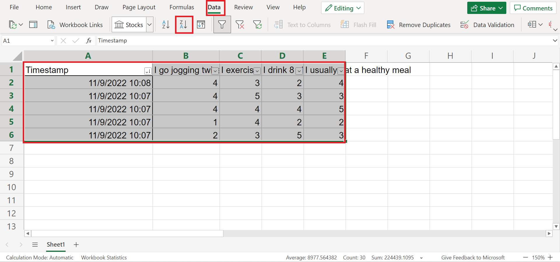
8. Next, we will sort of data set. So select the entire table and go to the Data tab. Then, click on Sort Descending. This will sort our data set from the largest to the smallest, making it easier to do calculations later on.
9. Afterward, we can start doing calculations. In this case, we want to obtain the average results for each question. So input the formula “=AVERAGE(B2:B6)”.

10. Next, simply drag the formula to the right to copy and get the results for the rest of the questions.
11. Additionally, we can also perform hypothesis testing in Excel. For example, we can quickly do a t-test in Excel if we have two data results to compare. To use the T.TEST function, simply type in an “=” equal sign to activate a function and type “T.TEST”.
Then, select the necessary components needed, such as the two groups or ranges you want to analyze, one-sided or two-sided, and the type of t-test you want.
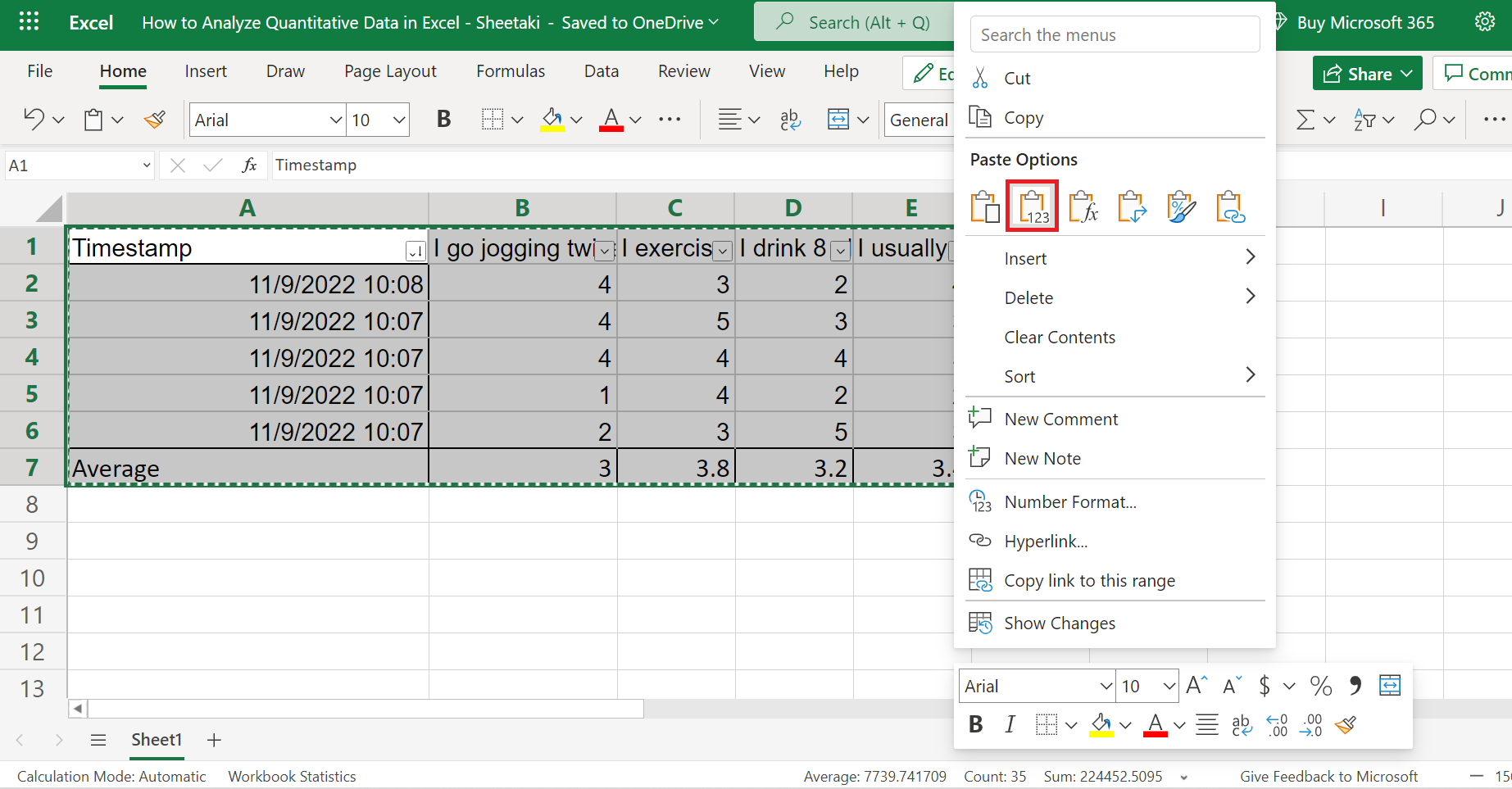
12. Now, we are done organizing and analyzing our data. Next, we will start presenting the results. Firstly, let’s create a new clean table. So select the entire table and press Ctrl C to copy. Then, right-click and choose the Paste Value option.
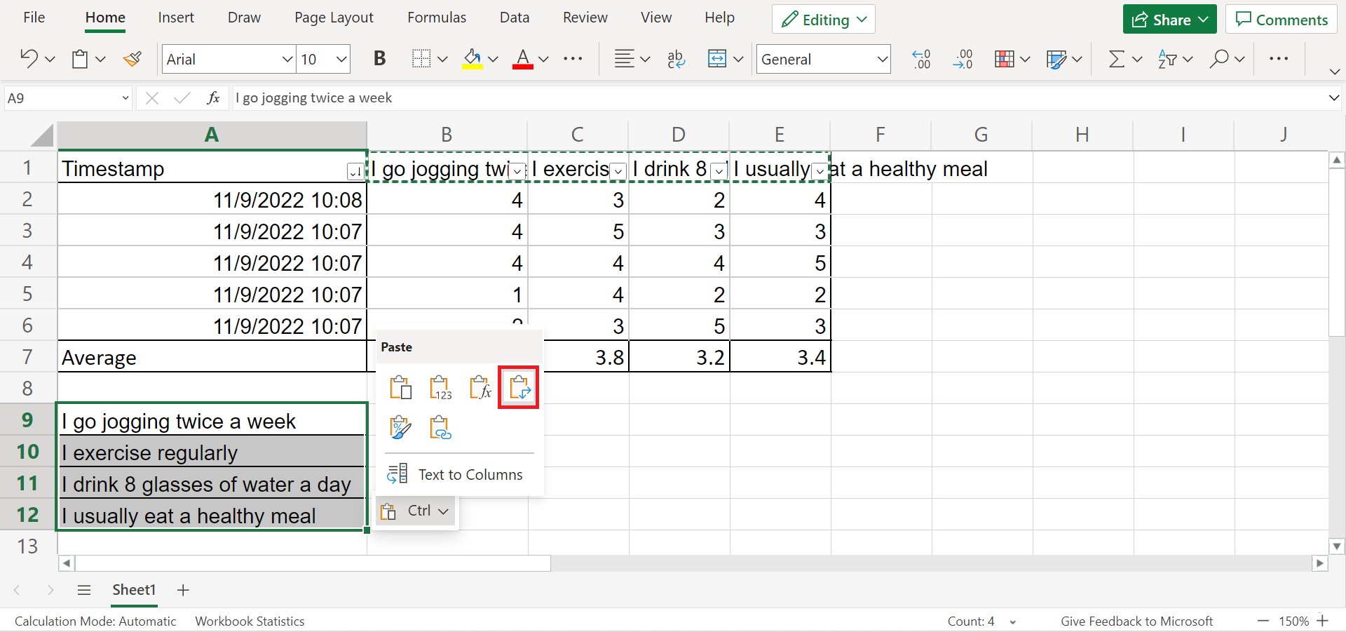
13. Next, select the questions and press Ctrl C to copy them. Then, choose another cell to paste it. So right-click and choose the Paste Transpose option. And this will paste the questions vertically.
14. Afterward, we will repeat the same process for the average results. So copy the averages and choose the Paste Transpose option to display them vertically.

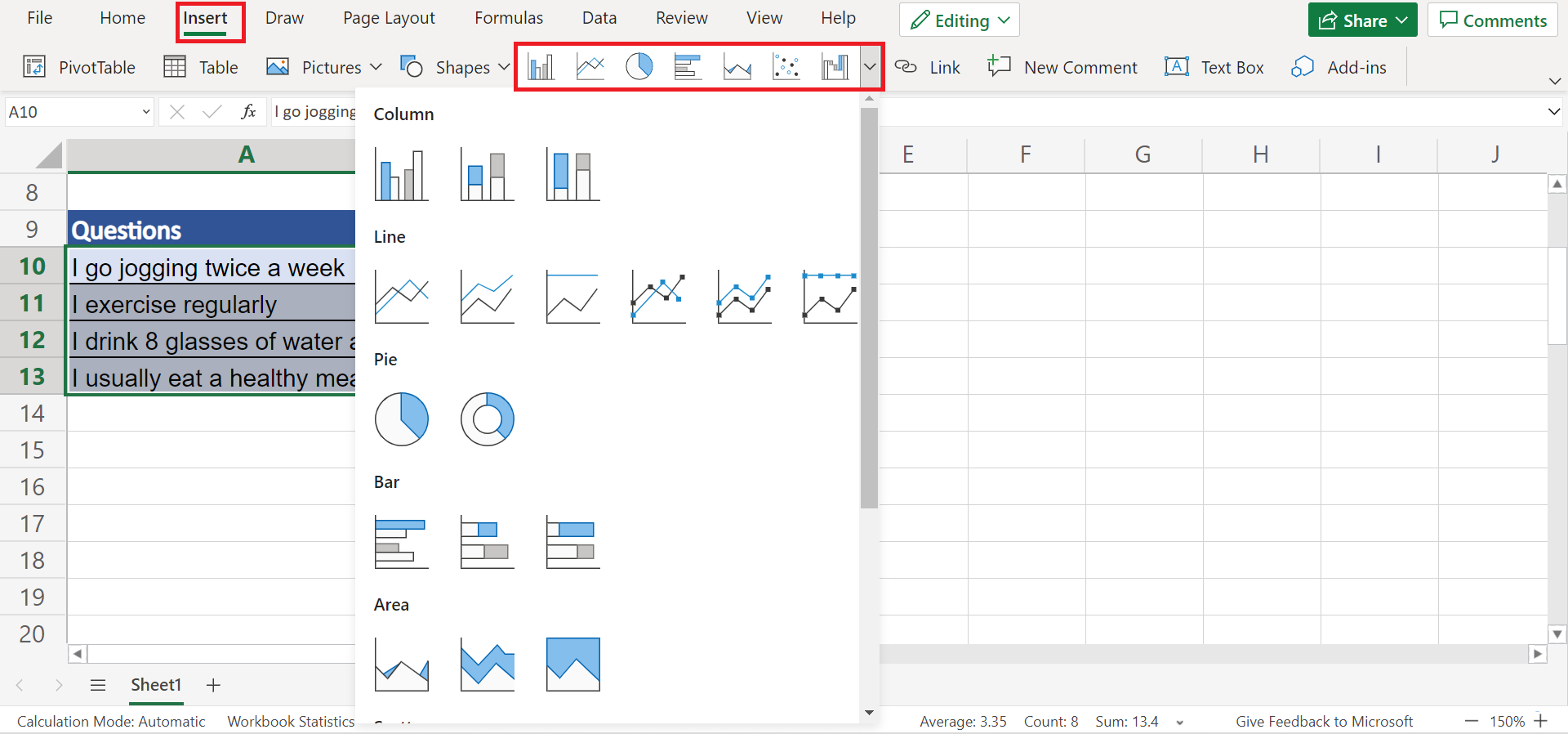
15. Next, we can display our results using charts. Firstly, select the data and go to the Insert tab. From there, click on the Charts dropdown menu and choose any chart appropriate for your data set. In this case, we will choose a Pie chart.
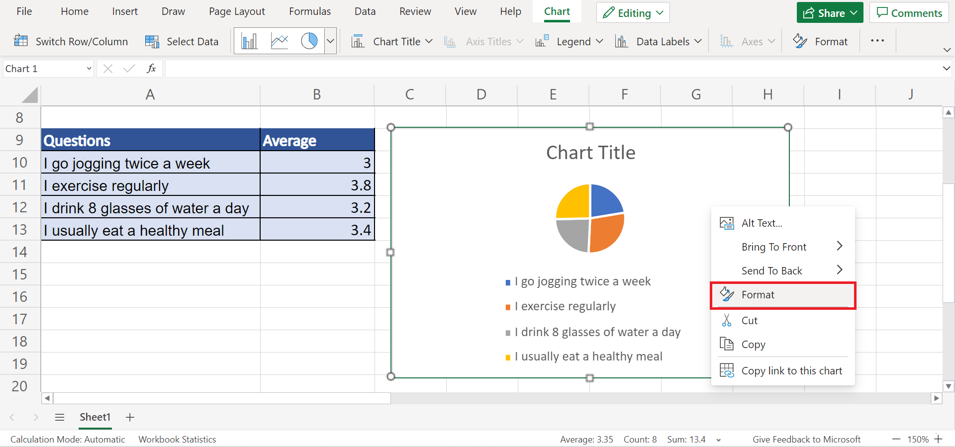
16. Afterward, the chart will appear. Then, right-click the chart and select Format to edit the formatting of our chart. Alternatively, we can simply double-click any part of the chart.
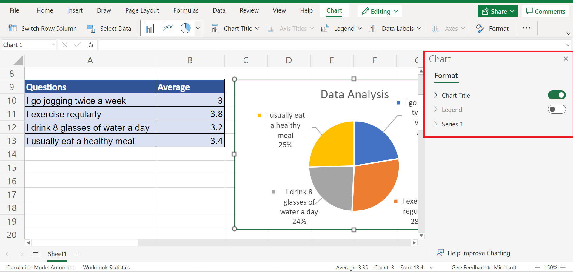
17. And the Chart window will open. In the Chart window, we can make some changes to the formatting of our chart. So we have the option to edit the Chart Title, Legend, and Series of the chart. Simply click on the arrow to open them and start making changes to your preference.
18. And tada! We have successfully analyzed quantitative data in Excel.
And that’s pretty much it! We have discussed thoroughly how to analyze quantitative data in Excel. And there are still many tools in Excel you can utilize when working with quantitative data besides calculating the average, t-test, and using charts. Now you can apply this in your own work.
Are you interested in learning more about what Excel can do? You can now use the various other Microsoft Excel formulas available to create great worksheets that work for you. Make sure to subscribe to our newsletter to be the first to know about the latest guides and tutorials from us.