


This guide will explain how to create a violin plot in Microsoft Excel using Python.
Table of Contents
Microsoft’s recent introduction of the Python in Excel feature is enabling users to use the power and versatility of Python to analyse their data. This allows users to execute Python code seamlessly within an Excel spreadsheet.
Python itself includes a wide library of functions that can also help with data visualization. One of these is the violin plot, which can help users compare the distribution of numeric data across different groups.
In this guide, we will provide a step-by-step tutorial on how to use Python in Excel to generate violin plots through the Seaborn data visualization library.
We will also cover how to load an existing dataset into Python in Excel and how to compare distributions across different groups.
A Real Example of Creating a Violin Plot in Excel
Let’s explore a few simple examples where we can use Python in Excel to create a violin plot from an existing dataset.
Generating a Violin Plot from an Excel Range

In the table above, we have the first thirteen rows of a dataset containing the ages of a sample population. We want to create an appropriate data visualization to understand the distribution of the ages.

Luckily, Python in Excel supports eaborn, a Python data visualization library that provides a high-level interface for creating visually appealing and informative graphs and charts.
We can use the following Python code to generate a violin plot using the seaborn library.
import seaborn as sns
import pandas as pd
df=xl(“Sheet1!A1:B31”, headers=True)
sns.violinplot(x=df[“age”])
The code above starts with the importing of the seaborn and pandas libraries. Next, we’ll need to load our dataset in the cell range A1:B31 into a DataFrame object df. After loading our data into Python, we’ll use the function sns.violinplot(x=df[“age”]) to generate a violin plot.

The function should then return an image of the generated chart.
Generating a Violin Plot Comparing Multiple Groups
We can also use the sns.violinplot() function to generate a violin plot comparing distributions between different groups.

In the table above, we have a similar dataset of ages that includes an additional gender column. We want to create a violin plot that compares the distribution of age between male and female respondents.
We can modify our seaborn function as follows:
sns.violinplot(x=df[“age”],y=df[“gender”])
By setting the y argument to the gender column, we are creating multiple violin charts stacked on top of each other.

Running the Python code will result in a violin plot with multiple violins comparing the distribution of male and female respondents.
Click on the link below to create your own copy of our examples.
Head to the next section to read our step-by-step tutorial on how to set up a violin plot in Excel.
How to Create a Violin Plot in Excel
- In your Excel spreadsheet, select a blank cell and type the keyboard shortcut Ctrl+Alt+Shift+P to convert the formula bar into a Python code editor.
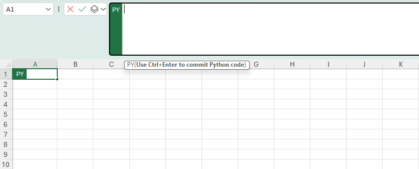
- You may also achieve this by selecting Formulas > Insert Python.

- Type “import seaborn as sns” and “import pandas as pd” to import the seaborn and pandas libraries.

- Next, we’ll need to load our dataset into a pandas DataFrame.
 In our example, our dataset is located in the cell range A1:B31 in Sheet 1. To load our dataset, we’ll use the code df=xl(“Sheet1!A1:B31”, header=True). We must set header=True to make it easier to specify the age column later on.
 - Next, we’ll use the sns.violinplot() to generate a violin plot based on the age column of our dataset.
 In our example above, we use the code sns.violinplot(x=df[“age”]).
 - Hit Ctrl+Enter to execute the Python code. If the cell returns the text “Image”, set the Python Output to Excel Value. You can find this option by clicking on the icon directly to the left of the Python editor.

- You should now have a cell containing a violin plot image.
You can click on the Create reference icon in the corner of the image to generate an image that you can place anywhere in your spreadsheet.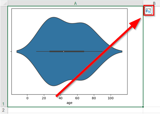
FAQs
- What is the advantage of using a violin plot over a box plot visualization?
Violin plots provide all the quartile data points that box plots do while also offering additional insight into the distribution of the dataset by displaying its density at different values. - How does one interpret the various components within a violin plot
A violin plot features a symmetrical, mirrored visualization of the distribution of a dataset. The width of the plot at any given y-value represents the density of the data at that y-value, with wider sections indicating higher data density.
To learn more about using Python in Excel, you can read our post on how to use the scikit-learn library in Excel. You may also be interested in our guide that explains how to create a five-number summary of a dataset in Excel.
That’s all for this guide! Be sure to check out our library of spreadsheet resources, tips, and tricks!


