Understanding how to create a Pivot Table report to summarize data in Google Sheets is useful if you want to analyze your data efficiently.
Table of Contents
Pivot Table report in Google Sheets is a quicker and more flexible way than formulas when it comes to exploring and summarizing your data.
Let’s take an example.
Say you have a list of different property type categories for rent, with their locations and prices, and need to know how many properties of each type there are or what is the total cost of all the apartments. 🏠🏘
We could do this with formulas, using a COUNTIF and a SUMIF but if you change your mind and would want to know the total cost of all the apartments at a certain location, you would have to modify all your formulas, which could be boresome.
So how do we do that?
Easy. With only a few mouse clicks and without writing a single formula, you can create your Pivot Table report that will summarize the data for each property type and location.
Let’s first take a look at the anatomy of a Pivot Table report in Google Sheets so you can better understand how Pivot Table reports work.
The Anatomy of the Pivot Table Report
Three main parts of Pivot Table reports are Rows, Columns, and Values.
- Rows – Rows section will always appear on the left side of your Pivot Table report. When you click ‘Add’ under the ‘Rows’, you will get a list of all of the column heading from your selected data range. Once you choose one of the column headings, all of the unique items from that column will appear in your Pivot Table report.
- Columns – Columns section will always appear at the top part of your Pivot Table report. When you click ‘Add’ under the ‘Columns’, you will get a list of all of the column heading from your selected data range. Once you choose one of the column headings, all of the unique items from that column will appear in your Pivot Table report.
- Values – Values section will always appear in the middle part of your Pivot Table report. When you click ‘Add’ under the ‘Values’, you will get a list of all of the column heading from your selected data range. Once you choose one of the column headings, all of the individual values from each row are combined together into a single value that will appear in your Pivot Table report (if you have a list of revenues you might want to sum them up or average them, or if you have a column of text values, you may want to count them).
Now that you know the main parts of Pivot Table reports, we will show you some real examples before showing you how to create a Pivot Table report to summarize data in Google Sheets.
Real Examples of Using Pivot Table Report to Summarize Data in Google Sheets
Remember our properties and their locations and values? 🏘🏠
We have created different Pivot Table reports using the same data set.

Now, let’s take a look at the Pivot Table reports we have created. This will help you better understand how Pivot Table reports work and how to create your own Pivot Table report to summarize your data in Google Sheets.

The first picture shows the SUM of prices for each property type category at each location, as well as the total for each property type category (at all locations) and Grand Total (SUM of all prices). You can also remove the Grand Total from your Pivot Table report.

The picture above shows all of the properties sorted by property type category and then by location, as well as the SUM of their prices. It also shows the Grand Total.

You can also add a new column that shows how many properties of each property type category are in each location.

You can also remove some data from the Pivot Table report (in this picture, we removed the ‘Houses’). All this can be done with just a few mouse clicks.
Pivot Table report aggregates your data. It combines several rows or columns of data into a single line.
How to Create a Pivot Table Report to Summarize Data in Google Sheets
Let’s begin creating your own Pivot Table report to summarize data in Google Sheets, step-by-step:
- First, open the sheet that contains your data you will use to create a Pivot Table report in Google Sheets and select the data range. For this guide, I will choose the range A1:C11.

- Then, go to the upper menu and select Data > Pivot Table.

- This will open the ‘Create Pivot Table’ toolbar. Choose where you would want to insert your Pivot Table report (in a new sheet or existing sheet). For this guide, we will use the new sheet. Click on the ‘Create’ button below.

- This will create a new sheet (Pivot Table 1) and will open the ‘Pivot Tabel editor’ toolbar on the right.
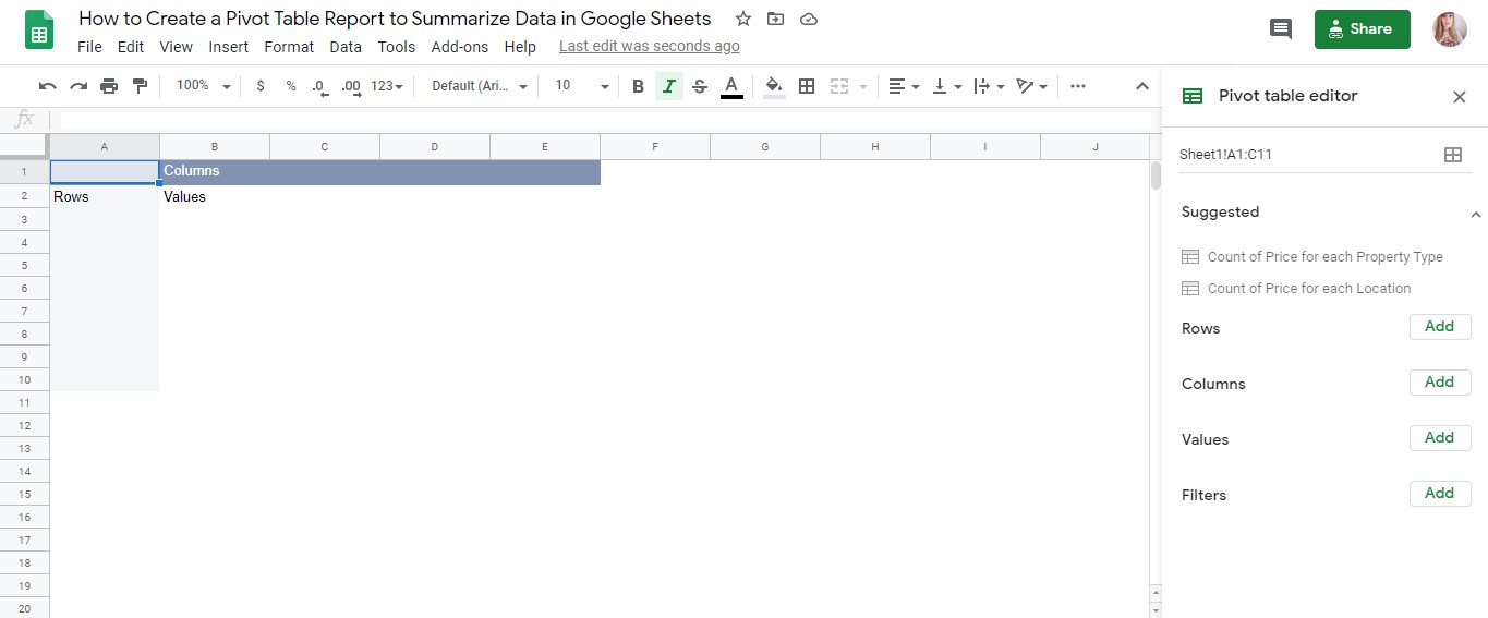
- You can first check if Google’s suggested Pivot Table reports suits your need and answer your questions. Since none of the available suggestions suits our needs, we will create a customized Pivot Table report.

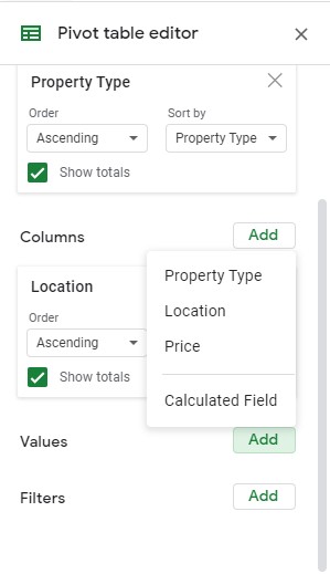
- Click ‘Add’ next to Rows and Columns to select the data you would like to analyze. For this guide, we will add ‘Property Type’ to Rows and ‘Location’ to Columns.

- Then, click ‘Add’ next to Values to select the values you would want to display within the rows and columns. For this guide, we will add ‘Price’ to Values.
- If you did everything according to the instructions, you should get a Pivot Table report like this. Once you are done, click on the ‘X’ button in the upper right corner of the ‘Pivot Table editor’ tollbar or any blank cell around your Pivot Table report to close it. To open the ‘Pivot Table editor’ tollbar again, click on any cell in your Pivot Table report.

You can also use the ‘Explore’ toolbar to automatically build a Pivot Table report. To access the ‘Explore’ toolbar, hover your mouse over the star-shaped button in the bottom right part of your spreadsheet and click on it. You can use the keyboard shortcuts (Alt+Shift+X), as well.
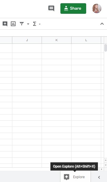
Once the ‘Explore’ toolbar opens, you will see ‘Answers’.

Choose one of the suggested questions (or type your own), and you will get a matching Pivot Table report (depending on the question you ask, sometimes you may get just the answer, or formula and chart).

You can also scroll down until you get to the Pivot Table. To get more suggestions, click ‘More’. You may choose one of the available Pivot Table report designs too. If, however, that it does not suit your needs, go ahead and customize it until you get exactly what you are looking for.

That is it! Now you know how to create a pivot table report in Google Sheets!
Make a copy of the example spreadsheet using the link below and take a closer look at different Pivot Table reports in Google Sheets:
Or you can take a look at the other Google Sheets formulas and learn how to use them with Pivot Tables to summarize your data even more effectively. 🙂