Learning how to create a project timeline in Microsoft Excel is useful when planning complex projects by having a visual component.
Table of Contents
One of the most significant parts of project management is the project timeline. From the beginning to the end of the project, the flow of tasks must be planned and determined.
The project timeline is a set of actions that must be completed in a specific order to complete the project within the specified time frame. Simply put, the project timeline is a timetable with to-do lists.
All of the tasks provided will have a start date, duration/period, and end date so that you can keep track of the project’s progress and ensure that it is completed on time.
In other words, information that is clearly presented and exhibited will be much easier for the human brain to process. As a result, when planning large projects with many moving parts, the visual component is critical.
The simplest way to create a project timeline in Microsoft Excel is by using the smart tools through graphical representations. In today’s tutorial, we will be exploring using scatter charts in Excel.
Have you not heard it? Don’t worry as we will go through each chart or Excel tool and explain what it is and how it can help us create a project timeline in Microsoft Excel.
This will be the scatter plot that appears on your sheet.
You may download a copy of the spreadsheet by clicking on the link below.
Once you are ready to start the tutorial, we can jump into creating the project timelines using different charts together!
Creating a Project Timeline Manually in Microsoft Excel
In this example, we will be building our own timeline table to visualize a product creation process. This section will walk you through each step of creating a project timeline in Microsoft Excel.
Follow these steps to start creating a project timeline for your product creation:
- First, we need to figure out the timeline for product creation, from the number of tasks or processes to be performed, the datelines, and also the number of days used to perform a task.
- Once all the above are made known, we list them out tidily on the sheet.
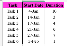
- Now we will start creating the project timeline. Click on the cell you want to start on, in this example, it will be E1.
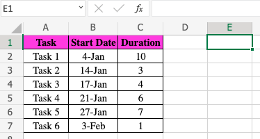
- We will create a title by entering
Project Timelinein E1 and also list down the tasks accordingly vertically.

- Next, we list down all the relevant dates. Since the project starts on the 4th of January, we will key in
4 Janin cell F2. The cell will automatically recognize4 Janas a date and format the cell accordingly.
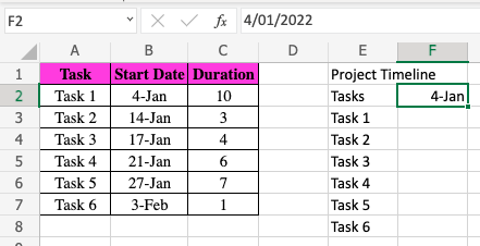
- Then, we will drag the corner dot of F2 to fill in the rest of the dates horizontally until it reaches the 3rd of February.
![]()
- Once we reach the 3rd of February, we then select the entire row of columns and double click on the line of the column heading. This helps to adjust the width of all the selected columns to fit the inputs keyed into the cells.

- A shortcut to select all the columns is to select column F, then press simultaneously Shift + Command + Right Arrow Key.
- Lastly, you can customize and design the project timeline table as to your preference, and it’s done!
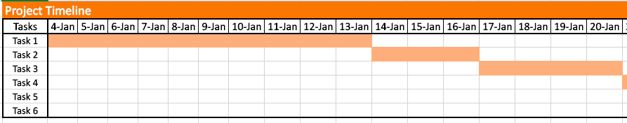
With this project timeline table, it is much easier to visualize which days you would need to meet which task’s deadlines and have a neater calendar to follow.
Creating a Project Timeline Using a Scatter Plot in Microsoft Excel
Dots are used to indicate values for two different numeric variables in a scatter plot (also known as a scatter chart or scatter graph).
The values for each data point are indicated by the position of each dot on the horizontal and vertical axes. Scatter plots are used to see how variables relate to one another.
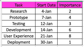
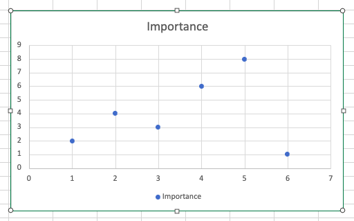
In this example, we are using the scatter plot to indicate the importance of a task in a project timeline. This means that the higher the dot or task is on the scatter plot, the more important the task is.
- Similar to the previous example, we will need to list down the specific tasks of a project and rate the importance of each task out of a total score of 10.
- Once the data are neatly displayed, we will select all the data to create a scatter plot. Select Insert, then select Scatter Chart and select the Scatter with only Markers.

- This will be the scatter plot that appears on your sheet.
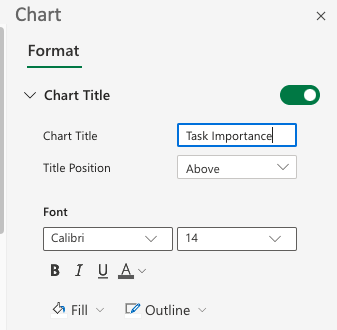
- Next, we need to edit the scatter plot. Double click on the graph itself, and a Chart Editing Box will pop up on the right of your sheet.

- First, we will rename the chart title to
Task Importance.
- Next, we need to change the Number Format. Make sure you input as per below. This will help to translate and format the dates shown in the graph.

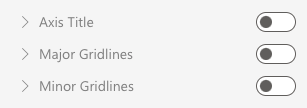
- Another thing to make sure of is to remove all major gridlines on both horizontal and vertical axis to give the graph and clean and professional look.
- The last thing to edit is the market itself. To find that section, click Series “Importance” and select the dropdown for Market Options. You can then customize it to your liking.

- Once all the above are done, your scatter plot will look like this.

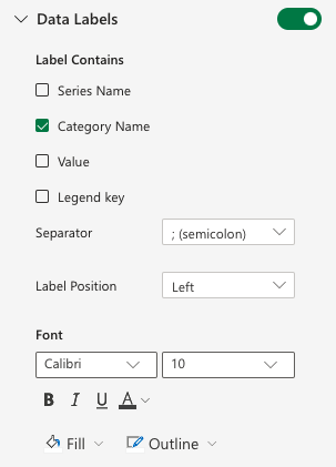
- To create a more informative scatter plot, we can also add labels next to the markers. Simply select the dropdown for Data Labels, tick Category Name, and customize the font as per your preference.
- Your scatter plot will look like these once labels are added.

By using the scatter plot, anyone can easily identify the most important task to focus on throughout the project timeline.
There you go! Now you know two different ways to display and visualize the timeline for any project.
Don’t forget to check out the rest of Microsoft Excel’s great features to help you improve and simplify your work in the real world!
Make sure to subscribe to our newsletter to be the first to know about the latest guides and tutorials from us.