Learning how to create a Gantt chart in Google Sheets is useful for creating a graphical display of a project schedule.
Table of Contents
Gantt charts are commonly used as a project management tool. It is a type of bar graph that helps visualize the project schedule. It is a popular way of showing various activities plotted against time. Each activity is presented as a bar, with its relative position and length along the time scale indicating the start and end dates, as well as the duration of the activity.
From a glance, one could be able to see the list of activities, duration, start and end dates of each, possible overlaps with other activities, and overall project duration. Indeed, a Gantt chart is a critical tool for anyone working on a project.
In this article, we’ll learn how to easily make a Gantt chart by making use of Google Sheets’ built-in chart maker. It has various chart types that you can use to quickly insert graphs. Although Gantt charts are not one of the available chart types, we shall learn how to tweak the stacked bar chart to create Gantt charts.
Consider this example.
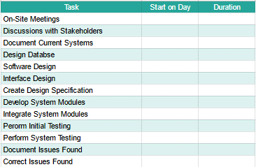
As the leader of your team, you have come up with a schedule to finish your team’s project efficiently. The list of tasks and corresponding start and end dates you have set are as follows:

There will be some tasks that coincide with other tasks, so sharing this schedule with your teammates as a table may not be the best option. Instead of presenting this information to your team as is, you wish to present it in a way that clearly depicts the timeline of tasks.
What could be a good way to present this schedule?
This is exactly the kind of situation where Gantt charts shine! Before we can create a Gantt chart in Google Sheets, we need to first tweak the data that we have. If we try to create a chart immediately using the format used above, it won’t properly present the information we intend to show.
Let me show you how to prepare your data to ensure that the Gantt chart you create will show the correct information!
Preparing the Data for a Gantt Chart
If you try to change the format of a cell containing a date into a number format, you will end up with an integer value. This is because dates in Google Sheets are actually numbers but formatted as dates. The integer value obtained is the number of days from the baseline of date and time in Google Sheets, December 30, 1899, 0:00:00.
This means that any dates used that after the 20th century would have an equivalent value of over 30,000. Using these values in the chart would render even year-long activities look insignificant based on the scale of numbers used. Therefore, we shall convert the data such that the reference would start with the earliest date in the project timeline.
- First, we need to create a new table for the chart to extract data from. Go ahead and copy the first column containing the list of tasks. Then, create two new columns with the headers Start on Day and Duration.
- Simply click on any cell to make it the active cell. For this guide, I will be selecting F2 where I want to show my result. Type out the formula: ‘=INT(B2)-INT($B$2)’. This takes the equivalent integer value of the start date of a given task and calculates the number of days from the start of the project.

- Press the Enter key to finish the formula. If an auto-fill suggestion box appears, click check to copy the formula to the remaining tasks. Otherwise, manually copy this formula to the remaining tasks.

- To determine the duration of each activity simply subtract the end date of each task to its start date. Enclose these values in the INT function to ensure that the result would be in a number format.

- Press the Enter key to finish the formula. Copy this formula to the remaining tasks.

How to Create a Gantt Chart in Google Sheets
Now that we have properly prepared our data, let’s finally learn how to create a Gantt chart!
- To insert a chart, first, specify the data on which our chart will be based on. Select the range E1:G14. Go to the upper menu and select Insert > Chart.

- Google Sheets will automatically select a chart type based on the given data. If a stacked bar chart is not automatically selected, change the chart type to a stacked bar chart from the Chart editor toolbar at the right.
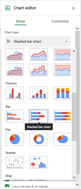
- Ensure that the ‘Use row 1 as headers’ and ‘Use column E as headers’ checkboxes are ticked. You should see the Tasks column placed in the Y-axis while the Start on Day and Duration columns are considered as series.

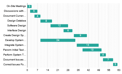
- Click on the portion of the graph that corresponds to the Start on Day values. Normally, these are the bars colored blue. You will then be directed to the Customise tab of the Chart editor toolbar. Under Series, set the color of the Start on Day series to none. This will make these bars transparent.

Done! We have successfully created a Gantt chart on Google Sheets! From here, you can explore more of the Customise tab of the Chart editor to be able to customize your chart. In the next section of this tutorial, we shall discuss a few tips to make your Gantt charts easier to read. This enables viewers of the chart to better extract data from the chart.
Editing and Customizing the Gantt Chart
The x-axis of the Gantt chart shows the number of days from the start of the project. While this is useful information, it may not be as intuitive to translate these numbers to actual dates.
Here are a few customization tips that may be helpful for viewers to get a better sense of date progression in the chart.
- First, I shall remove any excess elements that I don’t want to show in my chart. You may copy or skip this step, but I will remove the title, legend, and axis titles. At this step, you may also change the color of the bars to whatever you like. Simply click on the colored bars and change the color of the Duration series in the Customise tab.

- The first customization tip we shall implement is to change the gridlines to reflect weekly time passages. Under Gridlines and ticks, select the horizontal axis. For major gridlines, change the major spacing type to Step and set the value to 7. We will also add minor gridlines for each day. Change the minor spacing type to Step and set its value to 1.

- You should end up with the following graph. With the major gridlines set every 7 days, this will help the readers intuitively understand how many weeks since the project started the tasks are situated in.

- The next customization tip we have is to add data labels to these bars. One label we can choose to put is to add the duration of each task. Simply go to Series, select the Duration data set, and tick the Data labels check box. From there you can change the position of this label and its font.

- Your chart shall now look like this:
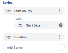
- Another type of label we can add is the specific date where these tasks start and end. For this step, we would need to insert more data for the chart to use. Under the Setup tab, go to the Start on Day data set, see more options, and select Add labels. Initially, the Tasks column will be selected. Simply replace these values with the data range containing the Start Date. In our example, this is the range B1:B14. You will notice that the header is used to label this data range.
- Next, we shall add the data labels for the End Dates. Similar to how the Start Date is added, go to the Duration data set, see more options and select Add labels. This time, select the data range containing the End Date, which is the range C1:C14.

- Depending on the data you have, you may choose to place these labels in a particular way to make sure they are still readable. These edits can be made under Series in the Customise tab. The Gantt chart with the start and end dates as data labels will look like:

These tips we shared are completely optional to follow! Feel free to use some or all of them if you like!
That’s pretty much all you should know on how to create Gantt charts in Google Sheets. If you want to practice some more, make a copy of our spreadsheet, and give it a try:
Or browse our other numerous Google Sheets formulas to create even more powerful formulas that can make your life much easier.