


This guide will explain how to plot Poisson distribution in Excel using the POISSON.DIST function.
Essentially, we first need to use the POISSON.DIST function to obtain the value to plot the Poisson distribution in Excel.
The rules for using the POISSON.DIST function is the following:
- The x value is shortened if it is not an integer.
- If mean or x is not a numeric value, the
POISSON.DISTfunction returns a #VALUE! error. - If x < 0, the
POISSON.DISTfunction returns a #NUM! error. - Likewise, if mean < 0, the
POISSON.DISTfunction returns a #NUM! error.
A Poisson distribution is usually used to show the possibilities or probabilities of an event or incident occurring in a given period of time. In Excel, the POISSON.DIST function basically returns the Poisson distribution value.
Statistically, a Poisson distribution needs the mean, number of successes, and a constant equal value of approximately 2.71828. But we can simply use the POISSON.DIST function in Excel to calculate the Poisson distribution value.
Additionally, plotting a Poisson distribution in Excel is easy since we already have available charts we can simply use to display the data. Regardless, we can choose any chart type available that will match our preference and best present our data.
Let’s take an example.
Suppose you are in charge of your company’s product delivery. So you want to find the probability or the possible number of times a delivery arrives every hour. To make it easier, you will do the calculation in Excel. Generally, this makes it easier to plot the Poisson distribution in your chart.
Now let’s learn more about the POISSON.DIST function to successfully use it in plotting our Poisson distribution values.
The Anatomy of the POISSON.DIST Function
The syntax or the way we write the POISSON.DIST function is as follows:
=POISSON.DIST(x;mean;cumulative)
Let’s take apart this formula and understand what each term means:
- = the equal sign is how we start any function or equation in Excel.
- =POISSON.DIST() this is our
POISSON.DISTfunction. Furthermore, this function simply returns the Poisson distribution. So all values inputted in the function need to be of numeric value. Otherwise, it will return a #VLAUE! error. - x refers to the number of incidents or events. And this is a required argument. Also, the x value must not be less than 0. Otherwise, it will return a #NUM! error. Additionally, the x value must also be an integer, or it will be shortened. Basically, x must be of numeric value.
- mean refers to the expected or predicted numeric value. Again, this is a required argument. It is the mean value of successes over a given period.
- cumulative is a required argument. And this is a logical value of either TRUE or FALSE. If you choose TRUE, cumulative will be returned with the number of events or incidents occurring between 0 and x. If you choose FALSE, it will return the number of events or incidents occurring is exactly x.
Great! Let’s check a real example of plotting Poisson distribution in Excel.
A Real Example of Plotting Poisson Distribution in Excel
Let’s check our data set before we start calculating the Poisson distribution using the POISSON.DIST function.
For instance, we want to calculate the possible number of times a delivery arrives in the warehouse every hour. To calculate this, we will use a previous day’s time log.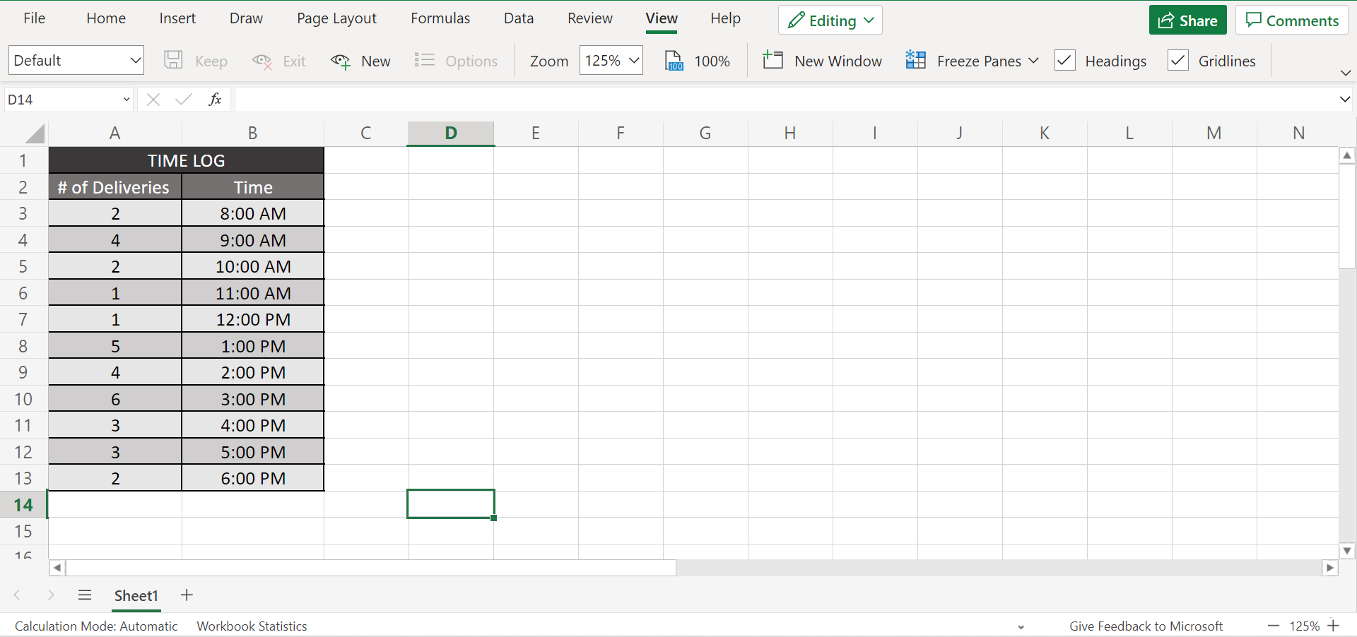
For example, the time log shows the number of deliveries arriving every hour on that particular day. Using this data, we can calculate the mean.
However, we first need to prepare our Poisson distribution table, where we will input the values to be used in the POISSON.DIST function. Next, let’s set our x to 11 successes, from 0 to 11. Afterwards, simply use the POISSON.DIST to calculate the Poisson distribution number.
Once we are finished getting the Poisson distribution values, we can start plotting them in a chart. And we can choose any chart available in Excel that works best with our data. In this case, let’s make use of a bar chart.
Finally, we have plotted the Poisson distribution in Excel.
You can make your own copy of the spreadsheet above using the link attached below.
Awesome! Now let’s learn the process of plotting the Poisson distribution in Excel.
How to Plot Poisson Distribution in Excel
In this section, we will learn the step-by-step process of how to plot the Poisson distribution in Excel.
1. First, we need to calculate the mean. So we simply need to divide the number of incidents or events by the number of cases. In this case, we can input the formula “=SUM(A3:A13)/COUNT(A3:A13)“ to get the mean.
2. Second, we can now calculate the Poisson distribution using the POISSON.DIST function. So prepare a table containing two columns. In the first column, input our x, which will have 11 successes, from 0 to 11. Meanwhile, the second column will be where we return the Poisson distribution.
3. Third, input the POISSON.DIST function. In cell G3, type in the formula “=POISSON.DIST(F3;$E$1;FALSE)”. Lastly, press the Enter key to return the result.
Furthermore, make sure to use absolute reference for the mean to get the correct result.
4. Afterward, drag down the formula to copy it to the rest of the rows and get the Poisson distribution of each x.
5. Finally, it’s time to plot our Poisson distribution. First, select the second row of the table or the Poisson distribution values. Then, go to the Insert tab. In the tab, go to the Chart group and select any chart of your preference. In this case, we will select the Bar chart.
6. If you want to format the chart, simply right-click the chart and select Format. So make the necessary changes you want. Besides, any changes made in the table containing the Poisson distribution will automatically reflect in the chart.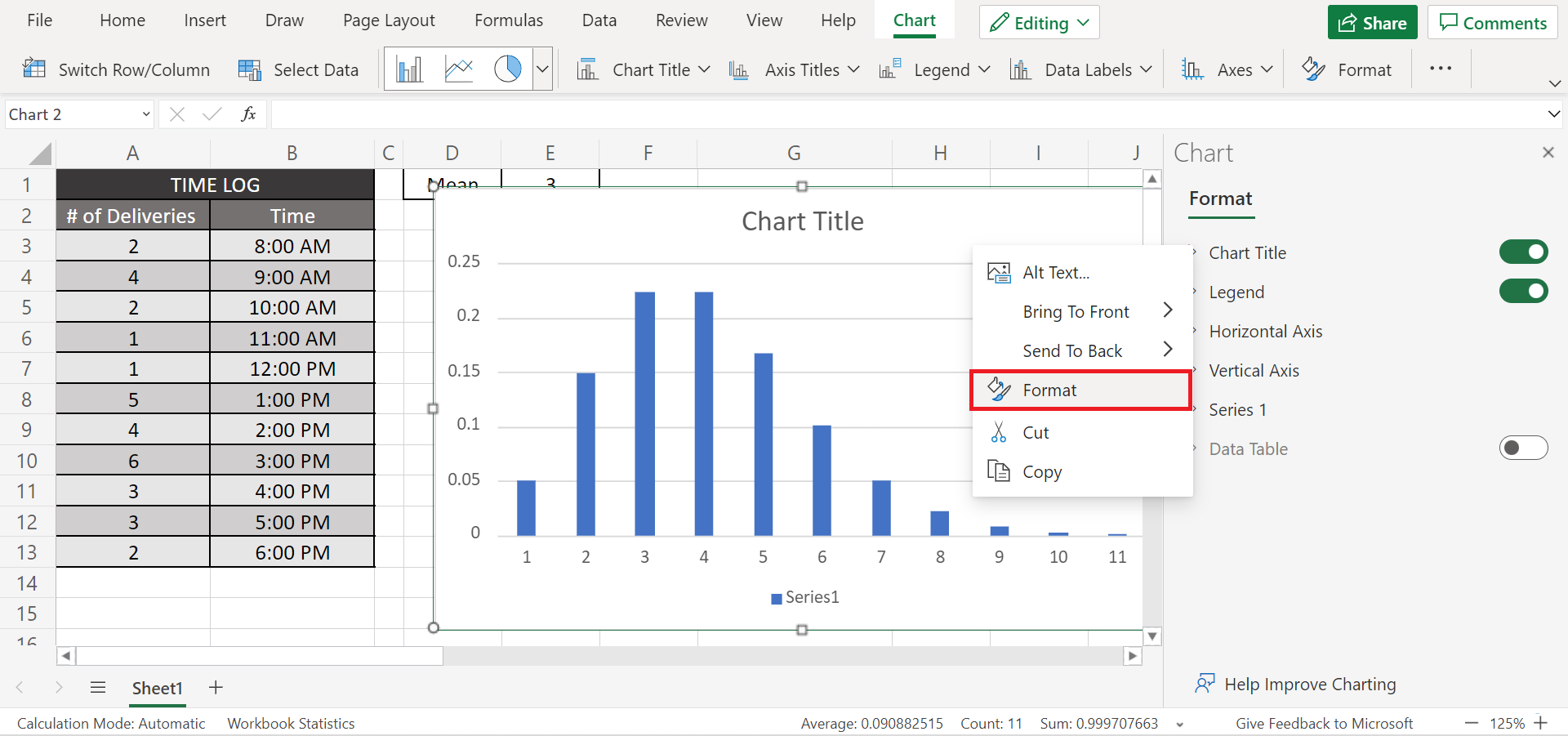
7. And tada! We have successfully plotted the Poisson distribution in Excel.
That’s pretty much it! Hence, you have learned how to plot the Poisson distribution in Excel using the POISSON.DIST function.
Are you interested in learning more about what Excel can do? You can now use the POISSON.DIST function and the various other Microsoft Excel formulas available to create great worksheets that work for you. Make sure to subscribe to our newsletter to be the first to know about the latest guides and tutorials from us.
[powerkit_subscription_form title=”Get emails from us about Google Sheets.” text=”Our goal this year is to create lots of rich, bite-sized tutorials for Google Sheets users like you. If you liked this one, you’ll love what we are working on! Readers receive ✨ early access ✨ to new content.” list_id=”default” bg_image_id=”2256″


