Learning how to create a radar chart in Google Sheets is useful when comparing several variables quickly in Google Sheets.
You may be more familiar with a spider chart, web chart, star chart, or even polar chart. These are all radar charts. A radar chart can be used to compare data groups and entities with different characteristics.
A radar chart can quickly compare huge amounts of variables in one place. This allows the comparison to appear less cluttered and readable. This is because the data are represented by shapes, also known as polygons.
Shapes help create a simple visual by laying on top of each other for us to compare. By using a radar chart in Google Sheets, outliers are also easily detectable since the data would be exemplified into a drastic change in shape.
Table of Contents
Anatomy of a Radar Chart in Google Sheets
While a radar chart can look tedious and complicated at times, it is quite straightforward to grasp by understanding a few basic features:
- Centre Point is the core of the radar chart where all axis are drawn from.
- Axis represents different variables. There are at least three axes in a radar chart, and each axis is given a name and value.
- Grids are formed after the axes are linked to each other. This helps us to understand better the information represented.
- Values are given once the chart is drawn. We will then plot the chart with distinctive colors for each entry.
Let’s use some examples to grasp better how to use a radar chart in Google Sheets!
A Real-Life Example of Using Radar Chart in Google Sheets
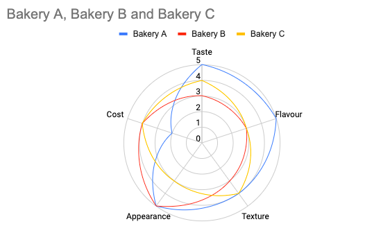
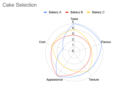
Imagine you open a cafe. It is due to order the monthly cakes for the cafe but could not decide which bakery shop to choose from.
There are three bakeries to choose from, each offering its signature cakes for you to taste. You have rated the cakes from each bakery according to a score of five; however, there are no clear winners.
In this scenario, a radar chart is a perfect tool to help visualize these data and show which cake would be the best.
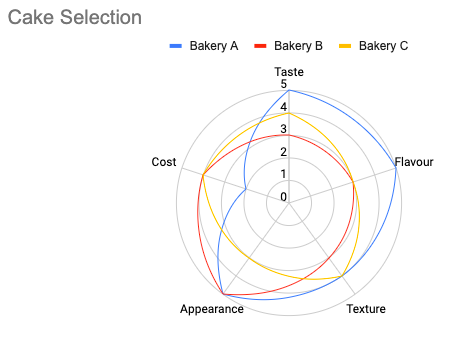
By using the radar char in Google Sheets, we can see the winner is the cake from Bakery A. As Bakery A’s shape is the widest among the three, this signifies that the cake from Bakery A scores the highest and satisfies the most variables.
You may make a copy of the spreadsheet using the link I have attached below.
How to Use Radar Chart in Google Sheets
Example 1:
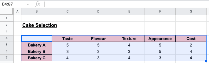
- First, you need to prepare your data in an organized manner. In this example, Bakeries A, B, and C will create three entries. Taste, Flavour, Texture, Appearance, and Cost will be the five variables.

- To create the radar chart in Google Sheets, we will select the data we want to present in the chart. This being B4 to G7.
- Now, we click on the Insert Chart icon on the toolbar above. You can also access this by clicking Insert, then Chart.
![]()

- Once you click on Chart, the Chart Editor will appear on the right side of your screen. This is where we can customize all the elements on the chart.
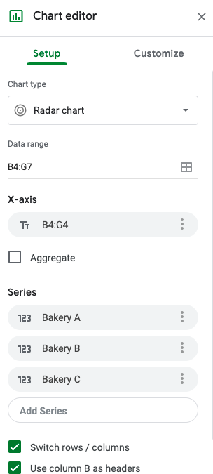
- Once the chart appears, it may not be a radar chart. We will need to click on Setup, then Chart Type to choose the Radar Chart.

- Once you make all the desired adjustments and customizations, your chart will look like this:
- We can also edit the title of the chart by clicking on it. If you want to change the names of the variables, you can simply amend the data. The chart will immediately reflect the changes made.
Example 2:
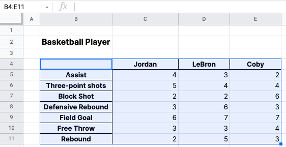
Imagine you are a basketball coach for an elite basketball team. It is the season to recruit some new players. You have been eyeing a few basketball players and shortlisted three players.
Each player has unique qualities and brings different synergy to the team. Hence, we can use the radar chart to reveal which player has the best attributes.
You have collected the data from past basketball leagues that the three players have been in.
- First, we summarize the data given from the basketball leagues. Then, we will select the data we want to be shown on the radar chart. In this example, it is B4 to E11.
- Like Example 1, we click on the Insert Chart icon on the toolbar above. You can also access this by clicking Insert, then Chart.
- Once the radar chart and chart editor appears, your window will look like this:

- Now you can customize and adjust your radar chart to your desired preference. To maximize the appearance of the chart, we can tick Maximize.
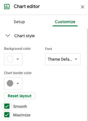
- We can also untick the Smooth feature to make the shapes in the radar chart more angular.

Now we can decide which features are more desirable and which player to recruit from there.
There you go! Now you have a few ideas on how to use the radar chart in Google Sheets to visualize your data better.
Don’t forget to check out other cool functions in Google Sheets to enhance and simplify work for your everyday use!