This guide will explain how to create a shaded target range in line charts in Google Sheets.
Using a shaded target range, users can quickly determine whether a metric is overperforming or underperforming. We will use the combo chart option to combine an area chart and line chart into a single visualization.
Let’s take a look at a simple example of a scenario where we might benefit from a line chart with a shaded target range.
Suppose you have a spreadsheet that helps you keep track of how many hours you work as a freelancer every week. Each row of this tracker has the week number and the total number of weekly hours you’ve rendered for that specific week.
To create a consistent work schedule, you’ve set both a lower limit and upper limit for your weekly hours. You plan to work a minimum of 30 hours and a maximum of 45.
Using a line graph, you can have an idea of how many hours you’ve worked each week. However, you want to make it easier to know whether you’ve exceeded your target range. How can we do this in Google Sheets?
Google Sheets allows you to create a combo chart. Using the combo chart feature, we can combine an area chart with a line chart to add a shaded target range.
Now that we know when it’s useful to add a shaded target range in line charts, let’s take a look at a sample chart in Google Sheets.
A Real Example of a Shaded Target Range in a Line Chart
Let’s take a look at a real example of a line chart with a shaded target range in Google Sheets.
In the example below, we’ve added multiple shaded ranges to our line chart. The area below the $500 mark is shaded red. We’ve colored the area above the $750 mark with green. The area between these two limits is shaded yellow.
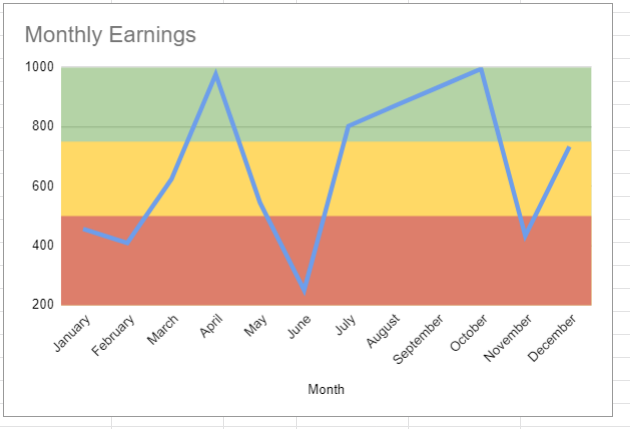
The combo chart above combines two types of charts: a line chart and a stepped area chart. The stepped area chart is created by adding three additional series to the chart. These additional series determine the lower limit and upper limit of the target range.
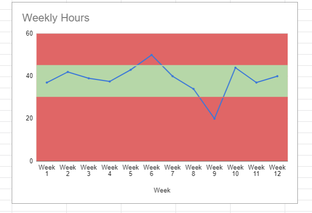
In the example below, we’ve used a combo chart to keep track of our freelancing hours. We can instantly see that we went over our target in Week 6 and underperformed in Week 9.
You can make your own copy of the spreadsheet above using the link attached below.
Are you ready to add a shaded target range to your Google Sheets line charts? Head over to the next section to read a step-by-step guide.
How to Create a Shaded Target Range in Line Chart in Google Sheets
This next section will guide you through each step needed to add a shaded target range in a line chart. We’ll explain how to take advantage of combo charts to overlay shaded regions in your charts.
Follow these steps to create our modified line chart in Google Sheets:
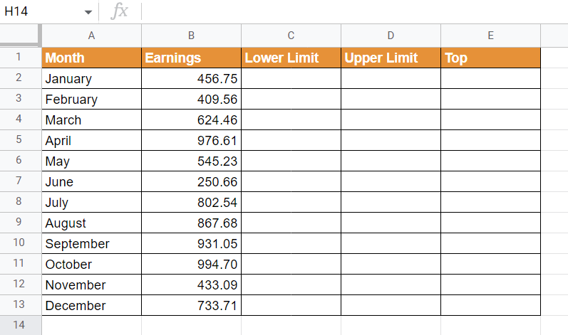
- First, select the dataset that you want to convert into a line chart. In this example, we’ll use a financial dataset of monthly earnings from January to December.

- Next, we’ll add 3 helper columns to our original dataset: lower limit, upper limit, and top. The lower limit and upper limit will determine the boundaries between each of the three sections. If you only need two ranges, you can combine the lower and upper limits to a single value.
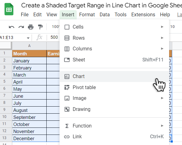
- Select the entire dataset and click on the Chart option under the Insert menu.
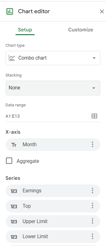
- In the Chart editor, select Combo chart as the chart type. Next, ensure that the x-axis is the Month column and that you have the numerical data and helper columns as series.
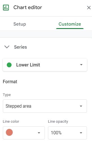
- In the Customize tab, we’ll start formatting each series in our chart to create our shaded target ranges. First, ensure that our Earnings data is formatted as a line chart.

- Next, we’ll convert our lower limit series into a stepped area. We’ll also use the color red to indicate this range.
- We’ll also convert the upper limit into a stepped area format. We’ll set the line color of this series to yellow.

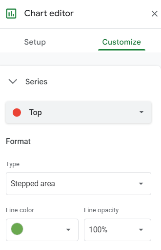
- We’ll also convert the Top series to a stepped area chart. We’ll set the line color to green.
- After customizing each of our chart series, we should now have a line chart with a shaded target range.
This step-by-step guide should be all you need to add a shaded target range on your Google Sheets line charts. We’ve explained how you can use Google Sheets combo charts to help visualize various ranges in your line chart visualization.
A combo chart is just one example of a visualization option available in Google Sheets. With so many other Google Sheets features available, you can surely find one that works best with your dataset.
Are you interested in learning more about what Google Sheets can do? Subscribe to our newsletter to find out about the latest Google Sheets guides and tutorials from us.