This guide will explain how to create a survival curve in Excel.
The survival curve can help give users a visual representation of the survival rate of a specific population.
The Kaplan-Meier curve is a graphical representation of the survival function, developed in the 1950s by Edward Kaplan and Meier.
The curve is a non-parametric estimate of the survival function that does not make any assumptions about the underlying data distribution.
The representation can be used to estimate the survival function from data that are censored, truncated, or have missing values. The survival curve shows a subject’s probability of survival up to time t.
Let’s take a look at a simple example where we can create a survival curve.
The most prevalent use case for the survival curve is in the field of medical research. Doctors can use the survival curve to determine how long a subject may last with a certain disease, given a particular treatment or other related factors.
Survival curves may also be used in business. For example, you may want to use a survival curve to determine how long it takes until a customer makes a complaint or claims a warranty for a certain product.
A survival curve may also be used to analyze customer retention over time. For example, a company may want to track how many customers they have retained after one year, two years, etc.
For example, if there is a sharp drop-off in retention after one year, the company may want to focus on strategies to keep customers engaged after the first year.
We can create a survival curve in Excel by formatting our subject survival data into a specific format.
The COUNTIF function can count the number of cells that meet certain criteria. We will use the Scatter plot chart in Excel to visualize our survival curve.
Now that we have a grasp on when to use the survival curve, let’s see how this works on an actual sample spreadsheet.
A Real Example of Creating a Survival Curve in Excel
The following section provides several examples of how to create a survival curve in Excel. We will also go into detail about the formulas and tools used in these examples.
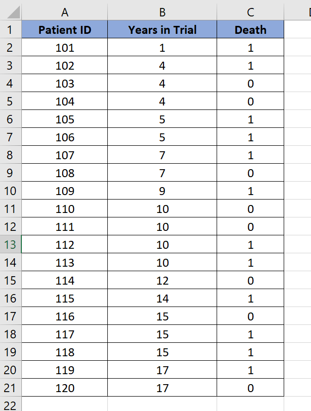
First, let’s take a look at our sample dataset.
We have twenty patients in our trial. Each patient has a corresponding patient ID, the number of years in trial, and a field indicating whether the patient has died.
We’ll convert this initial dataset into a different format that we can then plot in our Scatter chart.

The survival curve is plotted using connecting lines in a staircase-like pattern. The horizontal axis shows the number of days in the trial, while the vertical axis indicates the probability of survival.
For example, we can determine using the survival curve that the patient has less than a 60% survival rate after twelve years. In contrast, the survival rate at two years is 100%.
Do you want to take a closer look at our examples? You can make your own copy of the spreadsheet above using the link attached below.
If you’re ready to try out creating a survival curve, head over to the next section to read our step-by-step breakdown on how to do it!
How to Create a Survival Curve in Excel
This section will guide you through each step needed to create a survival curve in Excel.
Follow these steps to create the survival curve in Excel:
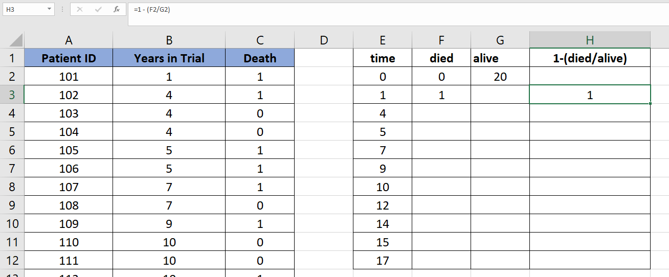
- First, create a new column labeled time. Add ‘0’ as the first entry.

- Next, we’ll have to fill out the column with all unique values in the ‘Years in Trial’ field. We can use the
UNIQUEfunction to accomplish this.

- Create a new field that will count how many patients have died at a specific time. We’ll use the
COUNTIFSfunction to check if the patient has died and if the patient lasted a specific time.

- Create another field that checks the number of patients still alive in the year before the current time period.

- Create another field that subtracts the ratio of the previous two columns from 1. We’ll use the formula
= 1 - (F2/G2)to compute for this value.
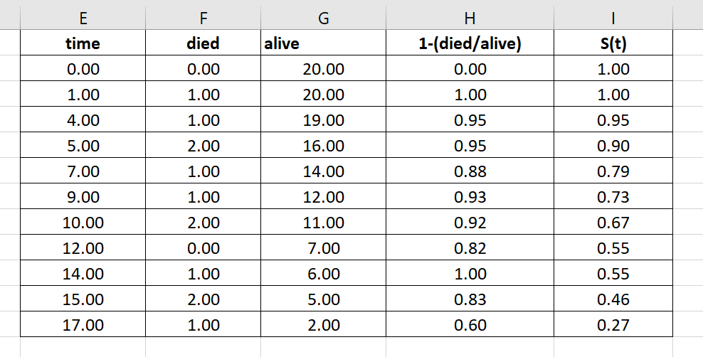
- Create a new field labeled S(t). This will be the output of our survival function given a time period t. The first value at time 0 must be equal to ‘1’.

- Compute for S(t) by multiplying the previous S(t) by the current row’s value in column .

- Use the Fill Handle tool to fill out the rest of the table. The value of S(t) should decrease over time.
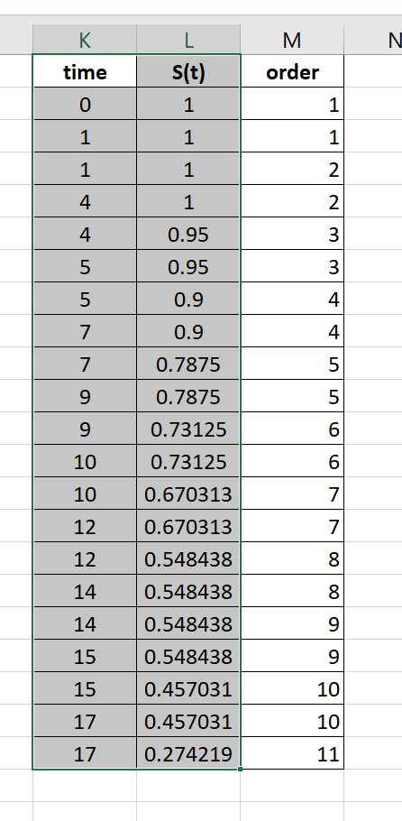
- Duplicate columns E and I into columns K and L.

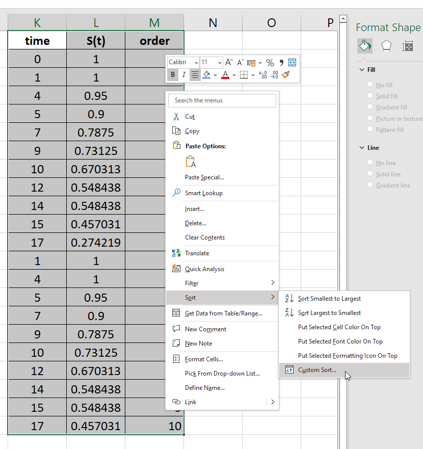
- In the time field, duplicate the time range again, excluding 0. Duplicate the S(t) field in column L. Add a helper column that numbers the rows, as seen in the table below.
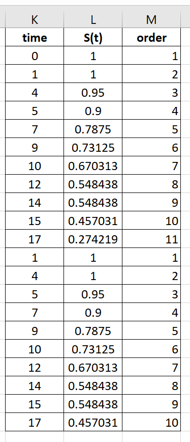
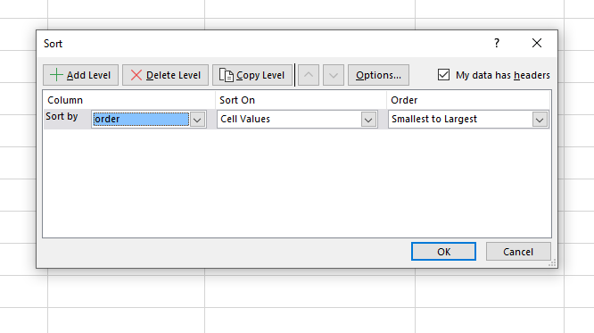
- Select the new table and right-click on the selection. Select the Custom Sort option.
- Sort the range by the helper column from smallest to largest. Click on OK.
- Select the newly-sorted columns time and S(t).
- In the Insert tab, select the Scatter graph option with straightened lines.

- You should now have a survival curve based on the initial trial data.
This step-by-step guide should provide you with all the information you need to start creating your own survival curve in Excel.
The survival curve is one way you can visualize your data in Excel. Our website offers hundreds of other functions and methods to help you get more out of Microsoft Excel.
With so many other Excel functions available, you can find one appropriate for your use case.
Don’t miss out on our team’s new spreadsheet tips, tricks, and best practices. Subscribe to our newsletter to stay updated on the latest guides from us!