This guide will explain how to use the SPARKLINE function in Google Sheets to create bar charts contained within a cell.
Table of Contents
A sparkline chart is a miniature chart that fits within a worksheet cell that can help visualize your data. Their condensed size can help visualize a large volume of data without taking up too much space in your worksheet.
We can add sparkline charts in our Google Sheets worksheets through the built-in SPARKLINE function. The SPARKLINE function supports four types of charts: line charts, bar charts, column charts, and win-loss charts.
In this guide, we will provide a step-by-step tutorial on how to create a miniature bar chart using the SPARKLINE function in Google Sheets.
The Anatomy of the SPARKLINE Function
The syntax of the SPARKLINE function is as follows:
=SPARKLINE(data, [options])
Let’s look into each argument to understand how to use the SPARKLINE function.
- = the equal sign is how we start any function in Google Sheets.
- SPARKLINE() refers to our
SPARKLINEfunction. This function accepts an array or range and returns a miniature chart of a specified type. - The data argument refers to the array or range of cells containing the data you wish to plot.
- The [options] parameter allows us to customize the chart output of our function.
- To create a bar chart with
SPARKLINE, we’ll need to set the “charttype” to “bar”. - The bar chart also supports a variety of other settings:
- “max” determines the maximum value along the horizontal axis
- “color1” will set the first color used for bars in the chart
- “color2” will set the second color used for bars in the chart.
- “empty” will control how
SPARKLINEtreats empty cells. This can be set to “zero” or “ignore” - “nan” will control how non-numeric data is handled. This can be set to “convert” or “ignore”
- “rtl” will determine whether the chart is rendered right to left.
A Real Example of Creating a Sparkline Bar Chart in Google Sheets
Let’s explore a sample use case for the sparkline bar chart in Google Sheets.
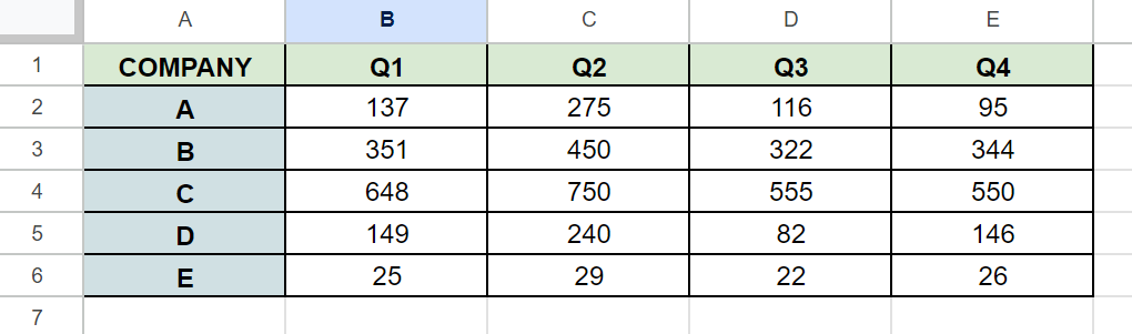
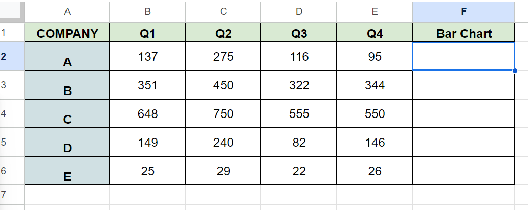
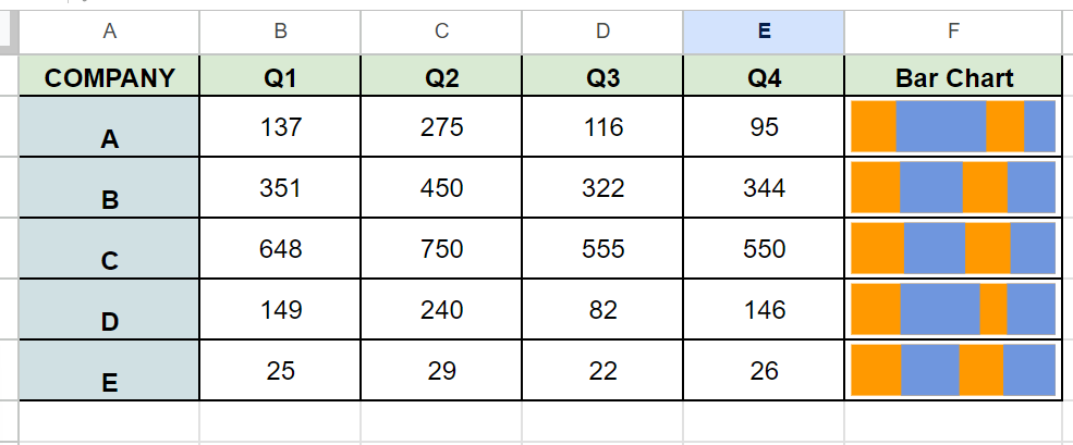
In the table above, we have a table showing the average number of sales of five different companies over four consecutive quarters. We want to create a sparkline bar chart to visualize which quarter accounted for the most sales for each company.
To create this visualization, we can use the following formula:
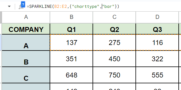
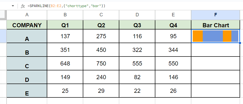
=SPARKLINE(B2:E2,{"charttype","bar"})

We can apply the formula to the rest of the column to compare the distribution of quarterly sales among the companies in our dataset.
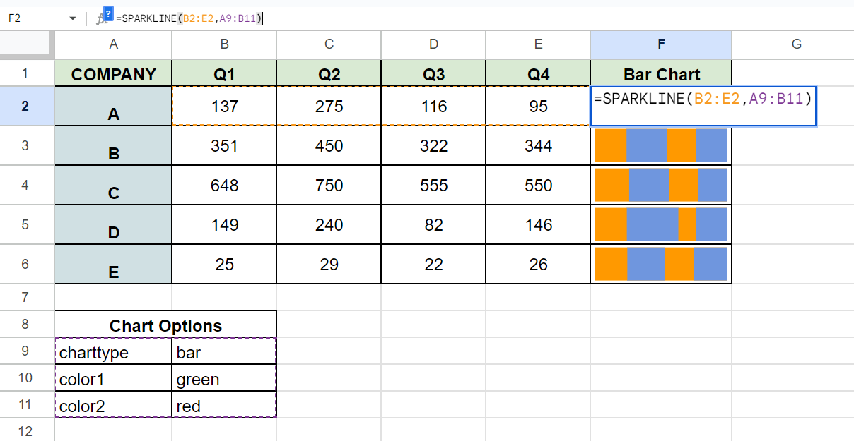
The second argument of the SPARKLINE function can also refer to a range of values. This range must have two columns: one column for options and another column for the corresponding value.
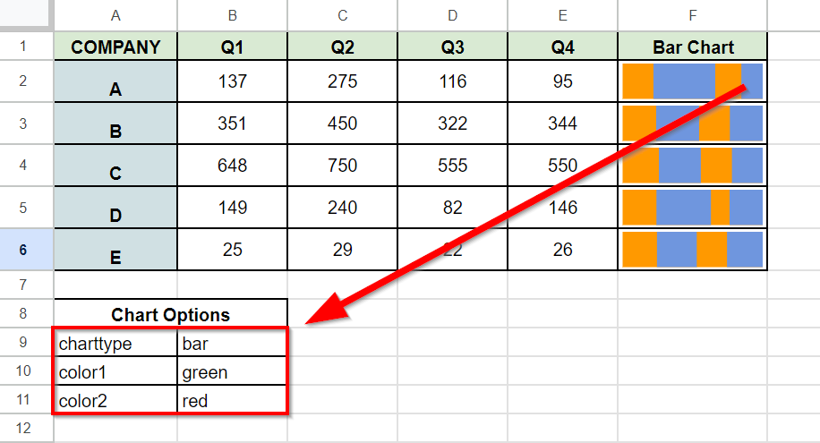
In the spreadsheet above, we’ve added a new range of values that will serve as the chart options for our sparkline. In addition to the charttype option, we’ve also set color1 to green and color2 to red.
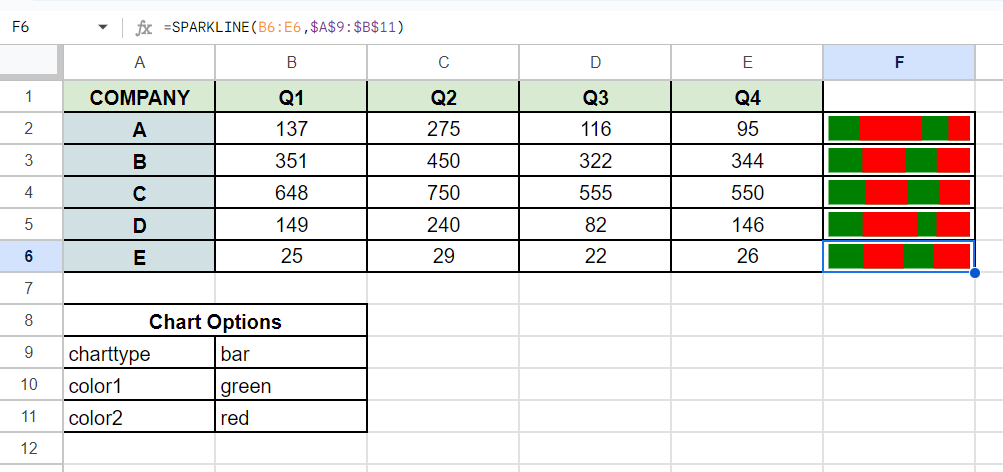
We can now use the following formula to use these chart options when creating our sparkline chart:
=SPARKLINE(B6:E6,$A$9:$B$11)
In the formula above, we’ll add the “$” character before the column letters and row numbers to create an absolute reference. This will allow us to use the same range when we drag the formula down with the AutoFill option.
With the new chart option range, we can now easily modify the appearance of our chart by adjusting the values in that range.
Click on the link below to create your own copy of our examples.
Head to the next section to read our step-by-step tutorial on how to create a sparkline bar chart in Google Sheets.
How to Create a Sparkline Bar Chart in Google Sheets
- Select the cell where you want to place a sparkline bar chart.
 In our sample spreadsheet, we’ll create a new sparkline chart in cell F2.
 - Type the
SPARKLINEfunction and enter the range you want to convert into a bar chart.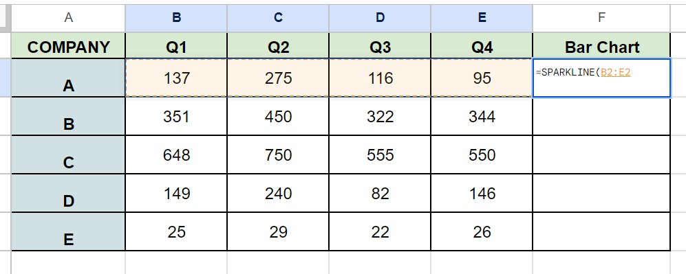
- Next, provide an array that includes the chart options you wish to include.
 In this example, we’ll use the array {“charttype”,”bar”} to set the chart type to a bar graph.
 - Hit the Enter key to evaluate the function.
- You can use the AutoFill feature to create sparkline bar charts for the remaining rows in your dataset.
- Instead of typing the array for chart options manually, you can reference a range with the corresponding options and values.
- Changing the chart options will adjust the appearance of your sparkline.
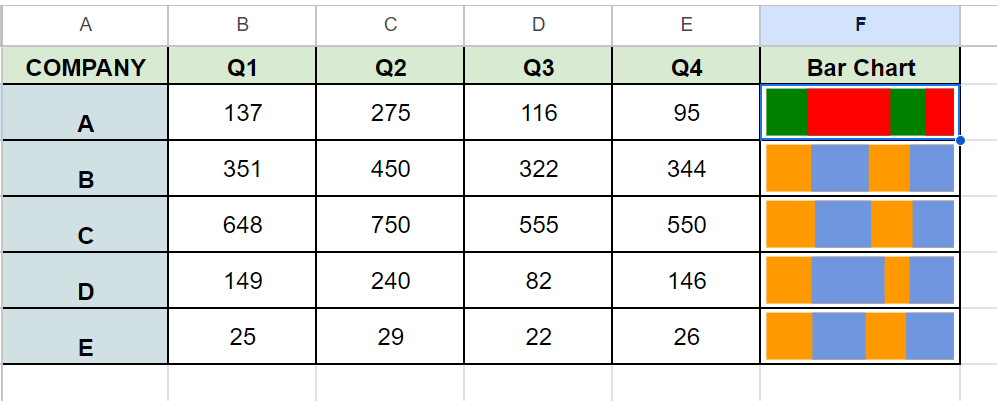 In the example above, we’ve edited the chart options to change the colors of our chart.
These are all the steps you need to follow to start creating a sparkline bar chart in Google Sheets.
To learn more about using the SPARKLINE function, you can read our post on how to use the SPARKLINE function in Google Sheets. You may also be interested in our guide on adding a win-loss sparkline chart in Excel.
That’s all for this guide! Be sure to check out our library of spreadsheet resources, tips, and tricks!